Blogs

News

Favorite Posts

ctodx

Discussions, news and rants from the CTO of Developer Express, Julian M Bucknall

XtraCharts now has splines? Wassat then?


Back in school, it seemed that we always had to draw some graph or other for math homework. We were given an equation like y = x3 - 3x2 and had to plot it on squared graph paper. I had a marvelous bendy ruler for this task and I'd carefully bend this plastic and wire contraption along the points of my graph so that I could draw a smooth line joining them. (I see they're called flexible curves these days, or maybe they always were, but to this English schoolboy, they were bendy rulers.)

With the latest version of XtraCharts, v2008 vol1, released today, we've added our version of this bendy ruler, a programmatic one that uses splines to join your data points (splines are also sometimes known as Bézier curves). No longer do you have a case of the jaggies when displaying a line chart, like those join-the-dots coloring books, you can now elect to have a smooth curve joining the points on your chart. And it's also available in area forms, both stacked and full-stacked, in 2D or 3D.

Splines have been around for many, many years. First popularized by Pierre Bézier, a designer working for Renault in France in the 60s (although invented by Paul de Casteljau who worked for the rival Citroën), they came to prominence with Adobe's PostScript in the early 80s where for the first time all fonts were displayed by using splines instead of bitmaps. Nowadays we don't even think about it any more, but the text you are reading now was created on the pixel grid of your monitor using splines.

Despite its weird name, a spline is merely a mathematical algorithm for deriving a quadratic (or, more generally, a cubic) polynomial that passes through two points. Draw enough of these polynomials joined together and you have a smooth curve through many points.

Luckily you don't have to worry about quadratics or cubics or joining together polynomials, because our charting team have done all that for you. Set the chart type, add your data points, and the charting engine does the rest, working out the best angle for joining lines on the chart, including the data points on the edge of the chart. After all, at one of the data points, you don't want the line arriving at one angle and leaving at another: the tangent for both line segments must be the same where they meet.

Oops, there I go into mathematics again. Sorry, occupational hazard.

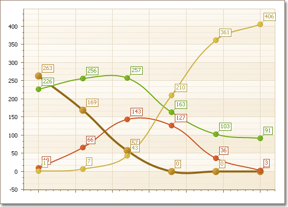
Here's a quick example that I copied from the What's New so you can see how it looks.


Published Mar 21 2008, 07:33 PM by Julian Bucknall (DevExpress)
Filed under: ,
Technorati tags: v2008.1, XtraCharts
Bookmark and Share

Comments


CESAR F. QüEB said:

Let me say... the data seems awasome...easy to understand...

Thank you DX!

March 22, 2008 1:13 AM
 

RAUL TORTIMA said:

the only thing I can say is:

ABSOLUTELY WONDERFUL !!!!!!!!!!!!!!!!!!!!!!!!!!!!!!!

having a competent team that knows math deeply is rathe fundamental in these days!

Congratulations...I dont see how you wouldnt take 100% of market share in charts and reports (xtrareports is also a piece of art)...

March 22, 2008 10:40 AM
 

Shankar said:

Great Job!!

Having fit a cubic spline, Why not cater for Quadrature and Derivative Orders to apply decision theory? Approximation Theory on Interpolations?

March 24, 2008 1:11 AM
 

Tomm Schuller said:

Nice improvements for the charts.

If you got logarithmic x-axis implemented aswell I'd be a happy goose ;)

March 24, 2008 4:49 AM
 

Jon Scolamiero said:

That's great!  However we really need logarithmic scales :(.  It's important for our business use (Oil and Gas) and would help us get off of one of your annoying competitor's products.

March 24, 2008 11:33 AM
 

Julian Bucknall (DevExpress) said:

Shankar: we have to start somewhere and take it step by step, there's no way we can do everything all at once.

Tomm and Jon: all right, already! I get the picture! Log scales good.

Cheers, Julian

March 24, 2008 2:34 PM
 

Daniel said:

But will it play a "reticulating splines" sound file?

March 25, 2008 1:33 AM
 

Jon Scolamiero said:

Julian,

We only bug you because we know you actually listen to your customers (and potential customers).

-Jon

"In Soviet Russia, Internal Framework Mocks you..."

March 25, 2008 2:31 PM
 

Shankar said:

Julian : I appreciate your Priorities.

The log scale will be extremely useful. Similarly Dual Y axis left and right would be of immense help .e.g plotting curves of sales and contribution, pressure head  and rpm etc..

I had another suggestion on Charts using data based on Std Deviation sigma/2 Sigma because often some unwanted data distorts the focus of the chart.

March 25, 2008 7:53 PM

About Julian Bucknall (DevExpress)

Julian is the Chief Technology Officer at Developer Express. You can reach him directly at julianb@devexpress.com. You can also follow him on Twitter with the ID JMBucknall.
More from DevExpress
Live Chat
Have a pre-sales question?
Need assistance with your evaluation?
We are here to help.
Chat is one of the many ways you can contact members of the DevExpress Team. We are available Monday-Friday between 8:30am and 5:00pm Pacific Time.
If you need additional product information, require pre-sales assistance, or want help with your order, write to us at info@devexpress.com or call us at
+1 (818) 844-3383.