There have been several changes across the board in our XtraEditors library.
Auto-Collapsing Panels
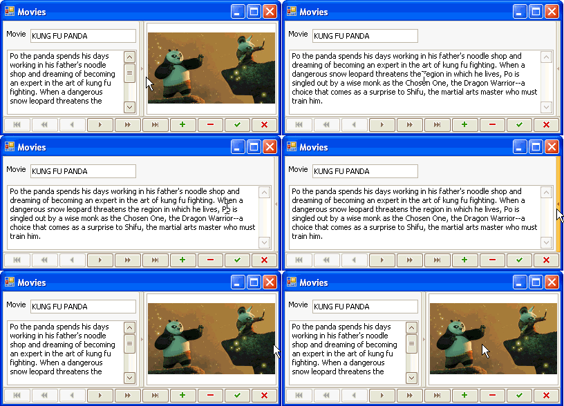
You can enable an auto-collapsing feature using a SplitContainerControl. With this, an end-user can minimize one panel, and so maximize the second panel, just by clicking on the splitter.

Prompt Text in Empty Editors
For editors that contain no data, you can easily add prompts telling end-users what this editor is used for. These prompts are displayed in a light gray within the editor's edit box, and it immediately disappears when the editor gets focus.

Super Tooltips for Tab Control's Pages
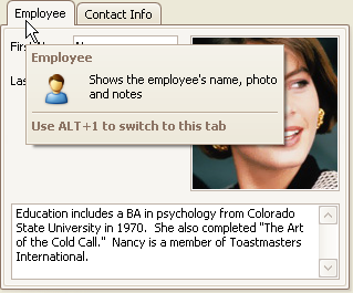
SuperToolTips give you the ability to implement advanced tooltips that display extended information about tab pages. You can embed large images and memo text into SuperToolTips, if required.

Custom Text Representations of Check Box Values
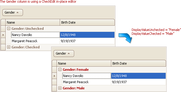
If a grid column or tree list column contains Boolean values, you can represent them using a CheckEdit editor. Currently, in certain situations (for example when grouping by this column, or when displaying the column's filter dropdown list) the true and false values are represented by the strings "Unchecked" and "Checked", which is not exactly informative (the top image below, which adds a certain amount of hilarity to some uses). From v2009.1, you can represent the true and false values using custom strings (the bottom image).

Minor Enhancements
As with our other products, we've implement a number of minor features from customer suggestions:
-
You can show error icons for editors using the DXErrorProvider component. By default, the error icon is displayed at a control's left edge. Now you can change the icon's location for standalone editors.

-
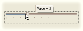
You can now enable tooltips for the indicator on a track bar control to display the current value. By default, only the value is displayed, however, you can handle an event to format the value in a specific manner or to provide custom display text.

- Built-in support for Icon files has been added to the image editors. You can freely load these files to the PictureEdit and ImageEdit controls, when they are used standalone or in-place within container controls (XtraGrid, XtraTreeList, etc).
- New skin elements (TabPageButton and TabHeaderButton) have been added to allow for custom painting of Close buttons in an XtraTabControl. Previously, the Close buttons were painted using a skin element from the Editors skin category, which was also used by other controls. Now, the Close buttons in the XtraTabControl are painted using dedicated skin elements.
Free DevExpress Products - Get Your Copy Today
The following free DevExpress product offers remain available. Should you have any questions about the free offers below, please submit a ticket via the
DevExpress Support Center at your convenience. We'll be happy to follow-up.