As you may already know, our Blazor Editors allow you to customize built-in command buttons and add your own buttons with custom behaviors. In this blog post, I'll take a closer look at this new capability.
Create Custom Command Buttons
You can integrate custom command buttons for the following Blazor Editors: DxComboBox, DxDateEdit, DxMaskedInput, DxSpinEdit, DxTextBox, and DxTimeEdit. As you might expect, buttons can display text and icons. You can change button appearance, set position (to the right or left edge of an editor), specify navigation URLs, and handle button clicks as needs dictate.
To create a button, simply define the Buttons collection in the editor and add a DxEditorButton object to it.
Command buttons will be most useful when users need to execute an action tied to a specific text field. The following examples should help describe the possibilities available to you:
“Add Item” Button
You can extend ComboBox functionality with a custom button that allows users to insert new items to a list. The code below inserts an Add Employee button to the ComboBox.
<DxComboBox Data="@Data"
            TextFieldName="@nameof(Employee.Text)"
            @bind-Value="@SelectedEmployee">
    <Buttons>
        <DxEditorButton IconCssClass="editor-icon editor-icon-add"
                        Tooltip="Add an employee"
                        Click="@(_ => OnButtonClick())" />
    </Buttons>
</DxComboBox>

@code{
    ...
    void OnButtonClick() {
        AddEmployeePopupVisible = true;
    }

    void OnEmployeeAdded(Employee newEmployee) {
        AddEmployeePopupVisible = false;
        if (newEmployee != null) {
            Data = Data.Append(newEmployee);
        }
    }
}

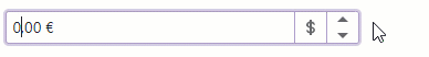
“Change Currency” Button
The code below adds a Change Currency button to the Spin Editor. The button allows users to change currency type when specifying a value.
<DxSpinEdit @bind-Value="@Price"
            Mask="@NumericMask.Currency">
    <Buttons>
        <DxEditorButton IconCssClass="@($"editor-icon {CurrencyButtonIconClass}")"
                           Tooltip="Change currency"
                           Click="@OnChangeCultureInfoButtonClick"/>
    </Buttons>
    <ChildContent>
        <DxNumericMaskProperties Culture="MaskCultureInfo" />
    </ChildContent>
</DxSpinEdit>
“Send Email” Button
In the following example, I’ll add a Send Email button to an editor.
<DxMaskedInput Value="@Email"
               ValueChanged="@((string value) => OnEmailChanged(value))"
               Mask="@EmailMask">
    <Buttons>
        <DxEditorButton IconCssClass="editor-icon editor-icon-mail"
                        Tooltip="Send Email"
                        NavigateUrl="@EmailLink" />
    </Buttons>
</DxMaskedInput>

@code{
    string Email { get; set; } = "test@example.com";
    string EmailMask { get; set; } = @"(\w|[.-])+@(\w|-)+\.(\w|-){2,4}";
    string EmailLink { get; set; } = "mailto:test@example.com";

    void OnEmailChanged(string email) {
        Email = email;
        EmailLink = $"mailto:{email}";
    }
}

Hide Built-In Buttons
You can now use new Show***Button properties to hide built-in command buttons that open a drop-down window (in DxDateEdit, DxTimeEdit,DxComboBox) or increase/decrease values (in DxSpinEdit).
The following code hides the built-in drop-down button within our Blazor Date Editor.
<DxDateEdit Date="DateTime.Today" ShowDropDownButton="false"/>
Customize Built-In Buttons
We’ve introduced several classes that allow you to customize built-in command buttons as follows:
Use associated properties to change built-in button icon, CSS class, position, etc. The following code changes the drop-down button’s icon in the Date Editor. The code hides the built-in button, adds a DxDateEditDropDownButton object to the `Buttons` collection, and specifies its IconCssClass property.
<DxDateEdit Date="DateTime.Today" ShowDropDownButton="false">
    <Buttons>
        <DxDateEditDropDownButton IconCssClass="oi oi-calendar"/>
    </Buttons>
</DxDateEdit>

Your Feedback Counts
As always, we appreciate your feedback.
Free DevExpress Products - Get Your Copy Today
The following free DevExpress product offers remain available. Should you have any questions about the free offers below, please submit a ticket via the
DevExpress Support Center at your convenience. We'll be happy to follow-up.