In another post, Oliver is describing a couple of the new features for DXCharts for WPF for v2009 vol 1. I thought I’d take a different tack and dive deep into the internals and talk about what sets our charting product apart from the pack.
When we started DXCharts over a year ago, WPF was still very new, and writing components was still a bit of a black art. Still is a little bit, to be honest. It’s not only the different run-time to consider, but also how to expose the functionality along two different axes (pun intended!): the designer axis and the developer axis. I’ll admit, we got it wrong the first time (ah, the joys of programming on the edge), and DXCharts internals have now been rewritten over the past year.
What did we concentrate on? We recognized that the really great thing about WPF is all about the user experience. The designer is god. (Well, OK, so is the developer, but don’t tell those who are prone to wearing all black gear from Armani.) If you want a standard-looking chart, there’s a lot out there. But if you want a chart that is customizable to the nth degree, DXCharts is the one for you. For example, we think that the ability for creating custom models is very important. Take a look at these examples:
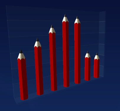
DXCharts is displaying a bar chart here, but the designer has customized it so that pencils are displayed instead of the usual bars. This would, for example, a great chart for an office supply application.
Another in the same vein:
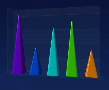
Here the customization not only extends to the shape of the bars, but also to the coloring. Each bar is a different color, indicating that the customizing does go deep. In fact, overall the level of customization exposed in XAML is broad: the designer has control over all aspects of the chart, such as labels, legends, and so on.
Another area we’ve spent a great deal of time is in the rendering of the charts, Here’s an example of a sloppily-drawn WPF chart from another (unnamed) component vendor, possibly due to conversions and calculations with integers:
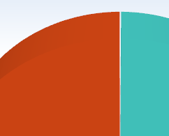
Notice that there is a very small gap between the two pie slices. They don’t come together. Although this example is zoomed to a certain extent, it is still visible by the end user at normal settings and we feel is not good enough.
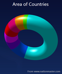
So our pie/donut charts look whole, and not as separate slices stuck badly together. We feel that such quality bars (hah, another pun) for WPF have to be set high right off the bat. So we spent a lot of time thinking about highlights and shadows, and such like. Another quality aspect I’d like to show that we embraced WPF completely is in our 2D chart demos. You’ll see a nice glassy reflection:

This effect, currently all the rage, is done through some clever WPF code on our behalf using transparency (go, us!), but is exposed to the developer through a simple property in XAML. This of course means that the feature can not only be exposed by the developer, but also by the designer at a later stage.
Now, of course, all this deep understanding of WPF and exposing its functionality to both designers and developers would not be worth it if the chart types and the functionality were not there. So for v2009 vol 1, we’re adding more 2D charts (Oliver’s post is the place to go for that news), for later in the year we’ll be adding yet more types and also things like scrolling and zooming and secondary axes (but more about that later).
Free DevExpress Products - Get Your Copy Today
The following free DevExpress product offers remain available. Should you have any questions about the free offers below, please submit a ticket via the
DevExpress Support Center at your convenience. We'll be happy to follow-up.