One of a series of posts on the new functionality that'll appear in DXperience v2009 vol 2. This is all pre-beta stuff, we're probably something like a month from beta.
This time, let's look at the new funnel chart in XtraCharts, for both ASP.NET and WinForms. A funnel chart is a weird beast indeed, one of those charts that has a quick visual hit resulting in a rapid understanding of the data, but one that is difficult to estimate the actual values. I'd have to say that labels are required for this type of chart, because we all have difficultly guessing the area of a shape.
(This is just like bubble charts, by the way, where the "third value" of a chart point is the area of a circle at that point. The chart is instantly understandable, yet we have difficultly in assessing the area of the circle at a single point, or even the ratio of the areas of two points on the chart. We should show the values as labels.)

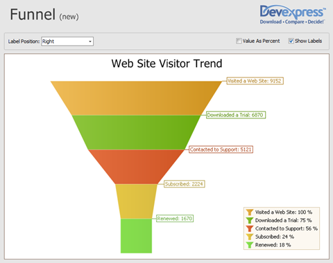
Here's a simple funnel chart. Unlike a pie chart, for example, the numbers are not supposed to add up to 100% or anything like that. It's supposed to show the decreasing values about some information set as we add more and more specificity to the data we're sampling. If you like we're showing the trends in a set of data from some process or workflow.
So, for instance, in this graph, we looking at the visitors to a fictitious web site that operates in the same way as ours. So the top band is the total number of visitors. From that set of data, we count the number of visitors who downloaded a trial and get the second band. Obviously this is less than the number in the first band, so we show this intuitively by the sloping lines (the start of the funnel shape, if you like). Of those visitors, a certain number used the support services of the web site — but not all — giving us the third band. Of these, a lesser number bought the product (fourth band) and of these, a smaller number eventually renewed (fifth band). And we're done.
Notice how this set of data produced a pretty good funnel (OK, we cheated on the numbers to make it so), but other data might produce a funnel nearer in shape to a vertical column, whereas other data might be more like a martini glass.
Nevertheless the band are all equal in height, in order to give the end-user a better chance to estimate the data values — in essence the average width of the band. But, it's still better to show the labels (we provide several locations for the labels: right (as shown), left, center, or left/right as a column). The data above is shown in absolute units, but you can also show it as percentages, which for such a chart may be a better alternative.
Free DevExpress Products - Get Your Copy Today
The following free DevExpress product offers remain available. Should you have any questions about the free offers below, please submit a ticket via the
DevExpress Support Center at your convenience. We'll be happy to follow-up.