One of a series of posts on the new functionality that'll appear in DXperience v2009 vol 2. This is all pre-beta stuff, it'll probably be something like the end of the month before the beta is ready.
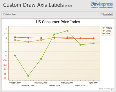
In this post, a quick look at the feature that allows you to custom draw the axis labels for your chart so, instead of accepting the default text that XtraCharts provides, you can jazz it up to suit the data or the chart you are displaying. For example, in this screenshot from the demo, the Y axis axis labels are drawn to size to indicate the values, and also negative labels are shown in red and positive ones in green.

Free DevExpress Products - Get Your Copy Today
The following free DevExpress product offers remain available. Should you have any questions about the free offers below, please submit a ticket via the
DevExpress Support Center at your convenience. We'll be happy to follow-up.