DevExtreme - New Material Design Theme (v18.1)

Google's Material Design is one of the most popular design languages used in Web and Mobile apps today.
This UI is characterized by a grid-based layout and the use of only a few vivid colors to raise the user's attention to certain elements on the screen.
Since it is originally developed for Google's Android UI, it has a strong focus on touch based devices but it can absolutely be used on desktops as well. In fact, there is official documentation available on how Material Design should work and look across different devices.
Since we value your feedback - and we got a lot on this subject - we have decided to supply you with a Light Material Design Theme for the DevExtreme components. This theme even comes with 5 predefined color-schemes which match the Material guidelines color palette!
Guidelines vs Real World
Though the documentation on Material Design is very detailed, we faced a couple of scenarios in which the documentation did not accommodate so we had to optimize and change some of those guidelines to have them match real-world use-cases.
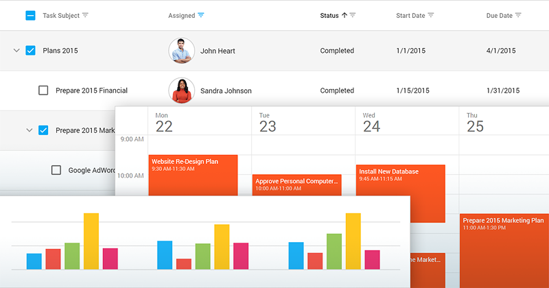
DataGrid
One of the issues we encountered is concerning the DevExtreme DataGrid.
The Material Design documentation clearly states that the padding between columns should be at least 56 pixels.
If the grid only contains numbers it looks good, but when the grid contains text columns as well, those texts will be truncated pretty heavily which makes it hard to read.
For this reason we decided to ignore this guideline and reduced the padding in our theme.

PivotGrid
According to the documentation, any table should have large indents between columns and should not have separators.
The purpose of the PivotGrid however is to display a lot of information in a tree-style way. If we would have followed the guidelines concerning spaces and indentation, a lot of screen real estate would be wasted.
For the sake of readability we did include separators between rows and columns.

Then, there are some components that come with DevExtreme which are not described in the guidelines at all.
In these cases we've taken a look at the different apps and services created by Google which provide similar functionality.
An example is the design of the DevExtreme Scheduler which is inspired by Google Calendar.

It's all in the details
To make sure that our controls have the best Material Design experience possible, there are a couple of other things we did that are worth mentioning.
The DevExtreme components have a huge set of configuration options to configure how they look. If you take a look at our scheduler, you can specify whether you want tabs or a drop-down box to select the current view by setting the appropriate configuration property.
If you select our Light Generic Theme, and don't set any of those properties, the Scheduler will display tabs to switch views while if you select the Material Design Theme, the Scheduler will display the drop-down instead of the tabs.
The same happens with labels; With the Material Design Theme we put the labels without a colon above the editor while with the Generic Themes, we put them in front of the control with a colon by changing the options of the Form Widget.
In other words, we apply a default configuration on the controls depending on the selected theme. If you want, you can change this behavior in your application but it will not be according to the Material Design guidelines anymore.
Demos and Theme Builder
Besides the different color schemes we provide with the Material Design Theme, we will make the Material Design Theme available in our online Theme Builder so you can select the accent color from the Material Palette or choose any color you want to have your personalized Material Theme.
With the official v18.1 release, you'll also be able to switch the Demo Gallery over to the Material Design Theme so you can see how awesome this looks!
More to come
Once v18.1 is released we will keep improving the Material Design theme. There will be a Dark Material Design theme, and we will include things like an option to enable or disable flat-style buttons, a floating action button and animated labels in the Form Widget when its control receives focus.
Angular, Vue, React, ASP.NET MVC / Core and more
This brand new theme will be available for all the frameworks we support with DevExtreme including:
Angular, Vue, React, jQuery, Knockout, ASP.NET MVC and .NET Core.
Try it now?
If you want to give this feature a test-drive, the public beta is already available. Use the npm pre-release package:
npm install --save devextreme@18.1-unstable
If you're not using npm, check out Mehul’s earlier blog post about pre-releases.
What do you think?
Let me know what you think of this by replying on this article or if you have questions or suggestions, then please take part in the discussion about this feature on GitHub.
Join the Webinar
If you want to see all new features introduced in our v18.1 release including the Material Design Theme, sign up for our upcoming “New in v18.1 - DevExtreme HTML / JS Controls” webinar where you’ll have a chance to ask questions about all the new features as well.
Join the webinar: https://attendee.gotowebinar.com/register/9186007723238099714
Free DevExpress Products - Get Your Copy Today
Don Wibier (DevExpress)