When we say "your feedback is important for us", we mean it. In fact, the new command column customization enhancements for the DevExtreme DataGrid and TreeList components were added directly as a result of your feedback. So thanks for your help, and keep sending us your comments.
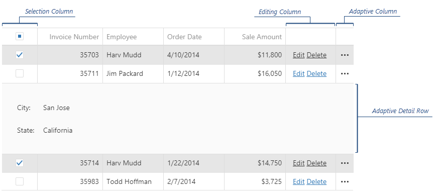
If you're not familiar with the term, command columns are those unbound columns that display the buttons for CRUD operations, selection, and the adaptive column:
With these new enhancements, you can now set the width, position, cell templates, and customize the command buttons too. Let's take a closer look at how you can use these new options.
Note: This feature is available in DevExtreme for Angular, Vue, React, jQuery, and ASP.NET MVC and ASP.NET Core.
Width
To set the width of the command column, declare it in the columns array for the component, then declare the value:
{
    columns: [
        ...,
        {
            type: "selection",
            width: 200
        }
    ]
}
Position
To define where a command column is to be displayed in the component, simply declare and insert it into the columns array at the required place:
{
    columns: [
        "title",
        "firstName",
        "lastName",
        {
            type: "selection"
        }
    ]
}
Cell Template
Templates are a great way to extend the UI and functionality of your component. Now you can use the cellTemplate or headerCellTemplate properties to customize the look and feel of a command column. Simply add the column declaration as before, then add either of these two new properties to define how the column behaves.
{
    columns: [
        …,
        {
            type: "adaptive",
            cellTemplate: function() {
                // render the custom cell content here
            }
        }
    ]
}
Customize Command Buttons
We've added several options to customize the command buttons too:
Add custom command buttons in default appearance
To customize command buttons, first declare a command column to contain buttons, and then define the buttons you need as an array within that column declaration. Some buttons are pre-defined (edit, delete, and so on), others you can fully declare an an object in that button array.
{
    columns: [
        …,
        {
            type: "buttons",
            buttons: [ "edit", "delete", {
                text: "My Command",
                icon: "...",
                hint: "...",
                onClick: function(e) {
                    // execute your command here
                },
                cssClass: "..."
            }],
        }
    ]
}
Add custom command buttons in custom appearance
To define a custom look, set up the template property:
{
    columns: [
        …,
        {
            type: "buttons",
            buttons: [ "edit", "delete", {
                template function($cellElement, options) {
                    // render your custom control here
                }
            }]
        }
    ]
}
Hide the built-in command column’s command buttons
To hide a built-in command button, do not specify it in the buttons array. In other words, only those buttons you specify in the array will be displayed:
{
    columns: [
        …,
        {
            type: "buttons",
            buttons: ["delete"] // hide the default `edit` button
        }
    ]
}
Hide the built-in editing buttons from a specific row
The editing behavior of the DataGrid and TreeList is defined through an editing object. You can now change the behavior of the editing object to allow for when a row can be updated, deleted, or added by specifying specifying a function predicate for the allowUpdating, allowDeleting, and allowAdding properties. Return false, the relevant editing feature is disabled; return true, the feature is enabled.
{
    editing: {
        mode: "row",
        allowUpdating: function(row) {
            return row.data.id % 2 === 0;
        },
        allowDeleting: function(row) {
            return row.data.id % 2 === 0;
        },
        allowAdding: function(row) { // only for TreeList
            return row.data.id % 2 === 0;
        }
    }
}
Add custom command column
Each column can have its own set of buttons, simply declare the new buttons columns in the columns array:
{
    columns: [
        {
            type: "buttons",
            buttons: ["edit", "delete"] // default editing buttons
        },
        "firstName",
        "lastName",
        {
            type: "buttons",
            buttons: [// specify your custom buttons here]
        }
    ]
}
NOTE: When you declare a buttons column, it replaces the default column that contains the editing buttons. Make sure you declare this editing column explicitly as shown in the code above.
Limitations
Currently, the feature is limited in that you cannot hide the 'expand row details' arrow from a specific row.
Test It Now (and provide feedback)
Experience the online demo. Then test-drive the public release on your local machine. Use the npm package:
npm install --save devextreme@18.2
Then let us know your experience with the DataGrid or TreeList's command column customization enhancements.
Join the Webinar
Sign up for the upcoming "New in v18.2 - DevExtreme HTML / JS Controls" webinar where:
- you'll see all the new features/tools/components in v18.2 and
- you can ask questions and interact with our devs
Register today: https://attendee.gotowebinar.com/register/1534319392881688322
Your Feedback Counts
We’d like to hear from you about your development plans and needs. Feel free to leave comments below, open Support Center tickets for detailed discussions or take part in conversations in our GitHub repository.
Free DevExpress Products - Get Your Copy Today
The following free DevExpress product offers remain available. Should you have any questions about the free offers below, please submit a ticket via the
DevExpress Support Center at your convenience. We'll be happy to follow-up.