Please listen up, all you data analysts: DevExtreme now supports a Sankey diagram. This diagram displays relationships between nodes, which are technically called links. From the perspective of the data, this is often about flow, for instance of goods or services – but any type of relation between groups of subjects can be visualized by a Sankey diagram.
As usual, the new functionality is available on all platforms supported by DevExtreme, including Angular, Vue, React, jQuery and ASP.NET MVC and ASP.NET Core.
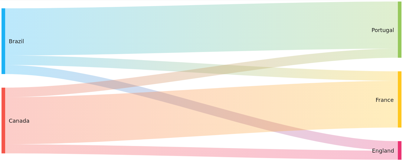
The diagram above can be rendered using the following code. You can see how the weight values are automatically rendered as links of differing widths.
$(function() {
  $('#sankey').dxSankey({
    dataSource: [
      { source: 'Brazil', target: 'Portugal', weight: 5 },
      { source: 'Brazil', target: 'France', weight: 1 },
      { source: 'Brazil', target: 'England', weight: 1 },
      { source: 'Canada', target: 'Portugal', weight: 1 },
      { source: 'Canada', target: 'France', weight: 5 },
      { source: 'Canada', target: 'England', weight: 1 }
    ],
    link: {
      colorMode: 'gradient'
    }
  });
});
A demo for the Sankey diagram is available, which you can modify and play with yourself. We also have Overview and API documentation available.
Thanks to everybody who already provided us with feedback during the development phase of this widget. We are still interested in your thoughts! Please feel free to leave a comment below, and it would be great if you could submit your responses to this short survey:
Free DevExpress Products - Get Your Copy Today
The following free DevExpress product offers remain available. Should you have any questions about the free offers below, please submit a ticket via the
DevExpress Support Center at your convenience. We'll be happy to follow-up.