As you probably know, DevExtreme’s Data Editors library includes a comprehensive suite of field editors
(calendar drop down, combo box, etc). If you’ve used DevExtreme in the past, you also know that these UI
controls can be used as cell editors within complex “container” components like our JavaScript DataGrid and
PivotGrid.
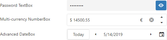
The purpose of this post is to detail the new custom button feature for our text-based JavaScript data edit
widgets (available in v19.1+). Though countless usage examples exist, perhaps the best illustration for the
virtues of this new feature is the “Show Password” button displayed within password editors (when pressed, the
Show Password button reveals the value entered inside the password text box.
Our new implementation allows you to create both simple multi-button text editors (like Show Password), or to
use button arrays and control positioning within the editor. As you can see in the images below, our JavaScript
text editors allow you to create intuitive text entry fields – be it a currency converter or an advanced Date
Edit dropdown.
The code example below demonstrates the ease with which you can reproduce the Advanced DateBox pictured above:
var millisecondsInDay = 24 * 60 * 60 * 1000;

    var dateEditor = $("#advanced-datebox").dxDateBox({
        value: new Date().getTime(),
        stylingMode: "outlined",
        buttons: [{
            name: "today",
            location: "before",

            options: {
                text: "Today",
                onClick: function() {
                    dateEditor.option("value", new Date().getTime());
                }
            }
        }, {
            name: "prevDate",
            location: "before",
            options: {
                icon: "spinprev",
                stylingMode: "text",
                onClick: function() {
                    var currentDate = dateEditor.option("value");
                    dateEditor.option("value", currentDate - millisecondsInDay);
                }
            }
        }, {
            name: "nextDate",
            location: "after",
            options: {
                icon: "spinnext",
                stylingMode: "text",
                onClick: function() {
                    var currentDate = dateEditor.option("value");
                    dateEditor.option("value", currentDate + millisecondsInDay);
                }
            }
        }, "dropDown"]
    }).dxDateBox("instance");
First, please note that role of the control’s location option. It determines where to place the button and offers the following values:
Second, the icon option allows you to quickly associate an icon from the DevExtreme Icon Library or to use a custom image as described in
our documentation.
Finally, you can specify default actions for the control as needed. Default actions include:
If you need to access one of these custom buttons in code, you can do so by calling the new getButton(name) method. For example, if you would like to hide the Today button in the example above, you would use the following code:
dateBoxInstance.getButton("today").option("visible", false);
Please note that this method does not return predefined buttons.
Angular, Vue, React, ASP.NET MVC / Core and more
As you know, DevExtreme supports multiple web development frameworks. All enhancements described herein are
available for:
Angular, Vue, React, jQuery,
Knockout,
ASP.NET MVC and .NET Core.
Test It Now (and provide feedback)
Test-drive the public release now. Use the npm package:
npm install --save devextreme@19.1
Once you’ve had the opportunity to evaluate our JavaScript Data Editors Library and its new custom button feature, please share your feedback/opinion below.
Free DevExpress Products - Get Your Copy Today
The following free DevExpress product offers remain available. Should you have any questions about the free offers below, please submit a ticket via the
DevExpress Support Center at your convenience. We'll be happy to follow-up.