DevExtreme Diagram v19.2 ships with the following new features/capabilities:
- Images within shapes
- Shape containers
- New data binding capabilities
- Full screen mode
- Read only mode
- Simple view
- Zoom
- UI Customization
Please note that the DevExtreme Diagram v19.2 is available as a community tech preview (CTP). It will be officially released in our v20.1 dev cycle.
Images Within Shapes
For some diagram types, users like to display images inside diagram shapes. This makes the diagram more informative and easier to understand. In our latest release, images can be displayed within predefined and custom shapes. The images can be specified within the designer or retrieved from a data source using data binding.
If you work with the designer to interactively modify diagram definitions, you can use one of three predefined shapes which include images at the top, right or left side of the shape. The context menu of the shape includes an Insert Image menu item to upload an image for the shape.
If you use data binding with the Diagram widget, you need to specify both imageUrlExpr and dataSource. imageUrlExpr names the field in the source data structure that contains the image URL.
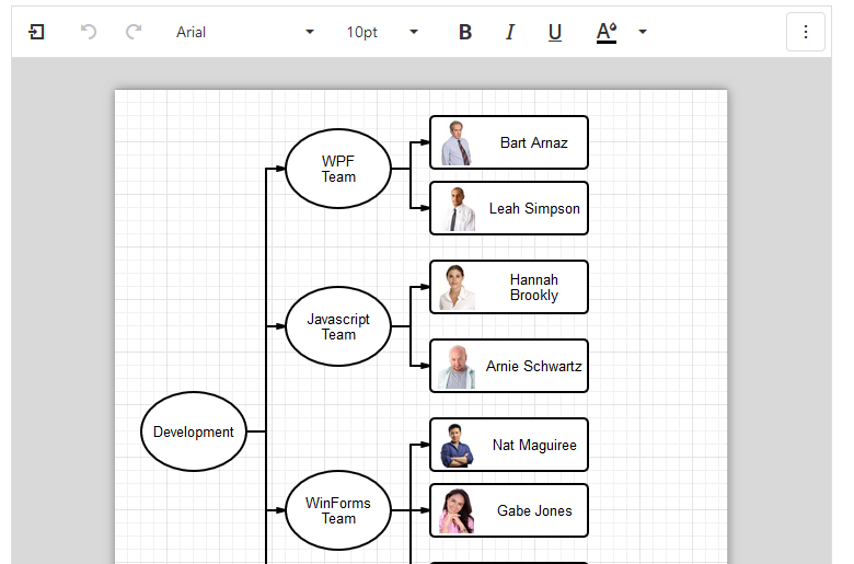
Embedded images are particularly useful for organization chart diagrams. Please click here for a demo.
Shape Containers
For complex diagrams it may be useful to group shapes and their connectors based on business logic (for instance to group employees by departments, or flow items by a workflow type). The Diagram widget now supports horizontal and vertical shape containers.

This feature addresses multiple usage scenarios:
- Collapsing a group of shapes to focus on the “bigger picture” during viewing/editing
- Dragging and moving a group of shapes and connectors
- Copying/Reusing a group of shapes as a template
- Applying common styles to a group of shapes
Containers can be nested, with one container including other containers and shapes.
To create containers, activate the containers category in the toolbox. This displays two shape types - Vertical Container and Horizontal Container.
toolbox: {
  groups: [
    'general',
    {
      category: 'containers',
      title: 'Containers',
      expanded: true
    }
  ];
}
Please click here for a demo.
New Data Binding Capabilities
Based on your feedback, we decided to extend the data binding functionality of the Diagram widget so you can bind additional shape properties. Basic binding for text and connectors was supported previously, but you can now bind shape position, size, style, image and other properties. This enables precise control of diagram and shape appearance for data-bound scenarios.
To support advanced binding, we added several options to the nodes and edges properties of the widget configuration. These options have names like xxxExpr, where xxx is the name of the node or edge property to bind. For instance, widthExpr binds the node width and lineTypeExpr binds the line type of an edge.
The binding properties can either refer to a field in the data source or to a custom function that determines the property value dynamically. For example, set the typeExpr option for the nodes object to a function that returns a shape type depending on a value of the bound data object:
nodes: {
  typeExpr: itemTypeExpr,
},

...

function itemTypeExpr({ customValue }) {
  return customValue === 'important' ? 'rectangle' : 'ellipse';
}
Please click here for a demo of the advanced binding features.
Full Screen Mode
When working with large diagrams, you may want to utilize all the space on screen. This is the purpose of our new Full Screen mode. You can activate this mode either by clicking the Full Screen toolbar item or by setting the option fullScreen from code.
Read Only Mode
It is now possible to configure Read Only mode for the Diagram widget. In this mode, a diagram is displayed for the user to view, but all editing operations are disabled. Export to supported image formats remains available.
You activate Read Only mode by setting the readOnly option to true. The Toolbox and the Properties panel of the Diagram widget are automatically disabled, but they stay visible by default. You may want to add property settings to hide these elements for a read-only appearance:
{
  readOnly: true,
  toolbox: {
    visible: false
  },
  propertiesPanel: {
    enabled: false
  }
}
Please click here for a demo.
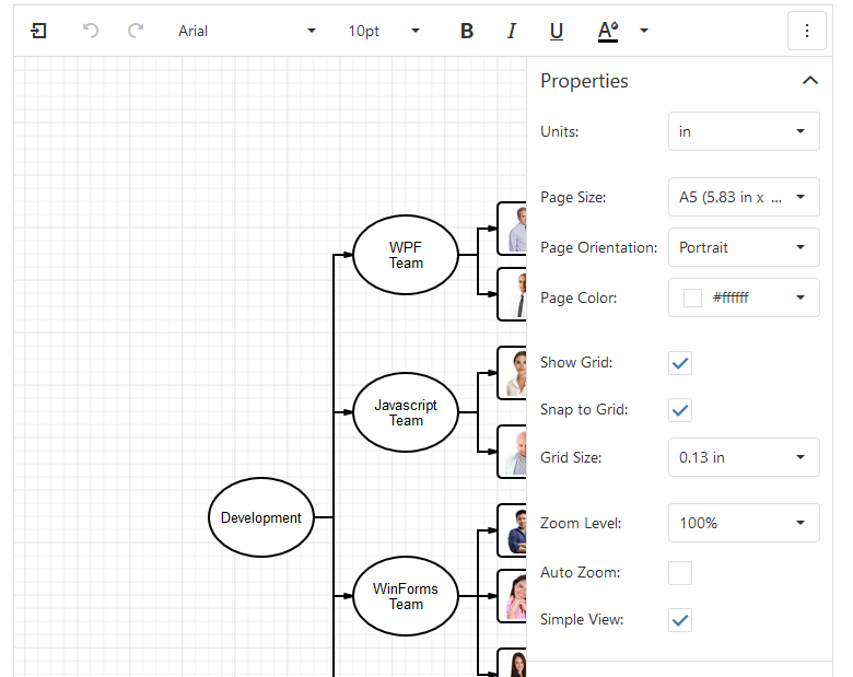
Simple View
The new Simple View display mode shows the Diagram on a flat surface without page separators. This is perfect for diagrams that are not meant for printing or export to specific sizes, and it saves space on screen because the gray background isn’t shown.
Simple View can be enabled by the user with a checkbox in the Properties panel or from code by setting simpleView to true.
Please click here for a demo that is configured for Simple View.
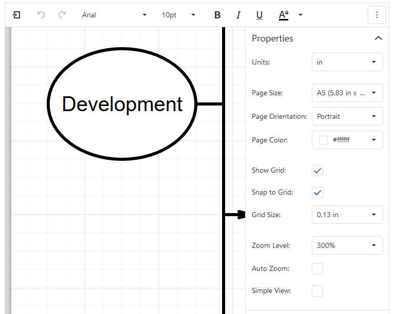
Zoom
The Diagram can now zoom its content interactively. Given the large size of many diagrams, this is an important usability feature that enables users to zoom out for large diagrams on small screens, or zoom in to focus on details.
The zoom level can be adjusted by selecting a preset from the Properties panel or by pressing CTRL and using the mouse wheel. Zooming occurs only within the Diagram widget and doesn’t affect browser zoom.
Alternatively, the configuration option zoomLevel provides a value setting to set the zoom level in code. The same option also allows you to change the presets available to interactive users. Finally, autoZoom can be set to automatically fit the Diagram content into the available space on screen either based on the whole content size or just the width.
UI Customization
We added features to enable customization of the UI elements displayed by the Diagram widget. You can configure the control to display only a subset of its items in context menus, toolbars, the Toolbox and the Properties panel, setting it up specifically for your application requirements.
There are four blocks of options:
- contextMenu controls the availability of the context menu and the visibility of commands within it
- propertiesPanel allows you to enable or disable the Properties panel, set its collapsed state and configure included commands
- toolbar provides options to show or hide the toolbar and configure its available items
- toolbox applies settings to the group and shape elements in the toolbox, hides and displays categories of elements as well as the Toolbox itself
Please click here for a UI Customization demo
Try It Now
You can test these features online or you can download the latest release and explore their capabilities on your own machine. Please let us know what you think - your feedback and feature requests are always appreciated!
Free DevExpress Products - Get Your Copy Today
The following free DevExpress product offers remain available. Should you have any questions about the free offers below, please submit a ticket via the
DevExpress Support Center at your convenience. We'll be happy to follow-up.