We are two months away from our next major update (v21.2). The purpose of this post is to preview upcoming features and give you the opportunity to test new functionality before we wrap up our current dev cycle.
To get started, simply install the ‘devextreme@21.2-next’ NPM package or use the online demo links below to explore our newest features.
Early Access and CTP builds are provided solely for early testing purposes and are not ready for production use. This build can be installed side by side with other major versions of DevExpress products. Please backup your project and other important data before installing Early Access and CTP builds.
This EAP may not include all features/products we expect to ship in our v21.2 release cycle. As its name implies, the EAP offers an early preview of what we expect to ship in two months.
Data Grid/TreeList
New Toolbar Customization API
You can now customize our DataGrid/TreeList Toolbar on-the-fly:
- You can alter Toolbar items dynamically, at any time (in the past, you could only do so once when the Toolbar was created).
- When using our DataGrid/TreeList within a React, Angular or Vue app, you can customize the toolbar declaratively without direct DOM manipulation.
We added a new
toolbar property that allows you to customize toolbar items in much the same was as a standalone Toolbar. Each DataGrid/TreeList Toolbar item can be specified as an object with the same structure as a standalone Toolbar. In addition, you can specify an item using a predefined string name from the list of built-in DataGrid/TreeList commands (such as 'addRowButton', 'applyFilterButton','columnChooserButton', 'exportButton', 'groupPanel', 'revertButton', 'saveButton', 'searchPanel').
The code snippets below demonstrate use of this new API:
Angular
<dx-data-grid ...>
    ...
    <dxo-toolbar>
        <dxi-item location="before">
            <dx-button
                text="My button"
                width="120"
                (onClick)="onClickHandler($event)">
            </dx-button>
        </dxi-item>
        <dxi-item name="columnChooserButton"></dxi-item>
    </dxo-toolbar>
    ...
</dx-data-grid>
React
<DataGrid ...>
    ...
    <Toolbar>
        <Item location='before'>
            <Button
              text='My button'
              width='120'
              onClick={this.onClickHandler} />
        </Item>
        <Item name='columnChooserButton' />
    </Toolbar>
    ...
</DataGrid>
Vue
<DxDataGrid ...>
    ...
    <DxToolbar>
        <DxItem location="before">
            <DxButton
                text="My button"
                width="120"
                @click="onClickHandler"
            />
        </DxItem>
        <DxItem
            name="columnChooserButton"
        />
    </DxToolbar>
    ...
</DxDataGrid>
jQuery
$('#container').dxDataGrid({
    ...
    toolbar: {
        items: [
            {
                location: "before",
                widget: "dxButton",
                options: {
                    text: "My button",
                    width: 120,
                    onClick: function(e) { ... }
                }
            },
            'columnChooserButton'
        ]
    },
    ...
})
Note that this new ‘toolbar’ option only allows you to customize toolbar items, not the entire toolbar. If you need to customize the toolbar itself, use the ‘onToolbarPreparing’ event instead.
Improved Search Functionality
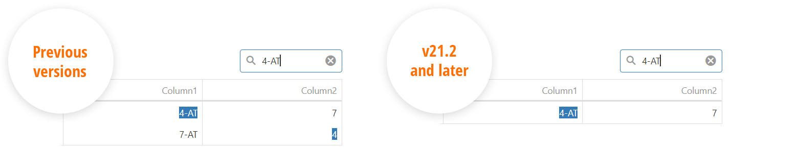
We reduced false-positive matches when users search for numbers within the DataGrid's Search Panel. Our DataGrid now matches search string with both original and formatted cell values, respecting column formatting. For instance, if your number column uses a $#.# format and a cell displays '$12,000.1', you can locate the record by using either '12000.1' or '$12,000.1'. Conversely, '12000.1m' will not match a ‘12000.1’ number cell value as it did previously. The following image describes the difference between our old and new implementation:
Improved navigateToRow API
As you know, long background operations such as data loading affect navigation (in such instances, you do not have access to a target row immediately). Our
navigateToRow method now returns a Promise object. This means you can get notified when a background operation has finished.
Control New Row Position
This functionality was released as a CTP in v21.1. However, after re-examining target use cases and processing user feedback, we decided to redesign our implementation slightly. The new API will use row keys instead of row indices.
To insert a new row at a custom position, you will need to specify the 'insertBeforeKey' or 'insertAfterKey' property. Both properties accept the key for the row before/after which you wish to insert the new row. For a simple alternative to popular use cases, we will add a 'newRowPosition' property with a set of shortcut values:
- "first"/"last" - Insert a new row at the beginning/end of the dataset.
- "pageTop"/"pageBottom" - Insert a new row at the top/bottom of the current page.
- "viewportTop"/"viewportBottom" - Insert a new row at the top/bottom of the viewport.
This modified API is not available in this EAP but is set for release in our v21.2 release cycle. If you want to share your feedback on the new API, please leave comments in the following discussion page:
DataGrid and TreeList - New record position.
Reworked Virtual Scrolling
In addition to the features outlined above, we dedicated a significant portion of our resources to reworking the DataGrid’s virtual scrolling engine. At this stage, we are not certain that all modifications will ship inside v21.2, but our changes will enable future capabilities that are simply impossible today. We expect to deliver a faster grid, give you additional control over scrolling (via new API members), and more.
If you rely on virtual scrolling (DataGrid/TreeList), please give our EAP a try and let us know if you find any unexpected behavior. We will do our best to address issues prior to official release.
HTML/Markdown Editor
Table Support Enhancements
The following new Table management features are now available:
- Support for the 'thead' HTML tag (table headers). (Online demo)
- Table and column resizing. Please use the new tableResizing configuration option. (Online demo)
- Context menu with common table operations that you can enable via the new 'tableContextMenu' configuration option. (Online demo)

The following Table-related features are not included in this EAP, but are expected to ship in our v21.2 release cycle:
- Multiple paragraph support (<p> tag) within a table cell
- Table Context Menu customization
- Manage table/cell properties via built-in dialogs.
Soft Breaks in Block Elements
We added a new 'allowSoftLineBreak' configuration option. When enabled, this configuration option allows users to break text within a single block element into multiple lines (via the <br> tag using the new Shift+Enter keyboard shortcut). As you would expect, this feature allows you to break a list item (<li>) into multiple lines or add multiline cells. (
Online demo)
Gantt
Sorting
DevExtreme Gantt now supports sort operations. Our implementation mirrors the API of our DataGrid and TreeList. You can configure sort-related user interface elements and behaviors via the new
sorting configuration option. The following properties are available:
- ascendingText, clearText and descendingText - Customize the text used for sorting context menu items.
- mode - Specifies sort mode:
- “none” - Sorting is disabled.
- “single” (the default value) - Sorting is allowed against a single column.
- “multiple” - Sorting is allowed against multiple columns.
- showSortIndexes - Specifies whether sort indices are displayed within column headers. This property applies only when the sorting.mode property is set to “multiple” and the DevExtreme Gantt is sorted against more than one column.
Task Expand/Collapse API
Our new API allows you to expand and collapse tasks programmatically:
- expandAll - Expand all tasks.
- collapseAll - Collapse all tasks.
- expandAllToLevel - Expands all tasks up to the specified level (a root task has zero level).
- expandToTask - Accepts a task key value, expands all tasks to make the specified task visible.
- collapseTask - Accepts a task key value, collapses the specified task.
- expandTask - Accepts a task key value, expands the specified task.
Specify a Visible Date Range
Previously, DevExtreme Gantt calculated its visible date range based on bound data. You can now manually specify date range via the new
startDateRange and
endDateRange properties.
Gantt View Customization API
We extended the API that manages resource and dependency visibility within the Gantt’s chart region:
- showDependencies - A new property that specifies whether dependencies are visible in the chart area.
- showResources() and showDependencies() - New methods to display/hide corresponding visual elements.
- “showResources” and “showDependencies” - New items for the Gantt component’s built-in toolbar.
Refresh
We added a ‘refresh’ method. As its name applies, ‘refresh’ reloads data and repaints the component.

Diagram
Touch Screen Support
We improved the Diagram component’s touch-screen support in Chromium based browsers (Google Chrome, Microsoft Edge, Firefox, Opera) and on touch screen devices such as Apple iPad and Microsoft Surface.
The following usage scenarios are now fully supported on touch screens:
- Create a new shape via drag-and-drop from the toolbox.
- Display/hide the context menu.
- Display/hide shape connection points.
- Create a connector and display the context toolbox.
- Rearrange shape connectors.
- Select shapes and connectors.
- Drag selected elements including a connector’s start and end points.
- Add text to diagram elements.
Other API and UI/UX Enhancements
CheckBox
The following CheckBox related enhancements are included in this EAP:
- The new blur method removes focus from the component.
- The new iconSize option makes it easy to customize CheckBox icon size.
- You can now use a ‘null’ value and place the CheckBox into an indeterminate state.
- CheckBox text is now automatically centered by its icon (useful for custom icon size).
Popup
The following Popup related enhancements are included in this EAP:
- The showing and hiding events can now be cancelled.
- The new wrapperAttr property allows you to add custom HTML attributes to the popup root element.
- Popup can now automatically adjust its position when its content size changes.
The features below will be included in our official release:
- The new ‘hideOnParentScroll’ property will allow you to close the popup when a user scrolls its container.
- The new ‘dragAndResizeArea’ property will specify boundaries for drag and resize operations.
- The new ‘allowDragOutside’ property will specify whether the Popup can overlap container boundaries during drag operations.
TreeView
Our TreeView now offers a new scrolling option. To disable simulated scrolling use the new
useNativeScrolling configuration option.
Button Group
We extended ButtonGroup selection modes with a new value - 'none'. You can now set the
selectionMode property to ‘none’ and use a ButtonGroup to display a button set as a single control, without enabling active/toggle state. We now use this option internally to display our Scheduler component’s date navigation controls.

Material Theme Update
We applied changes to our product libraries to mirror some of Google’s most recent Material Design Guidelines. For instance, Google deprecated the ‘underlined’ styling mode for inputs and chose to use ‘filled’ mode by default. We preserved both modes and you can switch back to the old style when necessary.

Certain Material Theme modifications (such as element size or spacing) may affect application appearance (if you have customized themes in the past). Please make sure to update your custom CSS, or enable legacy UI variants wherever possible. We expect to publish a detailed guide once we release beta 1. Feel free to submit a support ticket via the DevExpress Support Center if you encounter theme related issues in this EAP.
Features expected in v21.2 but not included in our first EAP
Though the following features are not included in our first EAP, we expect to include them in our next preview or our first beta.
TypeScript
We’re working to improve typings based on issues listed in
this discussion page and based on feedback from our customers. We appreciate your on-going support and engagement in this regard.
Native React Grid
Tree Shaking
We continue to improve Tree Shaking support and have optimized internal module dependencies in this release. This enhancement will reduce bundle size or code chunk sizes in certain usage scenarios (when using the Code Splitting technique).
Feedback
If you’d like to share feedback on this release, please comment below or use the appropriate discussion page (links above) on GitHub. For technical support inquiries, feel free to submit a support ticket via the DevExpress Support Center.
Free DevExpress Products - Get Your Copy Today
The following free DevExpress product offers remain available. Should you have any questions about the free offers below, please submit a ticket via the
DevExpress Support Center at your convenience. We'll be happy to follow-up.