DevExtreme UI Components (v22.2) — Customization Enhancements (Angular, React, Vue, jQuery)

In this post, we'll review a series of customization-related enhancements in our most recent major update (DevExtreme v22.2).
Should you have any questions about the features/capabilities outlined in this post, please submit a support ticket via the DevExpress Support Center.
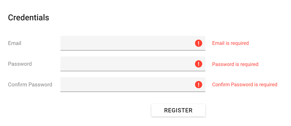
Validation Message Position
You can use our new validationMessagePosition option to specify the position of a validation message relative to editor input position. This option accepts the following values:
'bottom'(default)'top''left''right'
React
<TextBox validationMessagePosition="right">
    <Validator>
        <RequiredRule message="Address is required" />
    </Validator>
</TextBox>
validationMessagePosition is set to 'left' for editors within the "Billing address" area in the following demo:
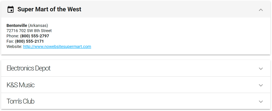
Accordion — Title Templates for Individual Items
You can now define Accordion title templates for individual items (by using the titleTemplate property for each item). In the following image, the title of the first item uses a different style:
React
<Accordion ... >
<Item
titleRender={() => (<b>First item title</b>)}
>
Item content
</Item>
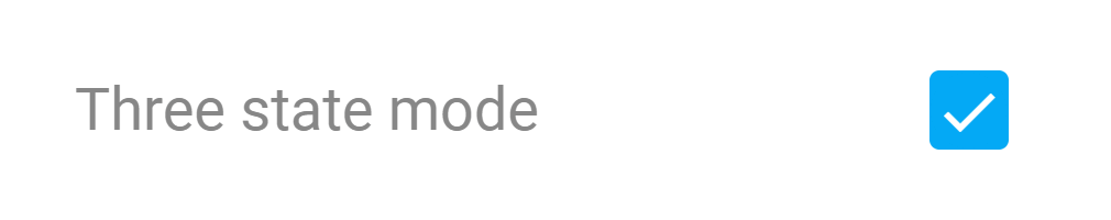
</Accordion> CheckBox — Cycle Through Three State
v22.2 ships with an additional CheckBox value change mode. In this mode, each click cycles through three component states – checked, unchecked and indeterminate.
Use the enableThreeStateBehavior option to enable this feature.
Angular
<dx-check-box
    [enableThreeStateBehavior]="true"
    [value]="null"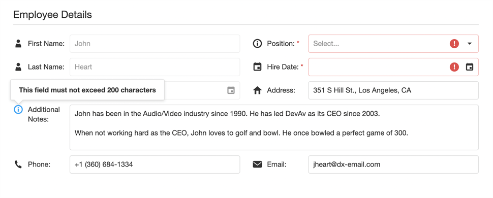
></dx-check-box> Form — Custom Label Template
Previously, the Form component could only display text labels. You can now use the label.template property to define a custom template and display images or other rich content within an editor’s label.
Vue
<DxForm ... >
    <DxItem ... >
        <DxLabel template="emailLabel"/>
    </DxItem>
    <template #emailLabel="{ data }">
        <LabelTemplate
            :data="data"
            icon="email"
        />
    </template>
</DxForm> DateBox — Customize Today Button Text
You can now change display text for the Today button (in 'date' and 'datetime' modes). Simply pass a string with your custom text to the todayButtonText property.
React
<DateBox
type="datetime"
todayButtonText="This very day"
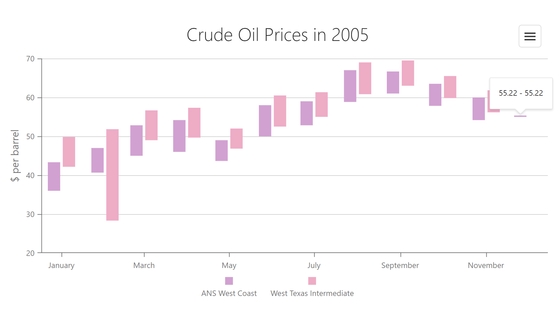
/> Range Bar Chart — Minimum Bar Size
If the smallest value in a Range Bar Chart data source differs substantially from the largest value, small values are visualized using tiny bars (making interaction difficult). In such instances, you can use the new minBarSize property to specify a minimal possible bar size in pixels.
<dx-chart ... >
    <dxo-common-series-settings ...
        [minBarSize]="2"
    ></dxo-common-series-settings>
</dx-chart> Free DevExpress Products - Get Your Copy Today
 Vlada Skorokhodova (DevExpress)