Getting Started with HTML Email: A Guide to Simple Responsive Code that Works Everywhere

In this article, I’m sharing two HTML email templates that I recently overhauled. I’ll break them down into snippets that show how to construct various types of layouts, correctly add images, and format text, lists, code or calls-to-action. I’ll also share some generic advice on HTML email code along the way.
Feel free to download these email templates and reuse them as required.
| Transactional Template | Newsletter Template |
|---|---|
| View Online / Download Code | View Online / Download Code |

|

|
Table of Contents
- How I Created This Guide
- A Few Words on Responsive Layout
- Top-Level Layout: Limited-Width Centered Content
- Content Layout: Paragraphs or Tables
- Side-by-side Layouts
- White Space Between Elements
- Text
- Images
- Styles: Inline or CSS Classes
- Preheader: Message Preview Text
- Final Words
How I Created This Guide (Disclaimers)
Coding HTML email is not my full-time job, but I need to deal with it from time to time. I have enough experience to know that HTML email will never render correctly on my first try, and I can rarely anticipate all possible problems. Something will appear broken in an Outlook viewer, or won’t adapt in mobile apps, or won’t be styled correctly in an online client. This is when I search the web for help.
I know that I am not alone. StackOverflow is filled with Q&A on how to transform regular HTML snippets into email-friendly code. There are many great in-depth articles on the subject. The solutions they give are life-savers: I grab the snippets and paste them into my code, realizing it would otherwise take me hours or even days to figure it out.
When you construct HTML this way - and I don't see any other option - the code tends to get out of hand. The fixes seem somewhat illogical to me, so I don't scrutinize and test every little thing when embedding into my code. The HTML may grow with unnecessary tags and attributes, added just in case, as insurance. And when the time came to overhaul the email, the code seemed unmanageable: I didn’t know which parts to discard and which parts to keep.
What does this code do? Did I put it here to fix a specific part, or did I simply copy it from somewhere else? Do I need the entire snippet or only a part of it? Is it possible that online clients that initially caused the problem have been updated and no longer require the code?
With those questions in mind, I knew I had to re-test everything. For every structural element I compared the way it was implemented with the way it could be implemented on a regular web page, and then stripped down various attributes or tags to achieve the minimum code sufficient to render well on all clients. In the end, I'm satisfied with the results, but also feel like I need to add a few disclaimers:
- The snippets and practices in this article should help you get started building emails similar to those displayed above. This limits the scope of this guide. I'm sure that after reading this you'll be well-equipped to continue researching on your own.
- Some examples will seem obvious. I'm showing them, because there are other, probably equally obvious options that DO NOT work.
- I've made reasonable effort to try and find compact code that produces the most responsive results. Once I find a version that's clean and works well across email clients, I will stop trying.
- I'm using Litmus.com to test email, in addition to sending test messages to myself and reviewing the output in Outlook, Gmail and iOS Mail.
A Few Words on Responsive Layout
When you're constantly dealing with email clients that have limited support for code you normally use for web pages, there's no way around contemplating the basics. How do you write code that is rendered well by any client on any device? What unites all HTML rendering platforms? What is the "ultimate responsive code"?
The Ultimate Responsive Code
Consider a tag like <p>. If your web page or email is but a few paragraphs of text, then any browser or email app will render it correctly on any device. The words will flow one after another and wrap to a new line when necessary. The same principle holds true for higher level content: any layout that naturally flows by itself will provide the most consistent results regardless of the end-user's software or hardware.
Of course, another reason your paragraphs will work is that <p> is a very basic tag: code that simple will render well anywhere. To support the claim that simpler code is better code, let me give you a few examples from my experience.
Example #1 - Failed Tricks with Images
You write code that conditionally loads an image of a certain size depending the screen resolution. You can also load vector images, if supported, or raster otherwise. You will discover, however, that tricks like this result in double images in forwarded emails. The code that seems to work best across all clients requires only one image tag and no conditional loading.
Example #2 - Failed Tricks with Visibility
My testing shows that you can't fully rely on media queries to work on any mobile client. So what should you do to remove unnecessary content on small screens? My advice is to accept that sometimes content cannot be conditionally hidden, and avoid relying on dynamic visibility. Instead, come up with a layout that looks good enough at any resolution with all elements displayed. You can keep the media queries as well and let them work where they work. Should they fail, your customers will still see decent looking email.
The Bottom Line
These are the rules to live by when dealing with HTML email:
- Before you start, or as soon as you encounter problems, consider ways to alter the design so that it naturally flows on screens of any size.
- Keep the code simple.
- Add fancy formatting as options, but always assume that they will not take effect in certain clients.
Top-Level Layout: Limited-Width Centered Content
In most cases, you'll want limited-width content on a desktop. On mobile devices, the layout should adapt to the small screen size.

The code below is all you need for a responsive layout. It might seem a bit complicated with the conditional table in the middle, but it's actually only two containers - one for full-width background and another for centered, limited-width content. Note that the code uses plain HTML tags and avoids media queries, which have limited support across email clients.
<!-- enable window-wide background filling -->
<!-- and add padding on mobile screens -->
<table cellspacing="0"
      style="background-color: #ff7200; width: 100%;">
    <tr>
        <td align="center" style="padding: 0 20px 0 20px;">

            <!-- required in Outlook, since it doesn't support 'max-width' -->

            <!--[if (gte mso 9)|(IE)]>
            <table cellspacing="0" style="width:600px;">
                <tr>
                    <td>
            <![endif]-->

            <!-- limit width to 600px on desktop and center -->
            <!-- set width to 100% for mobile screens -->
            <table cellspacing="0"
              style="width: 100%; max-width: 600px; margin: 0 auto 0 auto;">
                <tr>
                    <td>

                        <!-- add content and close out all tags -->

                    </td>
                </tr>
            </table>

            <!--[if (gte mso 9)|(IE)]>
                    </td>
                </tr>
            </table>
            <![endif]-->

        </td>
    </tr>
</table>
The code above can wrap a single section in an email or the entire content, depending on email design.
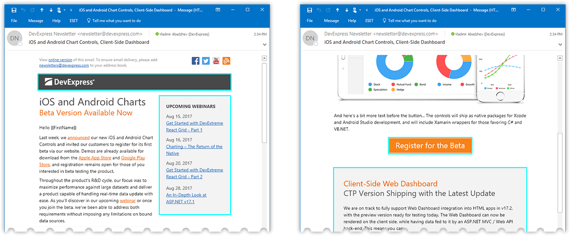
- Our Transactional email (on the left) requires full-width colored stripes in header and footer sections. You'll need to repeat the nested tables for each stripe, so that a different background color can be applied.
- Our Newsletter email (on the right) uses the same white background beyond the centered content. For these templates, you'll only need to use nested tables once to wrap the entire email content.

Content Layout: Paragraphs or Tables
I assume that you're done with the top-level layout described in the preceding section and are now populating your email with content blocks. Since I'm aiming for a natural flow/responsive layout, I have two basic strategies at my disposal:
- Stack blocks vertically and assume they will resize with the container.
- Place blocks side by side and assume that they will wrap when needed.
This section deals with vertically stacked content blocks. A discussion of side-by-side layout follows.
Control Text and Image Layout with Paragraphs
Many articles on HTML email code suggest tables for bulletproof layout because Outlook has poor support for padding and margin attributes in other tags. I used to take this advice a bit too far. At one time, my email templates had a table row for each paragraph and for each white space between paragraphs. But once I started to question that, I discovered that all clients will respect margin and alignment settings in a paragraph tag. Ultimately, this is what many designs boil down to - text and images, vertically spaced and horizontally aligned.
Here's the snippet from our Transactional email header. In addition to margin, note how line-height can help with layout management.
<p style="margin: 20px 0 35px 0; text-align: right;">
    <a href="https://www.devexpress.com/" ...>
        <img src="Logo.png" ... />
    </a>
</p>
<p style="margin: 0 0 0 0; font-size: 40px; line-height: 50px; ...">
    Maintenance Update
</p>
<p style="margin: 0 0 35px 0; font-size: 36px; line-height: 40px; ...">
    v17.2.5 is Now Available
</p>

To ensure that line-height behaves predictably in Outlook, you'll need to set the following attribute.
p {
    mso-line-height-rule: exactly;
}
Add Backgrounds and Borders Using Tables
As you'll see in our Newsletter template below, there are a variety elements - such as a header section, sidebar, a button, or a text block you need to highlight - that require custom background color, padding, and borders. All these blocks need to be rendered using a <table>, because padding doesn't seem to work with anything else in Outlook.
Here's the basic code for the header with a logo. It's boilerplate code, with the only unexpected thing being the min-width attribute. Without it, the block doesn't stretch all the way on Android 5.1 and Android 6.0 clients.
<table cellspacing="0"
    style="width: 100%; min-width: 100%; background-color: #4a4a4a;">
    <tr>
        <td style="padding: 8px 0 10px 20px;">

            <!-- add an image here -->

        </td>
    </tr>
</table>

Remember, the <table> is only required to style the block and enable paddings for the content. Within the table cell, you can build your layout using <p> tags with margins, as described in the preceding section.
No-Graphics Buttons
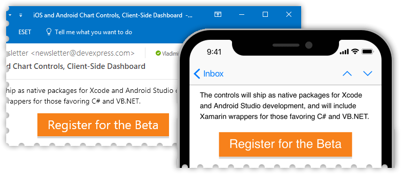
I avoid using graphics for my "call to action" elements, i.e. buttons, because an image might not be rendered by an email client unless the recipient explicitly selects "Download Pictures". So I end up emulating the button, constructing it from text with custom background color, padding and, possibly a border. This all fits into what I just described in the previous section, so once again I use a <table>. In fact, in my Newsletter template, I add a second row to emulate a shadow. Here's how it looks:
<div style="text-align: center; margin: 0 0 45px 0; padding: 0;">
<table cellpadding="0" cellspacing="0" style="margin: 0 auto 0 auto;">
<tr>
<td style="text-align: center; background-color: #F78119;
padding: 5px 20px 7px 20px;">
<a href="https://www.devexpress.com/..."
style="color: white; text-decoration: none;
font-size: 24px; line-height: 36px;">
Register for the Beta
</a>
</td>
</tr>
<!-- a row that emulates shadow -->
<tr>
<td style="padding: 0; height: 4px; line-height: 4px;
font-size: 4px; background-color: #d5d5d5;">
</td>
</tr>
</table>
</div>
You can use CSS3 attributes to apply rounded corners, shadows and other effects. As I mention in the introduction, email clients provide sporadic support for this, so you need to keep in mind that certain users will see a stripped down version: a simple colored rectangle with text. Here are my findings:
- Thunderbird, email clients on Mac, and most mobile clients will display both rounded corners and shadows.
- Most online email clients display rounded corners only.
- Outlook on a desktop will ignore both attributes.

<div style="text-align: center; margin: 0 0 45px 0; padding: 0;">
    <table cellpadding="0" cellspacing="0" style="margin: 0 auto 0 auto; ">
        <tr>
            <td style="background-color: #F78119; border-radius: 4px;
                box-shadow: 0px 0px 10px gray;
                padding: 10px 30px 10px 30px; text-align: center;">
                <a href="https://www.devexpress.com/..."
                   style="text-decoration: none; font-weight: bold;
                   color: white; font-size: 16px; line-height: 24px; ">
                    REGISTER FOR THE BETA
                </a>
            </td>
        </tr>
    </table>
</div>
Side-by-side Layouts
When you think about putting two elements on the same level horizontally, especially in an email, you can automatically assume that table columns are your best bet. I, however, am aiming to build a responsive layout, so a <table> tag is off the table. Once again, I want blocks to "flow", so I simply place elements one after another, so that they appear next to each other if space permits, or wrap and stack vertically on smaller screens. This basic rule applies to all element types discussed below: images, images with text, and larger content blocks.
Side-by-side Images
In this section, I'll show you the code for the footer section that displays platform icons.

In a sense, the code below goes against what I've been saying so far: I'm using a <div> instead of a <table> to format this block with a custom background color and padding. I'll explain why it works right after the snippet.
<div
style="text-align: center; padding: 0 20px 0 20px; background-color: #4a4a4a;">
    <a href="#" style="text-decoration: none;"
        ><img src="win.png" width="57" height="47"
            alt="WinForms" style="border: none;" /></a
    ><a href="#" ...
        ><img src="asp.png" width="55" height="47" ... /></a
    ><a href="#" ...
        ><img src="mvc.png" width="58" height="47" ... /></a
    ><span style="white-space: nowrap;"
        ><a href="#" ...
            ><img src="wpf.png" width="60" height="47" ... /></a
        ><a href="#" ...
            ><img src="win10.png" width="45" height="47" ... /></a
        ><a href="#" ...
            ><img src="html.png" width="40" height="47" ... /></a
        ><a href="#" ...
            ><img src="vcl.png" width="51" height="47" ... /></a
    ></span>
</div>
Here's the explanation:
- The
<div>works because: (a) thebackground-colorattribute is supported everywhere, (b) PNG images have transparent backgrounds that add padding vertically and between images, and (c) side padding is only needed on mobile, where<div>is fully supported. - The code is formatted to avoid white space between tags. This seems to be the simplest way to get rid of spaces between images.
- The
<span>that surrounds the last four images prevents a single image from wrapping to the second line. (Truth be told, I'm also using media queries to hide this entire block on mobile, but, as discussed above, this sometimes does not work and I need a decent-looking fallback version.) border: none;andtext-decoration: none;fight the side effects of putting an image into a link.
Side-by-side Text and Image
Our Transactional email's call to action is designed as follows:

I'm showing this example to once again stress the point that these layouts don't require any extraordinary code. Putting text next to an image in a paragraph makes it work across clients. A table is required only if the text is lengthy enough to wrap on smaller screens.
<p style="margin: 0 0 20px 0; text-align: right; vertical-align: middle;
    font-weight: bold; font-size: 14px;">
    <a href="#" style="color: #1099f9;">Download Manager</a>
    <a href="#" style="text-decoration: none;">
        <img src="arrow.png" width="44" height="44" alt="Learn More"
                style="border: none; vertical-align: middle;" />
    </a>
</p>
Side-by-side Content Blocks: Building a Multi-column Layout
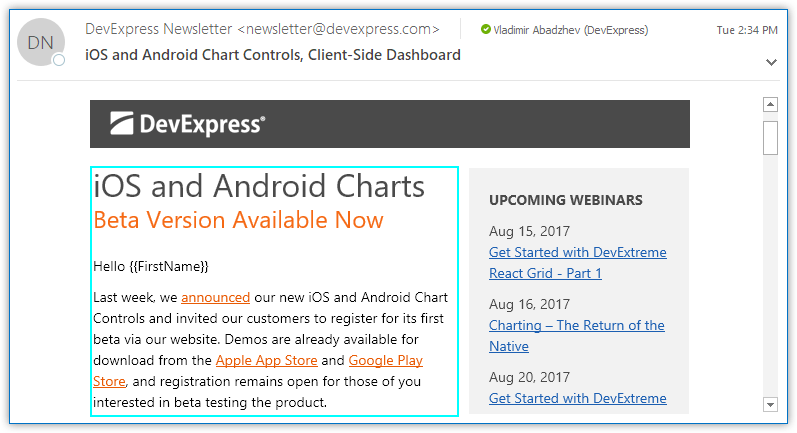
In this section, I show the code for our newsletter's sidebar, which is displayed to the right of the content on a desktop, or on top of it when viewed on a mobile device.
Following the main theme of this section, I'm simply putting elements one after another, letting them flow and wrap as necessary. In this case, the elements are <table> tags with nested content. I also wrap the tables into a container in order to keep them together and prevent their interaction with preceding and subsequent content.
<table cellspacing="0" style="width: 100%;">
    <tr>
        <td>

            <table cellspacing="0" align="right" class="column"
            style="background-color: #f2f2f2; width: 220px; margin: 20px 0 0 0;">
                <tr>
                    <td style="padding: 20px;">

                        <p style="...">
                            UPCOMING WEBINARS
                        </p>

                        <!-- more content -->

                    </td>
                </tr>
            </table>

            <table cellspacing="0" align="left" class="column"
            style="width: 360px; margin: 20px 0 0 0;">
                <tr>
                    <td>
                        <p style="...">
                            iOS and Android Charts
                        </p>

                        <!-- more content -->

                    </td>
                </tr>
            </table>

        </td>
    </tr>
</table>
A few things to note:
- Inner tables explicitly specify
widthandalignattributes. This is key to making the layout flow. - The sidebar table goes first within the code, and that's why it renders on the top (before) on small screens. But since it sets
align="right", it's rendered to the right (after) on a desktop. - The
class="column"part references a media query style that sets the table width to 100% on small screens. See the CSS below.
@media screen and (max-width: 640px) {
    .column {
        width: 100% !important;
    }
}
You can easily extend this example to achieve a multi-column content layout. I tried a three-column layout where all tables set align="left".
If Outlook adds extra spacing to your tables and breaks the layout, add the following code to your style declarations:
table {
    mso-table-rspace: 0pt;
    mso-table-lspace: 0pt;
}
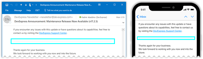
White Space Between Elements
Previous sections describe how you can choose the tags that let you build various layout configurations. This part lists the best practices of adding white space between those elements.
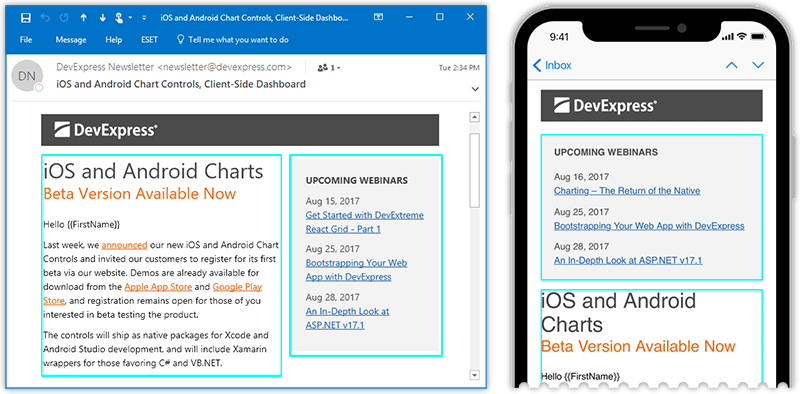
Everything I want to talk about can be illustrated using a single example from the Newsletter template - the part with the logo and the two-column layout under it:
First of all, each individual "column" should have white space added on top. That white space will separate content blocks from each other when they stack vertically on mobile screens. This technique allows you to build a responsive email while avoiding dynamic layout changes implemented using media queries or other means.
Now consider the left column. It contains text on white background, so I can apply margin-top to my first <p>. I simply pad column content without actually adding space between the tables, but the white background lets me get away with it.
<table ... >
    <tr>
        <td>
            <p style="margin: 20px 0 0 0; ... ">
                iOS and Android Charts
            </p>
The right column has custom background color, so the same trick will not work. In this case, I create separation by adding an extra table cell with white background.
<table ... >
    <tr>
        <td style="font-size: 20px; line-height: 20px;"> </td>
    </tr>
You can simplify that code and apply margin directly to a <table>, thus eliminating the need for an extra table cell. Note though, that depending on table content, this may not work in Outlook 2010 and earlier versions.
Text
Text and Paragraph Formatting
As I explained above, I usually put text into <p> tags with margin attributes that control vertical spacing. An exception to the rule is when a table cell contains a single block of text, in which case I put the text directly into a <td>. Regardless of which tag contains the text - <p> or <td> - the same tag defines text formatting attributes, which include the following. (I make a case for inline versus centralized styles later in the article.)
font-familyfont-sizeline-heightcolor
Here's an example from the Newsletter template:
<p
style="color: #4a4a4a; font-size: 32px; line-height: 36px; margin: 0;">
    iOS and Android Charts
</p>
<p
style="color: #F56914; font-size: 24px; line-height: 30px; margin: 0 0 20px 0; ">
    Beta Version Available Now
</p>
<p
style="font-size: 14px; line-height: 21px; margin: 0 0 10px 0;">
    Hello {{FirstName}}
</p>
<p
style="font-size: 14px; line-height: 21px; margin: 0 0 10px 0;">
    Last week, ...
</p>
I considered <h1>...<h6> tags for the headers, which will probably work, but decided on a neutral <p> to minimize the possibility that an online email client introduces conflicting styles.
And once again, I need to mention a required fix for line-height. Without it, Outlook will treat your values as "at least this much", giving itself the freedom to increase the height you specified.
p {
    mso-line-height-rule: exactly;
}
Lists
Lists built with <ul> / <li> tags render a bit inconsistently across different clients. The difference is mainly in list margins and the indent between bullets and text. To minimize the discrepancies, I use the following CSS trick I found online.
<!--[if gte mso 9]>
<style>
    li {
        text-indent: -1em; /* Normalise space between bullets and text */
    }
</style>
<![endif]-->
I also want to enforce is strict vertical spacing between items, which is why I explicitly apply margin and line-height in the code below.
<ul style="margin: 0 0 0 30px; padding: 0; font-size: 14px; color: #404040;">
    <li style="margin: 0; line-height: 21px;" >
        VCL Subscription
    </li>
    <li style="margin: 0; line-height: 21px; ">
        ExpressGridPack
    </li>
    <li style="margin: 0; line-height: 21px; ">
        ExpressQuantumPack
    </li>
    <li style="margin: 0; line-height: 21px; ">
        ExpressNavigationPack
    </li>
</ul>
This may seem a bit much for a simple bullet list. And if your list contains short single-line items such as in the above code, you may want to consider a simple paragraph with line breaks inside.
<p
style="margin: 0 0 20px 0; color: #404040; font-size: 14px; line-height: 21px;">
    - VCL Subscription <br />
    - ExpressGridPack <br />
    - ExpressQuantumPack <br />
    - ExpressNavigationPack
</p>
Source Code and Application Logs
For source code and application logs, it might actually be important to keep line breaks in their initial positions. Technically speaking, you may want to wrap that content into a <pre>, which goes against the responsive model, in which text freely flows to the next line. Worse yet, code or application logs can be auto-generated, which is the case in our Logify product. In this scenario there is no option to manually place the required line breaks and test in all possible clients - from the smallest phone to a desktop. I needed to find a way to let the code take care of itself.
In the end, I came up with the following look. I let the code wrap and use horizontal and vertical offsets so that readers can tell where line breaks were originally intended. (It may not look exactly like this on all clients. You'll see minor discrepancies, but the layout is never broken.)

There's essentially no away around wrapping each line into a paragraph to achieve this look.
...
<p class="logs">System.Windows.Forms.Control.CreateControl()</p>
<p class="logs">System.Windows.Forms.Control.WmShowWindow(Message& m)</p>
<p class="logs">System.Windows.Forms.Control.WndProc(Message& m)</p>
<p class="logs">System.Windows.Forms.ScrollableControl.WndProc(Message& m)</p>
...
And here's the referenced CSS class:
.logs {
    white-space: pre-wrap;
    word-break: break-all;
    text-indent: -10px;
    margin: 0 0 6px 10px;
    padding: 0;
    font-family: Courier New, Courier, monospace;
    font-size: 12px;
    line-height: 15px;
}
Our R&D team asked if I could find a way to wrap the entire code in a single tag. That's certainly doable, but with the following restrictions:
- In some email clients, mostly online, code does not wrap, and instead overflows the container. This does not break the rest of your email.
- In other clients, code wraps. Automatically added and intended line breaks look exactly the same.

Here's that single-tag HTML wrapper for code or logs:
<pre style="word-break: break-all; font-size: 12px; line-height: 15px;">
...
DevExpress.DashboardWin.DashboardDesigner.OnLoad(EventArgs e)
System.Windows.Forms.UserControl.OnCreateControl()
System.Windows.Forms.Control.CreateControl(Boolean fIgnoreVisible)
System.Windows.Forms.Control.CreateControl()
...
</pre>
Line Breaks in Responsive Layouts
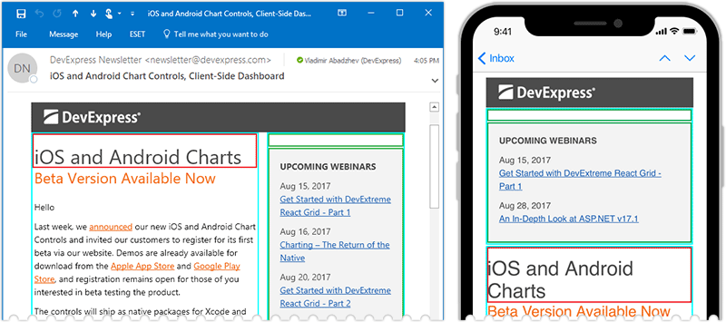
You usually want to keep headings and call-to-action links on a single line. If they do wrap, you never want the last word to be on the second line. The following image shows you two versions: the ugly and the fixed.
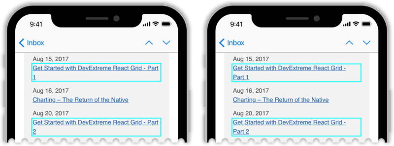
You might be tempted to address these issues with a <br> - a manual line break. That line break will appear in your desktop version as well and you don't want that. My usual trick is similar to what I showed for images earlier in the article. I force the last few elements - words - to stick together, only this time I don't use a <span>. Instead, I glue words to each other with non-breaking spaces ( ) or non-breaking hyphens (‑), so if anything wraps to a new line, it's never a single word.
<p style="...">
Aug 15, 2017 <br/>
<a href="#" style="color: #1c5fb2;">
<!-- adding to keep last two words together -->
Get Started with DevExtreme React Grid - Part 1
</a>
</p>
Removing Automatically Added Links
Email clients now automatically recognize locations, URLs, phone numbers, or dates and make that information actionable: you can lookup directions, start a call, visit a webpage or schedule an event. You can get rid of these links by using a zero-width non-joining space, a ‌ entity. I use it, for example, to stop the words "ASP.NET" or "VB.NET "from being hyperlinked to websites.
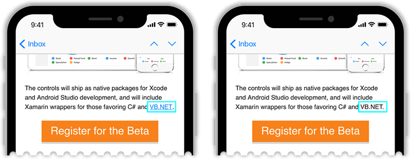
<p style="...">
<!-- using ‌ to avoid automatic links -->
... for those favoring C# and VB.‌NET.
</p>
Horizontal Lines
I ended up using an empty <p> with a top or bottom border applied. Here's a sample from our Transactional template:
<p
style="border-top: #d9d9d9 solid 1px; margin: 0 0 40px 0; height: 1px; line-height: 1px;">
</p>
I did try the <hr> tag in order to keep things semantically correct. Although you can normally use border settings to change the separator's appearance, certain email clients ignore these adjustments on an <hr>, which forced me to switch to a <p> tag instead.
Images
Provide One Double-sized Image
Whenever possible, I use "double-sized" images in my email. If I need a 100x100 logo, I'd actually upload a 200x200 version to the server, but set width and height to 100 in code. (It's important to use width and height attributes directly, not style="width; height;", as certain Outlook versions are picky about that.)
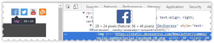
<img src="Facebook-HR.png" width="28" height="24" alt="Facebook" />
Double-sized images are needed for Hi-DPI screens such as iPhone's Retina screen, which already may amount to half of your audience. On those displays, multiple physical pixels take part in rendering a single logical pixel. As a result, fonts appear to be sharp, but your image may look somewhat blurry next to text, unless you provide a high-resolution copy that can actually make use of all underlying physical pixels.
A couple of warnings against two strategies that do not work well:
- Vector images are not universally supported across email clients.
- It's possible to conditionally provide two image versions - vector and raster, or hi-res and low-res - depending on the target device. Your initial tests might pass, but you'll see double images in forwarded emails.
The only conceivable reason why you might contemplate the strategies above is that with double-sized images you rely on email clients to automatically downscale the hi-res images when rendering on regular screens. In my experience, however, they do a pretty good job with that.
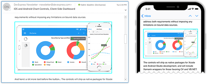
Responsive Full-width Images
In our Newsletter template, each large content section has a full-width illustration, which needs to scale down on smaller screens. There are two keys to making this work:
- Set
max-width: 100%;so that the image is resized with the container. - Leave the image's
heightattributes unset, so it is automatically calculated proportionally to the current width.
Hyperlinked Images
It so happens that all images in my emails serve as links. Even the large illustrations duplicate the call to action link in their respective sections.
When I wrap an <a> around an <img>, I add the following style attributes:
border: none;in the image tag. You can skip this if you don't care about Outlook 2003 and earlier or IBM/Lotus Notes clients.text-decoration: none;in the link tag. Otherwise you might see underlines on white space around the image.
<a href="https://www.devexpress.com" style="text-decoration: none;">
    <img src="logo.png" width="156" height="30" alt="DevExpress"
         style="border: none;" />
</a>
Styles: Inline or CSS Classes
Throughout this article I apply style settings inline, using the style attribute. If you download the entire source code you'll see that this is how I actually do things, with only a few things defined in <HEAD> CSS classes. There's a reason to this separation.
In part, this echoes the days when even Gmail had problems applying a font-family defined with a CSS class. They seem to have outgrown this, but a few online email clients will still only honor CSS settings defined inline. Since I want my emails to look good everywhere, I came up with the following compromise:
- All layout-related settings are inline (the layout is never broken).
- Styles that only have a cosmetic effect, such as
font-family, are defined in external CSS classes.
There weren't many settings I considered "cosmetic", however. The following code pretty much sums it up. Frankly speaking, if font-family had been more compact, I'd consider leaving it inline.
<style type="text/css">
    td, p, li, a, span {
        font-family: 'Segoe UI', Helvetica, Verdana, sans-serif;
        mso-line-height-rule: exactly;
    }
    a {
        text-decoration: underline;
    }
</style>

<!--[if gte mso 9]>
<style>
    li {
        text-indent: -1em; /* Normalise space between bullets and text */
    }
</style>
<![endif]-->
The CSS issue boils down to finding your personal comfort zone. I assume a lot of people wouldn't be as cautious as I am, and will move more styles up to the <HEAD> section, since it promotes effective code reuse and easier maintenance. Also, the majority of clients do support external styles now.
Preheader: Message Preview Text
In all of our email templates you'll see the following sections, which go above all other content.
<!-- preheader text -->
<p
style="font-size:1px; line-height:1px; color:#ff7200; display:none!important;">
    As part of our commitment to continuous improvement, we've released ...
</p>
<!-- end of preheader text -->
As you can see, all applied styles are just different ways of saying "hide me". I start with a display: none; attribute, and if that doesn't work, the text is colored to match the background. font-size and line-height are both set to 1px to ensure minimum influence on the layout.
Although my message's audience will not see that text, email clients will fetch it to display in the Message Preview section, which is a great way for me to sum up the content thus motivating the recipient to read more.
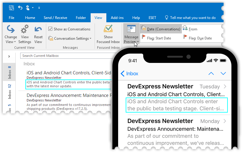
If the first sentence in the content already sums up the gist of your email pretty well, then you don't need to add this "preheader". This, however, is often not the case. As shown in our Newsletter template, your email might start with text that urges readers to add your email to the address book, or other technical information. In those cases, use this hidden text trick to substitute the preview text with a more relevant message.
Final Words
As I mentioned in the introduction, I consciously chose to use the most common, widely-supported HTML entities. I hope you can leverage my examples or entire templates to quickly build professional-looking emails with clean code. If required, you can find lots of additional tricks online - those that enable background images under your content, or even animations in certain clients, and so on. Those can easily be integrated with the code shown in this article. I didn't want to include them here, in an already lengthy article, so that I could stay focused on the basics.
Should you have any comments or questions, let me know in the comments below.
Free DevExpress Products - Get Your Copy Today
 Vladimir Abadzhev (DevExpress)