We are about two months away from the official v19.2 launch, so we wanted to share our progress and let you test major new functionality before we wrap up another development cycle.
If you are an active Universal or DXperience subscriber and would like to test upcoming v19.2 features prior to the official release, you can download the early access preview build from the DevExpress Download Manager and test the features described in this blog post. Let us know how well the new functionality address your requirements. This might help us fine-tune the implementation before the official release.
Introducing our New Cross Tab Report Control
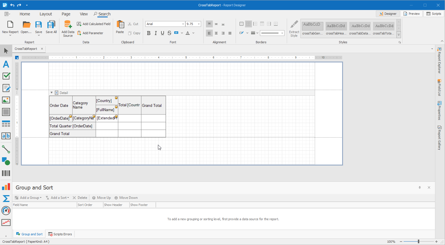
v19.2 includes the launch of our new Cross Tab report control. As you will soon discover, we’ve done our best to resolve limitations associated with our XRPivotGrid report control and introduce the necessary features to make code-free cross tab reporting a reality.
Cross Tab Report Demo
Requires installation of WinForms Reporting Demos included into this early preview build.
Key Features
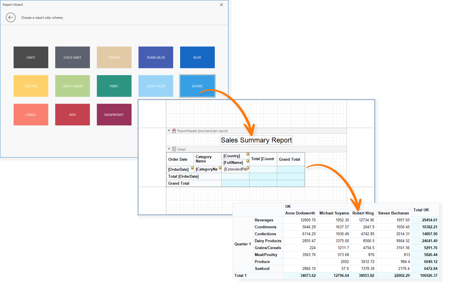
Report Wizard: Quickly Create Cross Tab Reports
We've added a new Cross Tab report type to our Report Wizard for both the DevExpress Visual Studio Report Designer and WinForms End-User Report Designer.

In the next page, users can select data source fields for each cross tab region…

….and generate/compete the report by selecting page and control theme settings:
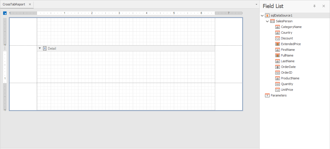
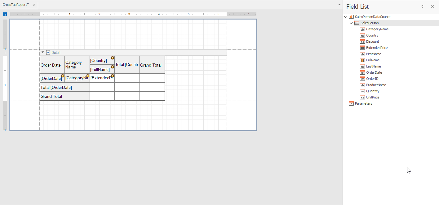
Manual Cross Tab Configuration: Drag Fields from the Field List
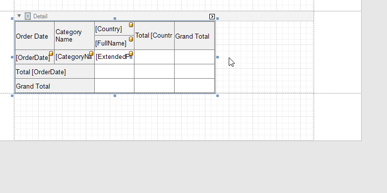
The new Cross Tab report control allows you to define its layout via drag & drop. The control’s DataSource and DataMember property values are automatically set once you drop a field onto the cross tab:
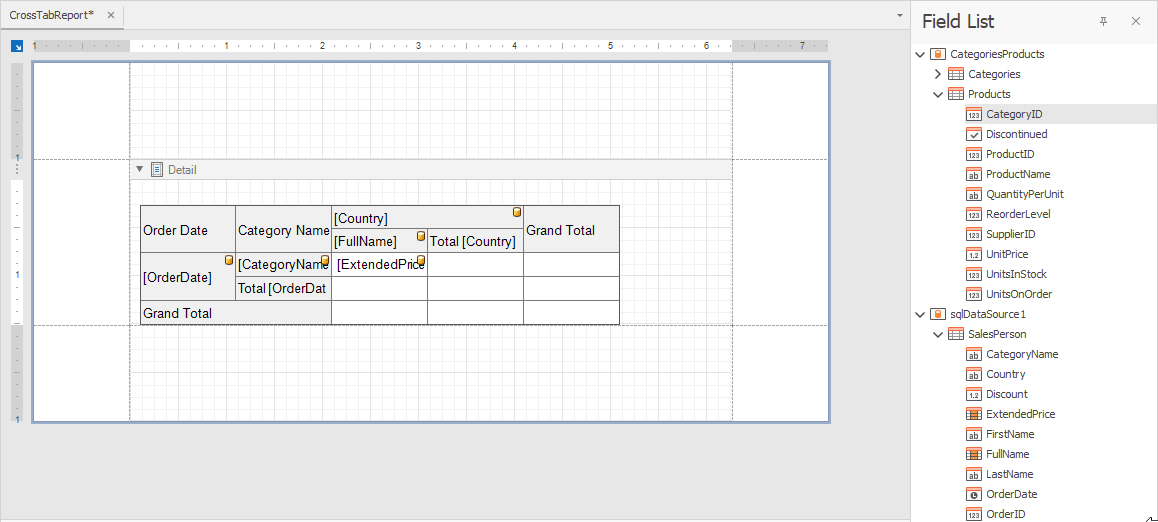
Built-in validation prevents you from adding data source fields from another data source. This helps you avoid errors while generating the cross tab layout:
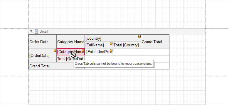
In addition, validation prevents you from binding cross tab cells to report parameters:
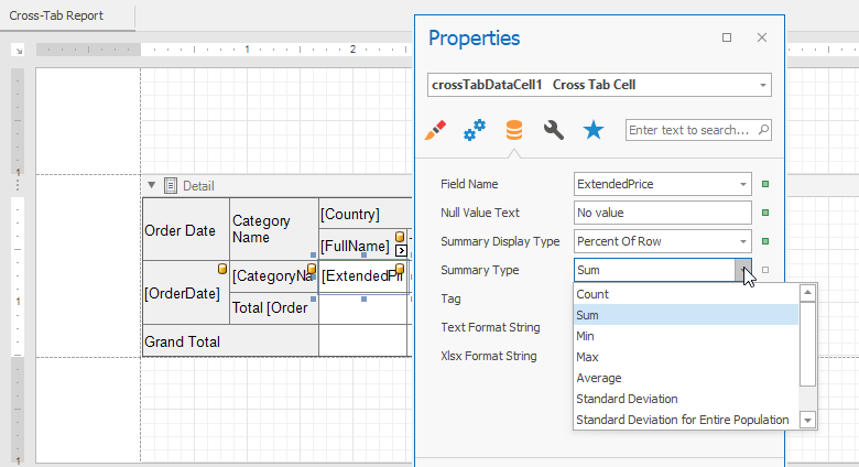
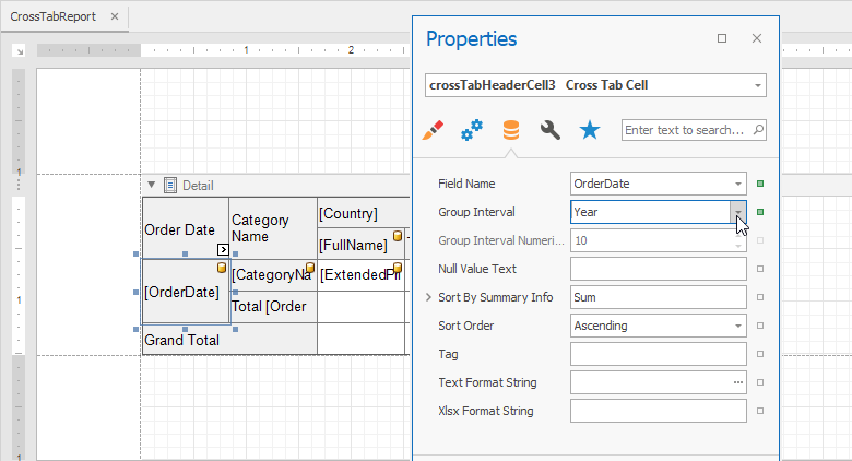
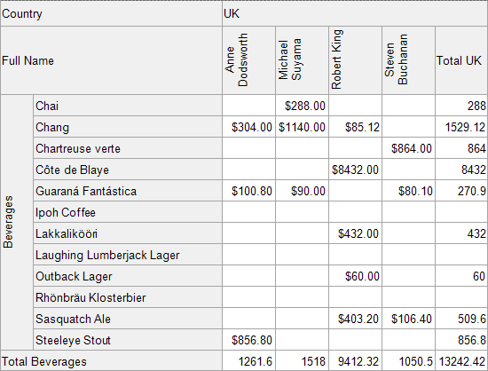
Aggregate and Shape Data: Use Multiple Summary Types, Group Intervals and Sort Options
With our next major release, you’re no longer need to dig within nested properties to change the manner in which data cells calculate data. Use the SummaryType and SummaryDisplayType Data Cell properties to specify the desired summary type and the way in which a calculated value correlates to summary values in other cells:
Use the GroupInterval, SortBySummaryInfo and SortOrder properties of Tab Header Cells to combine column and row fields into groups (and apply the appropriate sort order):
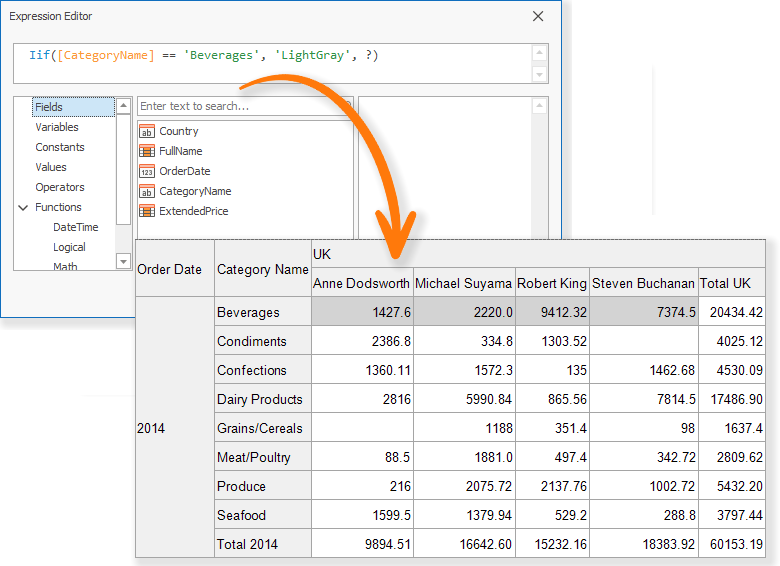
Select a cell and navigate to the properties panel to define expressions used for its appearance properties:

Use data source fields to conditionally format data cells:
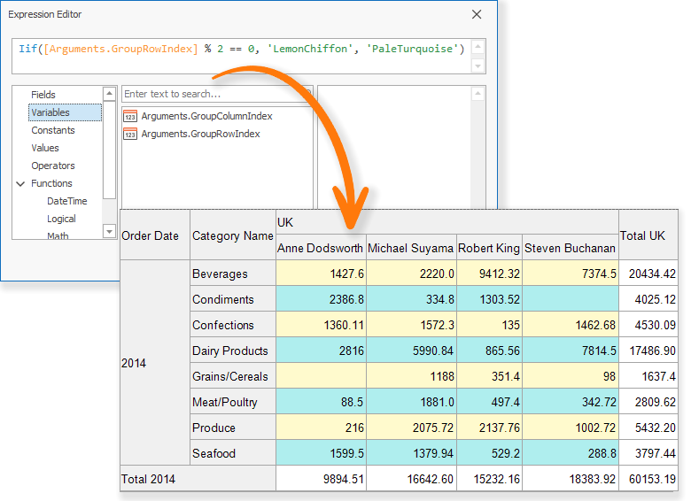
Our Expression Editor includes both GroupRowIndex and GroupColumnIndex arguments (specific to Cross Tab control cells). These arguments allow you to format data based on group index. For instance, here’s how you can define the background color for odd and even rows:
Use Report Styles
The Cross Tab report control offers 4 visual styles: General, Header Area, Data Area and Total Area. Use general style to define common appearance properties for all cross tab cells and then customize the appearance of the other regions using relevant styles:
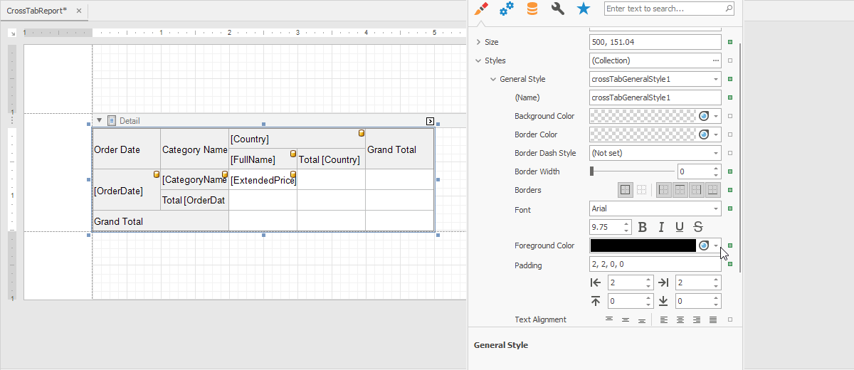
If Header, Data and Total Area styles are not fully defined, the values used by General style will be used automatically. Should you wish to manage appearance settings manually, simple select a cross tab cell and change appearance properties (BackColor, ForeColor, Font, etc.) as needed.
Intuitively Hide Data Cells, Totals and Headers
Select a cell and use RowVisible and ColumnVisible properties to manage row or column visibility. An invisible area is filled with a hatch brush. The same behavior applies to column and row totals:
Customize Print Layout Using Control Properties
Use the Cross Tab control’s smart tag to quickly customize printed output:
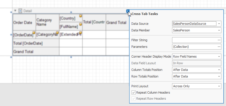
Corner Header Display Mode. Remove the blank region at the left top corner of the control -Choose what to print between the Row and Column Field Names or leave that area empty using the third property value:
Data Field Layout. Choose how to display multiple data field values and associated headers. Select between In Row and In Column modes:
Totals Position. Use ColumnTotalsPosition and RowTotalsPosition to specify the way in which totals are printed across columns and rows, before or after data.

Print Layout. Specify the Cross Tab's "growth" and print direction. See the figure below for available options:

- Repeat Column And Row Headers. Specify whether the Cross Tab control repeats column and row headers across page breaks.
- Rotate text displayed in cells. All Cross Tab cells provide an
Angle property. This allows you to print column and row headers vertically:
- Provide text for empty cells. Use the
NullValueText property to specify custom text for empty cells.
- Automatically adjust a column width based on its content. Set the
ColumnAutoWidthMode property to a value associated with the AutoSizeMode enumeration to achieve the desired result.
Avoid Use of the Prefilter Property While Filtering Data
You’re no longer required to handle events, obtain filter values and manually construct the filter string at runtime to filter pivot table data. The Cross Tab report control offers both a FilterString and Parameters property. OF note is the latter: this is a collection of internal cross tab parameters. They allow you to provide values outside a cross tab control’s data source. Whether it’s a report parameter or a report’s data source field value, you can now pass it down further to the cross tab control:
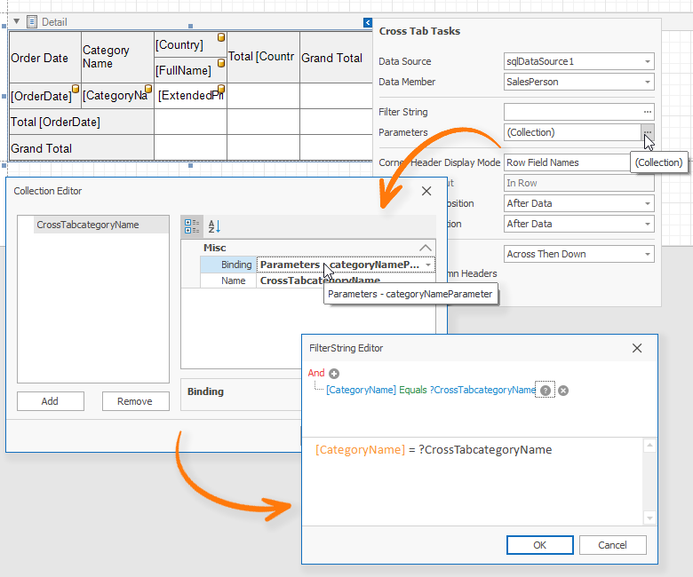
This feature is useful for those who need to pass report parameter values directly to the Cross Tab control or filter its data based upon a report’s grouping (when the Cross Tab is located in a group band).
Convert your Pivot Grid to the Cross Tab with One Click
The XRPivotGrid control smart tag now includes a "Convert to Cross Tab" option. As its name implies, this option allows you to convert your XRPivotGrid to our new Cross Tab report control.
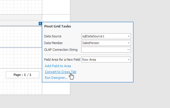
Please Note: Should you encounter issues or are unhappy with the conversion process, you can revert back via the "Revert to Original Pivot Grid" smart tag option within the Cross Tab control:

Your feedback will help us enhance this conversion process. Please let us know how we can improve our implementation.
Questions and Answers
Q: What will happen to XRPivotGrid?
A: We don't expect to develop this report control further. Our long-term goal is to enhance and extend our Cross Tab control.
Q: What will happen to reports that rely on XRPivotGrid?
A: We will not remove XRPivotGrid from our distribution. All your reports will continue to render/export without interruption. And yes, you can use both controls within the same report should you wish to transition to our new control.
v19.2 Release Notes
As you can see, we’ve invested quite a bit of time on our new Cross Tab report control. This feature affected resource allocation and we were forced to spend less time on capabilities outlined in our v19.2 roadmap. We’ll do our best to make this release as feature rich as possible, but we’re likely to postpone the release of several features detailed in our 2019 roadmap. Please stay tuned for further updates.
Your Feedback Counts
NOTE: Early Access and CTP builds are provided solely for early testing purposes and are not ready for production use.This build can be installed side by side with other major versions of DevExpress products. Please backup your project and other important data before installing Early Access and CTP builds.
Free DevExpress Products - Get Your Copy Today
The following free DevExpress product offers remain available. Should you have any questions about the free offers below, please submit a ticket via the
DevExpress Support Center at your convenience. We'll be happy to follow-up.