In my very first post as a DevExpress employee I quoted Rutherford B. Rogers:
We're drowning in information and starving for knowledge.
It is indeed the case that our software produces a fair amount of data exhaust. Oftentimes this exhaust languishes in a database or set of files and services without providing value and while producing excess overhead. At DevExpress we are committed to turning your data exhaust into valuable and actionable information that will enable your clients to be more productive and give meaningful insight into the key metrics that drive their business.
With that, we are excited to introduce a brand new dashboard tool to our already powerful family of data rich components. This tool is intended to help you build and distribute interactive data visualizations with ease.
Data
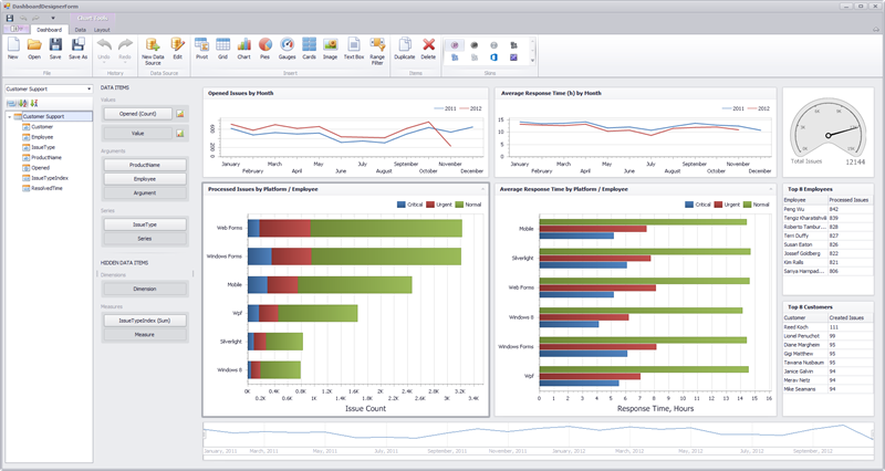
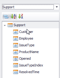
One of goals with this product is enabling you to access your data in a quick and intuitive way. If your particular application needs to access a database, we have you covered with 14 different engines, xml file binding, as well as POCO support.
The process of selecting data, therefore, is tailored to your specific needs. As mentioned earlier you can (in order of customizability):
- Select tables or views,
- Craft a specific query, or
- Simply bind to an IEnumerable of your custom generated objects
This level of customization allows for an infinite range of data options suited to your personal needs.
Dashboard Elements
The difficulty of understanding large amounts of data is made much easier with powerful and principled visualizations. Our new dashboard tool has 7 different data visualization elements each with different strengths and options.

| Pivot | The pivot dashboard element enables a cross-sectional view of data pivoted across multiple dimensions. |
| Grid | The grid enables a standard tabular representation of data. This dashboard element also contains embedded visual cues and displays that assist in quickly understanding data. |
| Chart | This quintessential visualization tool assists in the creation of bar, point, line, area, range, bubble, and financial charts. Our creation mechanism has also been significantly streamlined in order to visualize your data with simple drop actions. |
| Pie | The pie chart is a powerful visualization tool that enables users to understand distributions over small ranges. |
| Gauges | Gauges allow the comparative visualization of two values where one represents a target and the other an actual value. This dashboard element also allows for a multiplicity of gauges in a single dashboard element by creating a series view of the same. |
| Card | Cards, similar to gauges, are a textual visualization of target to actual values. These additionally include easy to understand positive/negative visualizations as well as easy to consume data explanations. This is a brand new visualization in the DevExpress family of visualization tools! |
| Range Filter | The range filter is also a brand new visualization tool that allows for automatic data filtering by presenting a chart based range. The range filter is automatically wired up to be a master filter and enables users to drill down into specific data in an effortless way. |
In addition to these data visualization elements, we have also included a static image and text dashboard element allowing finer grained dashboard customization. This will enable the addition of custom images and text that can spruce up the presentation of a dashboard.
Working with a Dashboard Element
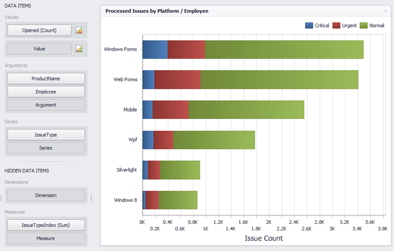
Once a data connection is established, all you need to do to add a dashboard element is click on the corresponding type you wish to create. Once that is done all you need to do from there is start dropping fields into the Data Items section.
Dashboard Element Data
For every dashboard element there are three things to consider:
- What data is represented?
- How the data is shaped?
- How should the user interact with the data?
Each dashboard element’s data bindings can be dragged from the available fields from the data source.
The three areas where these can be dragged are the:
- Values – the Y axis in the case of a chart (or the values of the items being measured)
- Arguments – this can be considered as the X axis (or the items being measured)
- Series – different sets of (x, y) pairs
Additionally one can drag fields directly into the Hidden Data Items Section. This section can be used to do additional sorting, filtering, and data shaping on values and arguments that are not necessarily visible in the actual dashboard element. Users of your dashboards will be able to shape data as they see fit – even with data elements not present in the visualization.
Dashboard Element Layout
Each dashboard element also has item specific layout capabilities. A couple of examples:
These layout options are element specific and allow for a tremendous amount of flexibility.
Interactivity
Next I want to tell you about how easy it is to create interactive dashboards. Every dashboard element visualization intrinsically is linked to a specific set of data. Because of this data connection, we are able to provide concise and pain-free methods of creating both dashboard wide filtering as well as simple element drill down. Each dashboard element has a data tab:

The data tab allows you to define either a dashboard wide filter, drill down, as well as the ability to define whether or not a dashboard element even participates in a filter. There is no code, variables, or anything for that matter needed to define these complex yet informative actions.
Viewers
The main output when designing a dashboard is the dashboard definition file. This file is a simple xml file which defines where the data comes from, what dashboard elements are defined, how they are bound, and what interactions have been created. This simple dashboard definition file can then be used in the WinForms dashboard viewer control. The final product looks very similar to the designer:
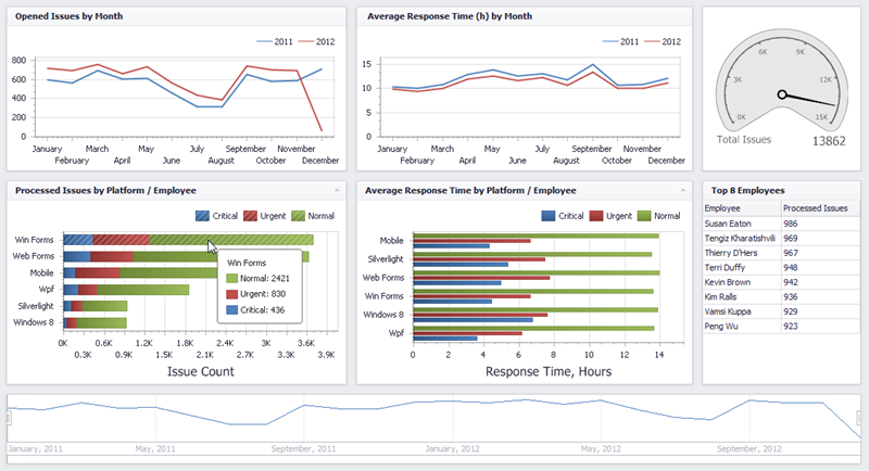
This viewer is fully interactive and will assist your users to get a really good feel for your data. Another exciting viewer we have created is our web viewer:
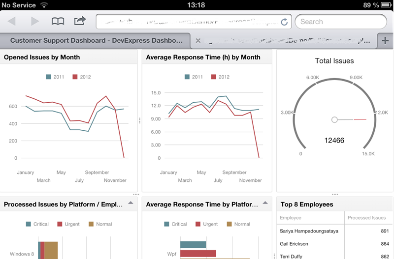
The web viewer uses our new HTML5/JS visualization tools available in DXTREME making them accessible to virtually any iDevice (above is an example with the iPad), Android, or Windows device. This viewer (just like the WinForms viewer) is simply dragged on to the design surface and bound to the dashboard definition file:

It is that simple!
Finally
There is so much more to talk about! I am personally very excited about this new product. As mentioned, my very first official post as a DevExpress employee outlined the importance I’ve always attached to gleaning knowledge from your data. I plan to dive into each aspect a bit more carefully in posts and videos to come.
There is much yet to come! Stay Tuned!
As always, if there are any comments and/or questions, feel free to get a hold of me!
Seth Juarez
Email: sethj@devexpress.com
Twitter: @SethJuarez
Free DevExpress Products - Get Your Copy Today
The following free DevExpress product offers remain available. Should you have any questions about the free offers below, please submit a ticket via the
DevExpress Support Center at your convenience. We'll be happy to follow-up.