DevExpress Icon Library

Thinking Out Loud
18 June 2015

A few weeks ago I mentioned that we've added a collection of new icons to our Icon Library - icons we created specifically for our DevAV demo apps. If you've not had the opportunity to review those demo apps, take a moment to run our Demo Center and see some of the user experiences you can create with our WinForms, WPF, ASP.NET and HTML5 UI controls/widgets.

In this post, I wanted to briefly describe what we're now shipping inside the DevExpress Icon Library and hopefully get your feedback and determine the types of icons you'd like us to create going forward. Remember that our Icon Library ships as part of all DevExpress Subscriptions (WinForms, WPF, ASP.NET, MVC) AND when you purchase a 12-month DevExpress Subscription, you can incorporate any of these icons within your projects and distribute them royalty-free.

The Icons

First a basic primer for those of you who've not used our Icon Library. As you can see in the image below, we've categorized the icons into groups such as Actions, Alignment, etc.
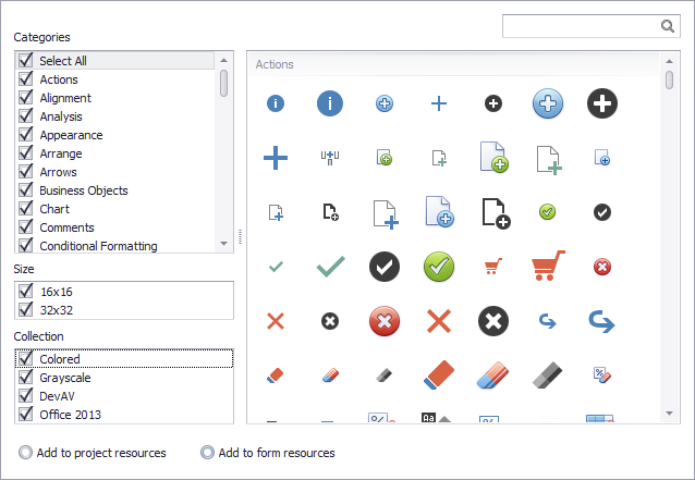
DevExpress Icon Library for .NET Developers

We've further organized icons by Size and assigned them to individual "Collections" (v15.1 includes a DevAV Collection - see image below).
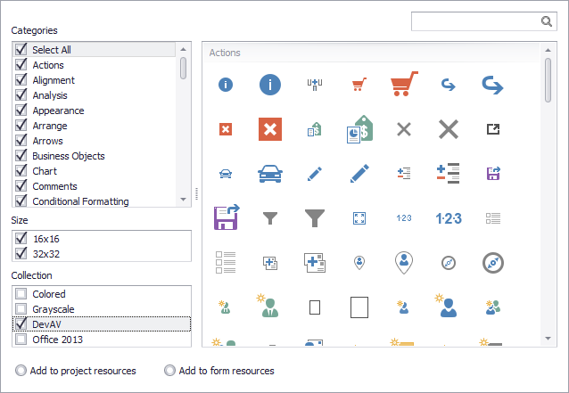
DevExpress Icon Library - DevAV Collection

When you explore these icons, I'm sure you'll find similarities between those inspired by Office 2013 and those we use inside our DevAV app. This leads me to my first question....

Which do you prefer - do you like/use the "flatter" icons or do you prefer the look of more traditional icons inside the "Colored" collection?

DevExpress Icon Collection - Flat vs Traditional

Question #1 leads to question #2 - which involves the UX changes inside Windows 10...part of which includes changes to icons. How many of you plan to change the icons used in your apps to replicate those found in Windows 10 (even when shipping solutions that are used inside older versions of Windows)?

And finally, though we cannot add too many "one-off" icons, we can definitely add icons that are widely used simply missing in our current offering. What icons/icon types would you like to see us add in upcoming release cycles?


Free DevExpress Products – Get Your Copy Today

The following free DevExpress product offers remain available. Should you have any questions about the free offers below, please submit a ticket via the DevExpress Support Center at your convenience. We’ll be happy to follow-up.
Robert Schlesinger
Robert Schlesinger

Definitelly I & my customers prefer traditional icons, no Metro UI or Win10 flat icons (or even worse: black icons)

18 June 2015
Del W
Del W

Great, I use them all the time!

18 June 2015
Brendon Muck [DevExpress MVP]

I have to stick with the traditional colored icons simply because I require several that aren't in the DX library, and it's easier to find similarly-styled icons from public sources like iconarchive.com.

18 June 2015
Laurence
Laurence

Colored all the way for me - I can't stand the new icon style, they're drab and washed out looking

18 June 2015
Christopher Todd
Christopher Todd

I don't mind flat icons so long as they are colorful and meaningful. Most metro icons like what is found in VS is un-usable. What you have so-far for DevAV and Office 2013 are nice, but I would need more choices. Plus, 24x24 would be greatly appreciated!

18 June 2015
vasanthkumar rajasekhar

we use all of them

Thanks for the new icons

18 June 2015
Johann Nell 2
Johann Nell 2

Love the DevAv icons. My customers prefer them. They add a clean and simplistic UI.

18 June 2015
Jacek Jedlinski 1
Jacek Jedlinski 1

Few days ago I replaced all colored icons from my project to new office 2013 and I think it was a good move. Now interface looks simplier and modern. But I had to create few additional icons by myself. Definitely worth it. Thanks.

18 June 2015
Andrew Fraser
Andrew Fraser

Coloured with a bit of gloss works for me :-)

I make extensive use of IconShock icons which are grouped into categories such as Business, Database, Security, Medical etc. though as your icon collection is expanding I am finding I am using your icons more frequently.

19 June 2015
Daniel Rail
Daniel Rail

We actually use both styles in our applications, but sticking with one style for a specific icon(i.e.: flat style for the checkmark and cancel, and the colored style for the close).  We simply choose with regards to which one is better and clearer, for the end user.  The same thinking is used for any icons that are not part of the DevExpress Icon Library.

19 June 2015
Mark Bissett 2
Mark Bissett 2

I'll echo what the others have said - I'd never use the flat icons - they look terrible (bit like the whole metro thing).

On a more positive note, the other coloured icons are fantastic.

19 June 2015
John01
John01

I have not checked all of them but can add Clients, Venues, Suppliers, Quotes, Invoices, Timesheets, Proposals if not there. These are fairly generic.

19 June 2015
John01
John01

I have come up with a few more . Take your pick. :)

Accounts, Activity, Archive, Availability, Bookings, Breach, Business Divisions, Client Forecast, Collection, Confirmation, Contact Status, Contact Type, Contacts, Counties, Countries, Credit Note, Current/Active, Deductions, Delivery, Departments, Drinks, Enquiries, Equipment, Event Type, Events, Events List, Experience, Feedback, Financial/Finance, Find Credit Note, Find Event, Find Invoice, Find Quote, Food Items, Health & Safety, Invoice Address, Live Stock, Location, Lost, Lost Pitch, Mailshot, Marketing, Monthly Sales Analysis, Nationality, Options, Payment Frequency, Payment Methods, Payment Terms, Payments, Payroll, Preferences, Prospect, Quotes List, Recruitment, References, Register Staff/Contact, Reprimand, Security, Setup, Source, Staff, Staff Rates, Staff Roles, Stations, Stock, Stock Entry, Stock Take, Successful, Tax Codes, TBC, Templates, Terms & Conditions, Text/SMS, Training, Units, Unknown, VAT/Sales Tax, Visa Type

20 June 2015
Dave Frank
Dave Frank

I'd like to move to the new icons, I like the 2013 look myself. But like someone else said, if you need icons that aren't common you can almost certainly find them with traditional coloring. I can't bring myself to mix and match so continue on with the colored ones even if it looks a little odd to me with an Office2013 theme. If Microsoft doesn't reverse field, though, and continues in this fashion I think I'll just have to have the custom icons done if they aren't in a newer style.

20 June 2015
Brendon Muck [DevExpress MVP]

The flat icons really only match well with the Office-themed skins. They look a bit out of place with the DX skins. It would be cool to be able to tie an icon set with a group of skins so that if an end-user chose a DX skin (like Coffee or Caramel), they'd see the traditional colored skins, but the application would switch to the flat skins if they choose a modern Office theme.

20 June 2015
Bassam Abdelaal
Bassam Abdelaal

Colored and traditional is the one I prefer

I noticed that you have many icons in XAF that's not in the icon library , would be nice to add those too

21 June 2015
John01
John01

Please add option to import external icons.

22 June 2015
Dave Hesketh
Dave Hesketh

If there was a specific skin that reflected the Windows 10 look in XAF, I think we would consider using the flat icons but the existing icon set you provide is amazing.

Additional icons that we end up creating are:

Client (Casual, not a worker)

Child

Business (Non industrial compared to BO_Organization)

Business Group (A collection of businesses or an umbrella company)

Project (We relate this to a collection of tasks and the BO_Folder doesn't quite fit)

;)

24 June 2015
Cory Crooks
Cory Crooks

I prefer the "flat" look for one reason only... laziness... Our app has a lot of domain specific functionality for which we generally have to try and find "something close" or create our own. Creating icons that tend toward more simplistic and a limited color palette is A LOT easier.

Speaking of color palette, any chance of you guys publishing the palette used for the flat ones, or any design guidance (i.e. what software *you* use to create them)?

29 June 2015
Ian David McLean
Ian David McLean

The new flat icons are great but as John01 said, we could do with a few more and his list is just about right.

30 June 2015
Nikita (DevExpress Support)

Hello guys,

@John01, @Ian

We know that the support for user images in the gallery can be very useful. Though this is not a simple task, we are currently researching possible ways of providing such a feature.

6 July 2015
Tim Robinson 2
Tim Robinson 2

I like them all, and right now I'm using the Flat style for the app I'm developing. Good job guys.

20 September 2015
Paul Tezza
Paul Tezza

I like the flat icons better.  And I'd really like to see you guys add the following icons:

-append row

-insert rows (not cells)

-a closed folder (not open)

16 November 2015

Please login or register to post comments.