We are about two months away from the official v19.1 launch, so we wanted to share our progress and let you test major new functionality before we wrap up another development cycle. If you own an active Universal or DXperience subscription, you can download the CTP build from the DevExpress Download Manager and test the features described in this blog post. Do let us know how well the new features address your requirements, since your feedback will help us fine-tune our code before launch. You can share your thoughts via our Support Center, the comments section below, or by emailing us at wpfteam@devexpress.com.
If you are using a trial version and would like to access these new features today, purchase a Universal or DXperience subscription license and you will automatically receive access to the CTP version. If you are ready to upgrade to Universal or DXperience from another subscription level, email us at clientservices@devexpress.com for preferential upgrade pricing.
We’ve prepared a list of the new functionality that is ready for further testing, along with a brief description of each feature and some usage/testing guidance. We shall be publishing separate in-depth blog posts on these features shortly, so stay tuned!
Visual Studio 2019 Support
You may have seen our announcement about Visual Studio 2019 support in version 18.2.4 of our components. However, since this version was released before the newest Microsoft IDE became available, our installation used standard synchronous packages as we had done for all previous versions of Visual Studio. For VS2019 though, this decision caused the IDE to show notifications about DevExpress extensions causing performance to be slowed down.
Version 19.1 is different. It has been designed and built with all the up-to-date Visual Studio 2019 requirements in mind and is fully compatible with this IDE. The newest version of DevExpress controls loads asynchronously, and has no impact on IDE start-up performance.
AutoSuggest Editor
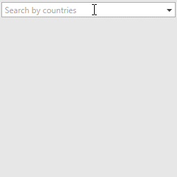
The AutoSuggestEdit displays a drop-down list of suggestions as the user types in the text box.
To work with the AutoSuggestEdit, you will need to handle the following events:
- QuerySubmitted. This event fires when the editor's text has been changed. In the event handler, you can provide any relevant suggestions that would be displayed in the editor's popup window.
    void Countries_OnQuerySubmitted(object sender, AutoSuggestEditQuerySubmittedEventArgs e) {
        this.countries.ItemsSource = string.IsNullOrEmpty(e.Text)
            ? null
            : this.context.CountriesArray
                  .Where(x => Regex.IsMatch(x, Regex.Escape(e.Text), RegexOptions.IgnoreCase | RegexOptions.IgnorePatternWhitespace))
                  .Take(10)
                  .ToArray();
    }
-
SuggestionChosen. This event fires when the user selects a suggestion in the editor's popup. You need to use this event to get the selected item.
-
TextChanged. This event fires when you set the editor's EditValue property.
Demo Link: AutoSuggestEdit
BreadCrumb Control
With v19.1, we can show you a preview version of the new Breadcrumb Control. It simplifies navigation within an app, and allows you to construct hierarchical navigation paths.
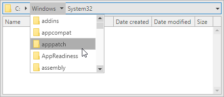
Demo Link: File System
TimeSpan Masks
We have implemented the new TimeSpan mask type, so that the TextEdit and ButtonEdit controls can now work with TimeSpan values.
The TimeSpan masks extend the standard .NET Custom TimeSpan Format Strings syntax.
<dxe:TextEdit MaskType="TimeSpan" EditValue="5.01:02:03" Mask="h HH m MM ss SS"/>

TimeSpan masks also support optional mask parts, which will appear when a user enters a corresponding literal or navigates through them using left and right arrows.
<dxe:TextEdit MaskType="TimeSpan" EditValue="00:00:00" Mask="[hH ][mM ]sS"/>

The TimeSpan masks support both positive and negative values.
Demo Link: TimeSpan Masks
Data Grid
Group Filters
You can group values in a column's Excel-style drop-down filter by using values from another column. In this case, users can filter data by multiple columns.
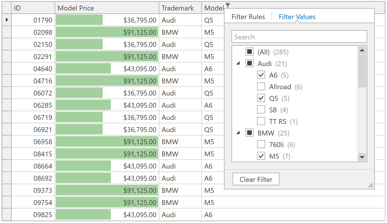
Demo Link: Excel Style Filtering
Documentation
“No Records” Text Block
The WPF Data Grid and WPF Tree List controls can display the "No Records" text block in the data area when a data source is empty or a filter/search query has no results.
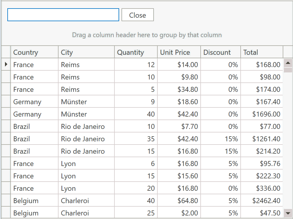
Demo Link: Grid Searh Panel
Documentation
Tree List
New Item Row
The Tree List now supports the New Item Row - an empty row at the top or the bottom of the tree. Users can enter data into this row to create new nodes, and then drag them anywhere in the hierarchy.

Demo Link: New Item Row
Documentation
New Filter Mode
The Tree List supports a new filter mode. In this mode, a node that meets the filter criteria is displayed along with all its parent and child nodes.

Demo Link: Filtering
Documentation
Gantt Control - Task Interaction and Automatic Scheduling
The WPF Gantt area is now interactive. You can drag tasks, resize them, change progress, and define predecessors in the UI. Other Gantt elements will react to your changes and be redisplayed. Summary tasks will adjust their progress and duration after changes to their children. Tasks and milestones will change their Start Date after changes to their predecessors.
In addition, the Gantt control now supports a dependency lag for predecessor tasks and can calculate the task duration according to defined working time rules.

Demo Link: Startup Plan
Scheduler Control
Date Navigation Panel
The Date Navigation Panel shows the current time interval and displays buttons to allow the user to navigate the intervals.
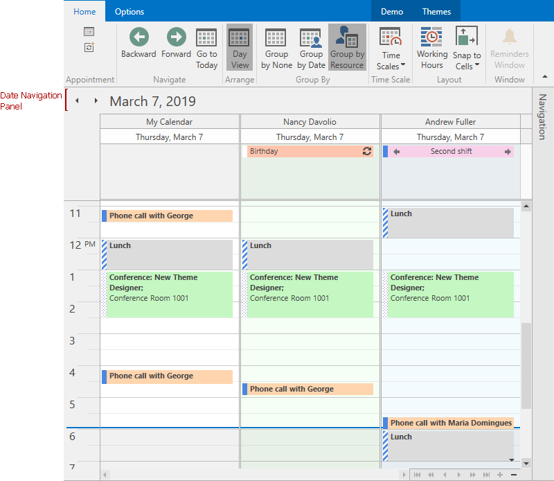
Documentation
Demo Link: Agenda View
Printing
We have greatly improved the Scheduler’s print functionality. The control's API now includes numerous printing options such as printing interval, the number of resources per page, the ability to hide the calendar element, etc.
You and your users can choose from a set of predefined printing templates: DailyStyle, WeeklyStyle, MonthlyStyle, TimelineStyle, TrifoldStyle. Templates are automatically adjusted to the current window settings.
And last, but not least, the WPF Scheduler control introduces a new Print Preview window.
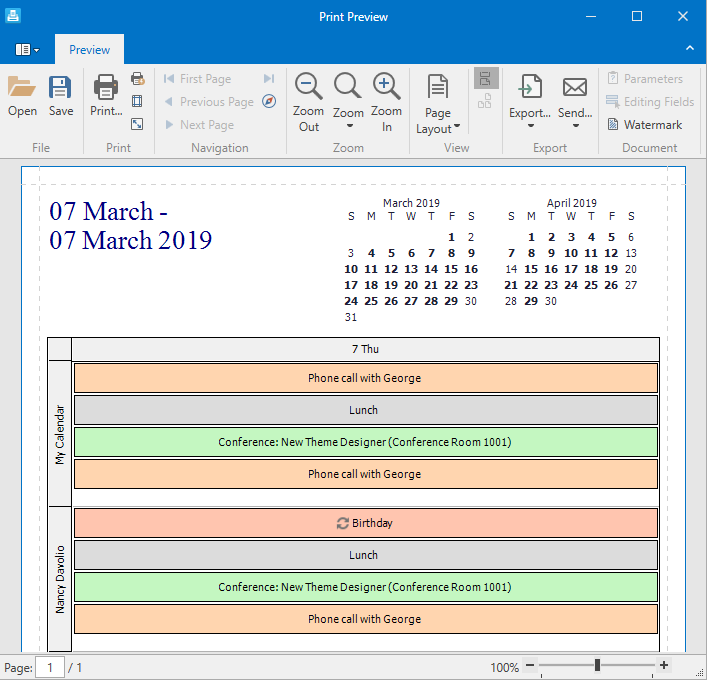
Demo Link: Printing
Clipboard Support
Users can now copy and paste appointments within the Scheduler as well as any control or application that supports text input. We have provided options and events that allow you customize or restrict certain clipboard operations.

Documentation
Diagram Control
Collapsible Containers
Users can now collapse or expand container content. To enable this functionality, set the DiagramContainer.CanCollapse property to true.
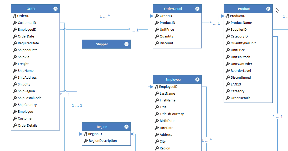
Demo Link: Database Diagram
Export to Pdf
We have added out-of-the-box PDF export to the WPF Diagram control. Diagrams are saved as vector images, which means that scaling issues are eliminated.
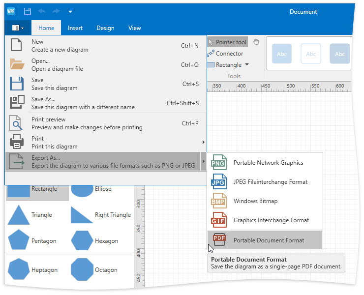
Demo Link: Diagram Designer
Free DevExpress Products - Get Your Copy Today
The following free DevExpress product offers remain available. Should you have any questions about the free offers below, please submit a ticket via the
DevExpress Support Center at your convenience. We'll be happy to follow-up.