Our v19.2 release includes a new Badge control. With its API, you can display a badge over any control or UI element, be it a data grid column or a Toolbar\Ribbon item. In addition to standard WPF properties, our Badge control ships with numerous customization options.
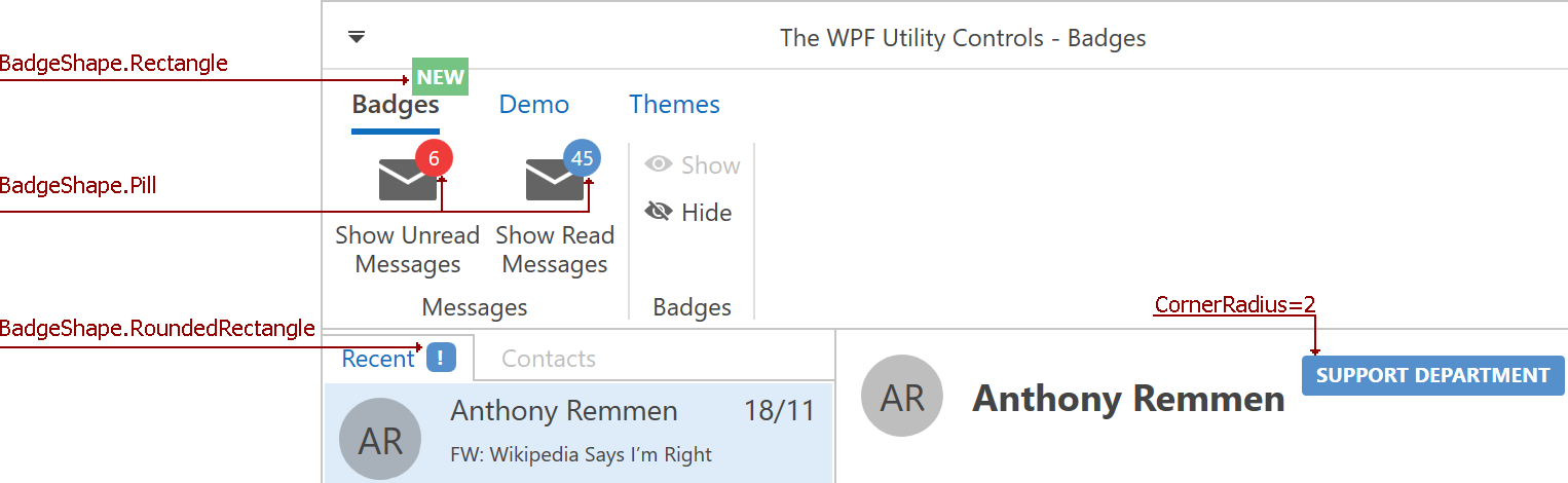
Shape
The Badge API includes a predefined shape set. You can use predefined shapes without modification or customize a shape via the CornerRadius property:
Color
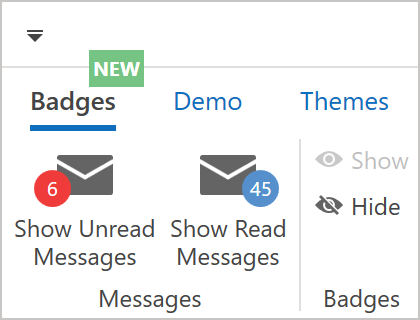
The Badge API also includes a Badge.BadgeKind property. Each BadgeKind ships with a predefined color value.

Color values can vary based on the DevExpress Theme used in an application.

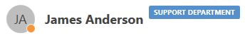
You can specify custom Badge colors via Badge.Background, Badge.BorderBrush, and Badge.Foreground:

Position
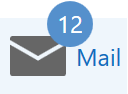
A Badge’s default position is over the top-right corner of the parent UI element, but you can customize its horizontal\vertical alignment and anchor as needed.
When you display a Badge over a BarItem with a glyph, the Badge is displayed over the glyph:
Content Format
You can use ContentStringFormat and ContentFormatProvider to format Badge Content when it is displayed as a string:
Useful Resources
Your Feedback Matters
We’d love to hear your thoughts on our new WPF Badge control. Are there any additional features you’d like to see us add in the future? Feel free to comment below and share your experiences with the entire DevExpress community.
Free DevExpress Products - Get Your Copy Today
The following free DevExpress product offers remain available. Should you have any questions about the free offers below, please submit a ticket via the
DevExpress Support Center at your convenience. We'll be happy to follow-up.