In this post, we'll detail some of the features we expect to ship in our next major release (v20.1) and invite active Universal and DXperience Subscribers to test new functionality (by downloading/installing our Early Access Preview) before we complete our current dev cycle. Should you have any questions or want to share your thoughts with us, please post a comment below.
As always, we thank you for choosing our WPF components and for placing your faith in DevExpress.
Early Access and CTP builds are provided solely for early testing purposes and are not ready for production use. This build can be installed side by side with other major versions of DevExpress products. Please backup your project and other important data before installing Early Access and CTP builds.
This EAP may not include all features/products we expect to ship in our v20.1 release cycle. As its name implies, the EAP offers an early preview of what we expect to ship in two months.
.NET Core Support
We've added the following .NET Core designer features in our current release cycle (v20.1)
- Applying application themes from App.config to all designer previews.
- Selection of non-visual elements (Data Grid columns, Toolbar & Ribbon items).
- Basic Smart Tags - displaying links to documentation, selecting the application theme.

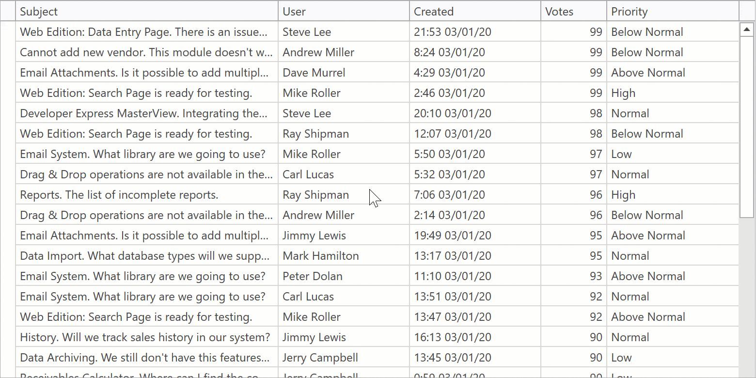
WPF Data Grid
Virtual Sources - Data Editing
Infinite and Paged sources now support data editing via Edit Entire Row. End users can press the Update button after entering cell values to post changes to a data source asynchronously.
Demo Link
Documentation
WPF Data Grid and TreeList - Common Features
Automatic Column Best Fit
The Data Grid and TreeList can automatically recalculate optimal column width when you scroll data.

Documentation
WPF Gantt
Resources
You can assign resources to gantt tasks and specify the percentage of time a resource spends on a task.

Demo Link
Documentation
Backward Scheduling
Backward Scheduling allows you to manage projects that have a specific deadline. You can plan backwards - scheduling each task from a deadline to the beginning of the project.

Demo Link
Documentation
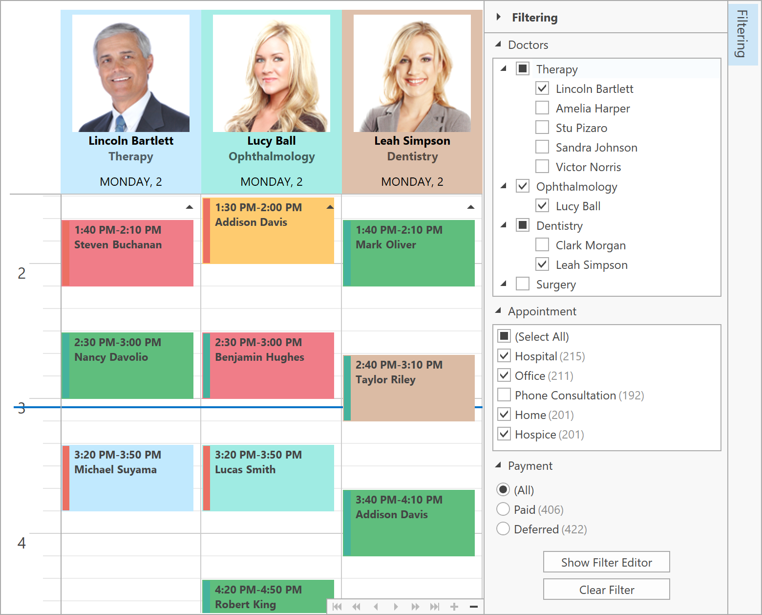
WPF Scheduler
Appointment and Time Region Filtering
We have added the ability to dynamically hide appointments and time regions. You can define a filter criteria in XAML or code-behind using our criteria syntax. The FilterAppointment and FilterTimeRegion events allow you to describe custom filtering logic.
You can also bind the Scheduler to the Filter Editor or Filter Elements to incorporate our filtering UI in your next WPF app.
Demo Link
Documentation
WPF Diagram
Text Tool
Our new Text Tool allows you and your users to add text labels to your diagram.

Property Panel Localization API
We have extended the DevExpress.Diagram.Core.Localization.DiagramControlStringId class. You can now localize property names in the Property Panel.
WPF Pivot Grid
Customization Form Search
The WPF Pivot Grid's customization form displays a search box that allows end users to filter the available fields list.

Demo
WPF Accordion
Selection Restriction
You can now restrict selection in the WPF Accordion control. The CanSelectItem event occurs when an end user moves the mouse over an item or selects items with the keyboard. The event handler allows you to prevent selection for specific accordion items.
Documentation
Show Popup on Hover
When the AccordionControl is used in collapsed mode, it displays its items in popup window when an end user clicks an item. To display the popup on mouse hover, set the ShowPopupOnHover property to true.
After an end user moves the mouse outside the popup window, the popup window is hidden with a delay specified using the PopupHideDelay property.
If an end user selects an accordion item within the popup window, the popup window remains open.
Documentation
WPF Ribbon and Toolbars
Appearance Options
With this release (v20.1) you can fully customize Ribbon, Toolbar, and BarItems appearance via the following properties:
- Background,
- BorderBrush,
- BorderThickness,
- CornerRadius,
- Foreground,
- Margin,
- Padding.
You can also use triggers based on custom conditions, mouse input, and visual states to control a BarItem’s appearance.
Documentation
WPF Ribbon - Backstage View Enhancements
You can now display a glyph for Backstage tab item headers. You can also display tab item headers at top or bottom of the BackstageView.

Demo Link
Documentation
Compact SVG Declaration
You can now specify SVG icons using a compact definition:
<dxb:BarContainerControl>
    <dxb:MainMenuControl>
        <!-- The old SVG definition -->
        <dxb:BarButtonItem Glyph="{dx:SvgImageSource Uri=Images/Notebook1.svg}"/>
        <!-- The new SVG definition -->
        <dxb:BarButtonItem Glyph="Images/Notebook2.svg"/>
    </dxb:MainMenuControl>
</dxb:BarContainerControl>
An SVG image source can be bound to Strings, Uris, and Streams. You don’t have to create an IValueConverter to bind an ImageSource with a ViewModel.
WPF Data Editors
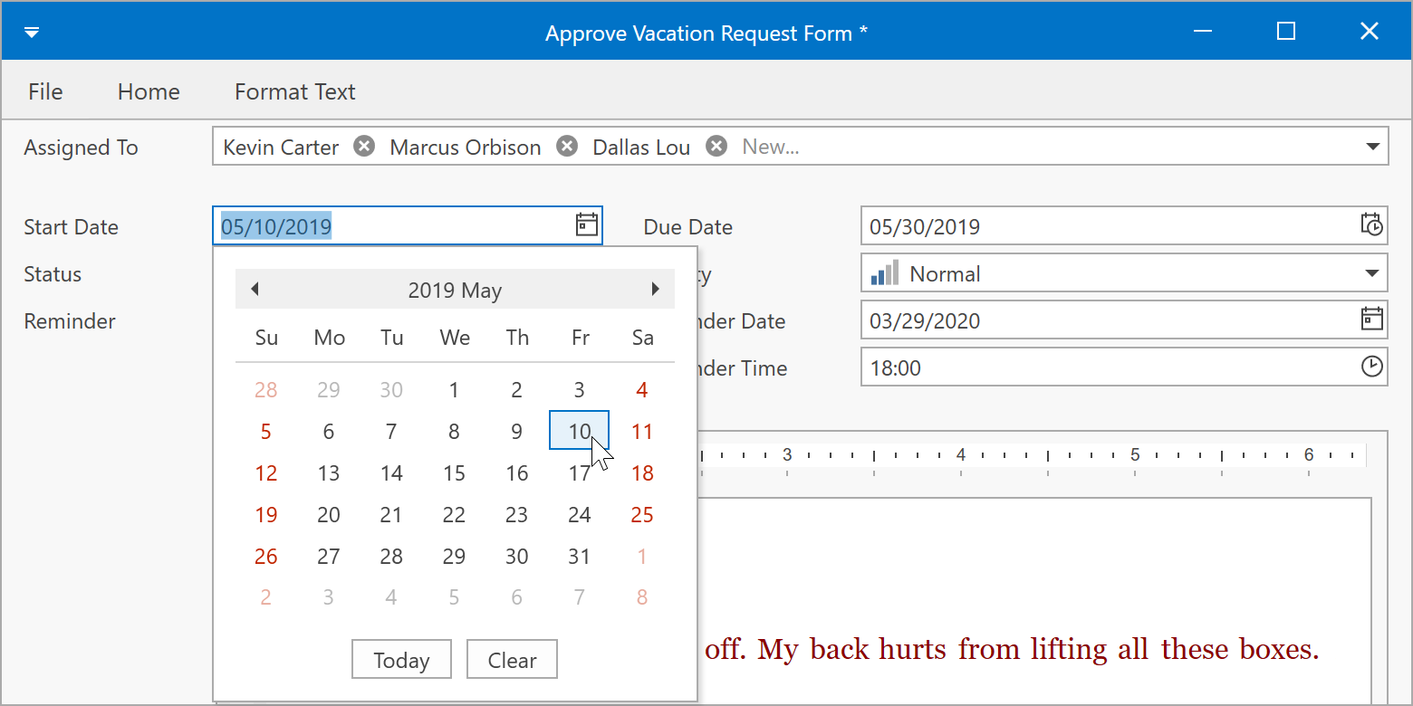
WPF DateEdit - Operation Mode Glyphs
With this release (v20.1), our WPF Date Edit’s drop-down button displays different glyphs for different operation modes.
Demo Link
Documentation
WPF TrackBarEdit
Our WPF TrackBar Editor can draw labels alongside ticks and display a tooltip with the current value when a user drags a thumb.
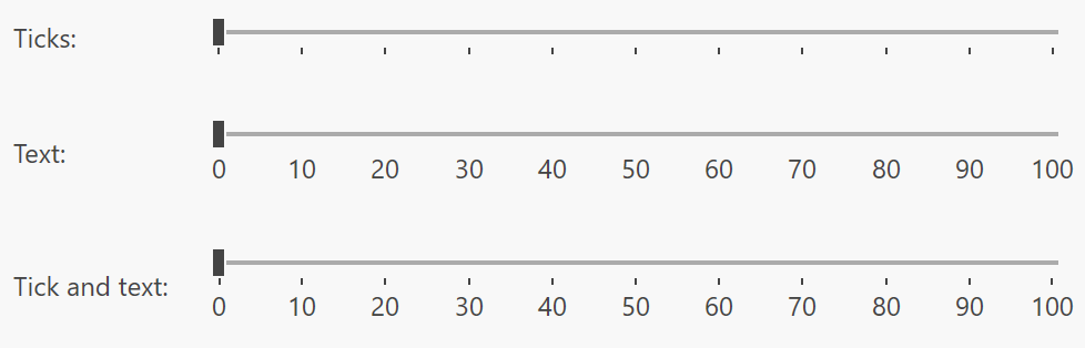
You can fully customize the label content and appearance settings using the following new API:
Other Editor Enhancements
- WPF ListBox Edit, ComboBox Edit, and Lookup Edit now include an ItemsSourceChanged event.
- End users can triple-click to select the entire text line in our WPF TextEdit.
- We have improved text selection in editors with masked input.
WPF Themes
New Default Theme
We’ve changed our default theme to Office2019Colorful. Unlike our previous default theme (Office2016White), Office2019Colorful supports palettes, lightweight templates, and standard WPF control customization with the Background, BorderBrush, and BorderThickness properties.
You can use the CompatibilitySettings.LegacyDefaultTheme property to return to a previous default theme.
Your Feedback Matters
As always, we welcome your feedback. Please post your comments below or create a new support ticket if you’ve beta tested our Early Access Preview.
Free DevExpress Products - Get Your Copy Today
The following free DevExpress product offers remain available. Should you have any questions about the free offers below, please submit a ticket via the
DevExpress Support Center at your convenience. We'll be happy to follow-up.