Our v20.1 release includes an extended list of the control appearance properties. This blog post summarizes appearance customization enhancements you can integrate in your DevExpress-powered WPF app today.
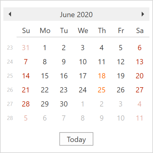
DateNavigator Control
You can now specify cell appearance for the following cell states:
- MouseOverState
- DisabledState
- InactiveState
- FocusedState
- SelectedState
- TodayState
- SpecialDateState
- HolidayState
- NormalState.
The code sample below specifies aspecial date foreground and disables highlighting for the current date:
<dxe:DateNavigator>
	<dxe:DateNavigator.Appearance>
		<dxe:DateNavigatorCellAppearance>
			<dxe:DateNavigatorCellAppearance.SpecialDateState>
				<dxe:DateNavigatorStateAppearance Foreground="#FF7200" BorderThickness="0"/>
			</dxe:DateNavigatorCellAppearance.SpecialDateState>
			<dxe:DateNavigatorCellAppearance.TodayState>
				<dxe:DateNavigatorStateAppearance BorderBrush="White"/>
			</dxe:DateNavigatorCellAppearance.TodayState>
		</dxe:DateNavigatorCellAppearance>
	</dxe:DateNavigator.Appearance>
</dxe:DateNavigator>
Standard Properties Support
We extend the list of controls that support the following standard customization properties:
- Background / Foreground
- BorderBrush
- BorderThickness
- CornerRadius
- Margin / Padding
Our most recent themes (Office 2016 SE, Office 2019, VS 2017, VS 2019) now offer enhanced templates for the following controls:
- Ribbon items, pages, categories, and groups
- Toolbars and Toolbar items
- Context menu and Context menu items
- SimpleButton, DropDownButton, and SplitButton
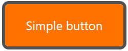
Supported appearance settings allow you to quickly customize look and feel throughout your application or create individual UI elements that stand out from the rest. For example, the code snippet below creates an orange action button that your users won’t miss.
<dx:SimpleButton Content="Simple button" Background="#FF7200" Foreground="White"
Padding="10" CornerRadius="5" BorderBrush="#505050" BorderThickness="3" …/>
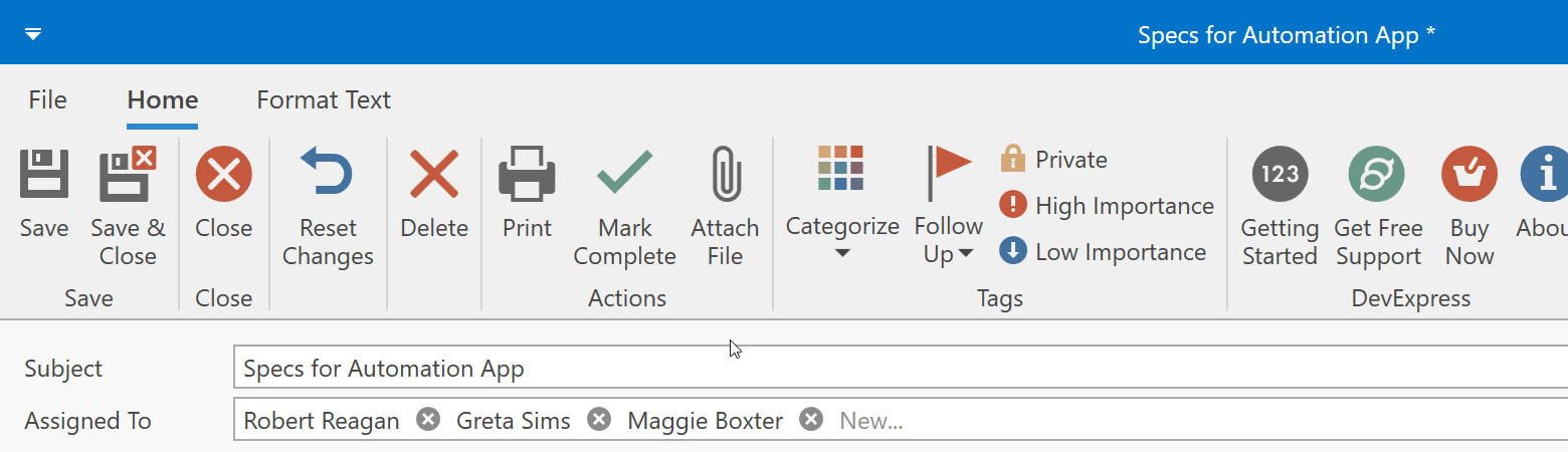
Bar Triggers
As you may know, Toolbar items used in DevExpress Ribbon and Toolbars are non-visual elements that generate visual counterparts in the UI. The same item can be displayed in multiple places at the same time. For example, the image below displays the same items on a Ribbon page and in the Quick Access Toolbar area:

Because Toolbar items are non-visual elements, it is hard to customize associated visual states with regular WPF triggers. In v20.1, we introduced custom triggers for Toolbar items. These triggers provide the same functionality as regular WPF triggers, but can be defined for Toolbar items directly.
Here's how to customize the appearance of BarCheckItems based on checked state:
<dxb:BarCheckItem Content="Private" …>
	<dxb:BarCheckItem.Triggers>
		<dxb:ItemTrigger Property="IsChecked" Value="True">
			<dxb:ItemSetter Property="Background" Value="#ffeb3b"/>
		</dxb:ItemTrigger>
	</dxb:BarCheckItem.Triggers>
</dxb:BarCheckItem>
<dxb:BarCheckItem Content="High Importance" …>
	<dxb:BarCheckItem.Triggers>
		<dxb:ItemTrigger Property="IsChecked" Value="True">
			<dxb:ItemSetter Property="Background" Value="#d20f38"/>
			<dxb:ItemSetter Property="Foreground" Value="White"/>
		</dxb:ItemTrigger>
	</dxb:BarCheckItem.Triggers>
</dxb:BarCheckItem>
Feedback
As always, we welcome your thoughts/opinions. Please post a comment below and let us know what you think about our new WPF Appearance Customization options.
Free DevExpress Products - Get Your Copy Today
The following free DevExpress product offers remain available. Should you have any questions about the free offers below, please submit a ticket via the
DevExpress Support Center at your convenience. We'll be happy to follow-up.