The DevExpress Spreadsheet Document API and our Spreadsheet UI controls (for WinForms and WPF) support a broad range of 2D and 3D chart types. In our most recent major release (v20.2), we extended the list of supported chart types and added support for Excel 2016 charts. Excel 2016 chart support is available as a CTP (community tech preview).
In this blog post, we’ll describe how to quickly use our Spreadsheet API and create/customize Excel 2016 charts within your app. As you might expect, you can also print and export these Excel 2016 charts to PDF.
Histogram Chart
A histogram chart breaks numeric data into equal-sized intervals (or bins) and displays the number of data points that fall within each bin. Our Spreadsheet API allows you to specify bin width, define the number of histogram bins, and create overflow and underflow bins.
In the following code example, our .NET Spreadsheet API is used to display exam score distributions within a histogram.
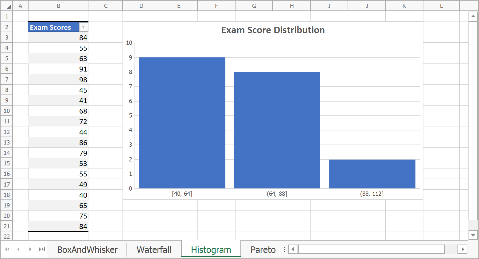
// Create histogram chart and specify its location.
Chart chart = worksheet.Charts.Add(ChartType.Histogram, worksheet["B2:B21"]);
chart.TopLeftCell = worksheet.Cells["D2"];
chart.BottomRightCell = worksheet.Cells["K18"];

// Define histogram series options.
var options = chart.Series[0].LayoutOptions.Histogram;
options.BinType = HistogramBinType.BinWidth;
options.BinWidth = 24;
// Specify gap width.
chart.Series[0].GapWidth = 10;

// Add chart title.
chart.Title.Visible = true;
chart.Title.SetValue("Exam Score Distribution");
Pareto Chart
A Pareto chart contains columns sorted in descending order and a line that displays cumulative totals. This chart type helps demonstrate the Pareto principle or the 80/20 rule. It highlights the most important factors underlying a given data set.
The following code example (using our .NET Spreadsheet API) generates a simple Pareto chart. Note: A Pareto chart uses the same bin options as a histogram chart.

// Create Pareto chart and specify its location.
Chart chart = worksheet.Charts.Add(ChartType.Pareto, worksheet["B2:C7"]);
chart.TopLeftCell = worksheet.Cells["E2"];
chart.BottomRightCell = worksheet.Cells["L17"];

// Specify series options.
var options = chart.Series[0].LayoutOptions.Histogram;
options.BinType = HistogramBinType.ByCategory;
// Specify gap width.
chart.Series[0].GapWidth = 15;

// Add chart title.
chart.Title.Visible = true;
chart.Title.SetValue("Key Causes of Late Projects");
Box and Whisker Chart
Box and whisker charts help visualize data distributions. They display the following statistical indicators for a given data set: minimum value, first quartile, median, third quartile, and maximum value.
With our Spreadsheet API, you can specify the following options for box and whisker charts:
- Display mean markers and mean line;
- Plot inner and outlier data points;
- Define quartile calculation method.
The following code example generates a simple box and whisker chart:

// Create box and whisker chart and specify its location.
Chart chart = worksheet.Charts.Add(ChartType.BoxAndWhisker, worksheet["B2:E17"]);
chart.TopLeftCell = worksheet.Cells["G2"];
chart.BottomRightCell = worksheet.Cells["N17"];

// Set minimum and maximum values for the value axis.
Axis axis = chart.PrimaryAxes[1];
axis.Scaling.AutoMax = false;
axis.Scaling.Max = 70;
axis.Scaling.AutoMin = false;
axis.Scaling.Min = 40;

// Specify series options.
foreach (Series series in chart.Series)
{
    var options = series.LayoutOptions.BoxAndWhisker;
    options.ShowMeanLine = false;
    options.ShowOutlierPoints = true;
    options.ShowMeanMarkers = true;
    options.QuartileCalculationMethod = QuartileCalculationMethod.ExclusiveMedian;
}

// Add chart title.
chart.Title.Visible = true;
chart.Title.SetValue("Academic Performance Distribution");
Waterfall Chart
A waterfall chart displays a running total as values increase and decrease over time. This chart type allows you to analyze data categories and their contributions to total values.
In the code example below, we use a waterfall chart to evaluate company profit. Our .NET Spreadsheet API allows you to display individual columns within the chart as total columns. These columns visualize subtotal and total values and start on the horizontal axis at zero. Our example contains two total columns: Gross Income and Net Income.

// Create waterfall chart and specify its location.
Chart chart = worksheet.Charts.Add(ChartType.Waterfall, worksheet["B2:C7"]);
chart.TopLeftCell = worksheet.Cells["E2"];
chart.BottomRightCell = worksheet.Cells["L17"];

// Hide major gridlines for the value axis.
chart.PrimaryAxes[1].MajorGridlines.Visible = false;

// Specify series options.
var options = chart.Series[0].LayoutOptions.Waterfall;
options.ShowConnectorLines = true;
// Set the third data point as total.
options.SubtotalDataPoints.Add(2);
// Set the last data point as total.
options.SubtotalDataPoints.Add(5);

// Add chart title.
chart.Title.Visible = true;
chart.Title.SetValue("Income Statement");
Funnel Chart
A funnel chart is used to visualize individual stages within a larger process. Funnel charts help determine how data evolves as it moves through each stage.
The following funnel chart sample displays the percentage of website visitors that executed a specific action during a visit (downloaded a trial, contacted support, purchased a subscription, etc).

// Create funnel chart and specify its location.
Chart chart = worksheet.Charts.Add(ChartType.Funnel, worksheet["B2:C6"]);
chart.TopLeftCell = worksheet.Cells["E2"];
chart.BottomRightCell = worksheet.Cells["L18"];

// Add chart title.
chart.Title.Visible = true;
chart.Title.SetValue("Website Visitor Trend");
Limitations
Our current Excel 2016 chart implementation ships with the following limitations:
- Our Spreadsheet API allows you to create sunburst and treemap charts. However, you cannot display these charts in our Spreadsheet UI controls. Sunburst and treemap charts cannot be printed or exported to PDF at this time.
- Our WinForms and WPF Spreadsheet controls do not contain user interface elements to insert Excel 2016 charts, change type, or specify chart colors and style.
We plan to address these two issues in our v21.1 release cycle.
Your Feedback Matters
Should you have any questions about our new Spreadsheet chart types or if you require assistance from a member of our support team, feel free to submit a ticket via the DevExpress Support Center.
Free DevExpress Products - Get Your Copy Today
The following free DevExpress product offers remain available. Should you have any questions about the free offers below, please submit a ticket via the
DevExpress Support Center at your convenience. We'll be happy to follow-up.