We expect to ship our next major .NET MAUI update (v24.1) in a couple of months. This post outlines the features available in our early access preview (EAP) build and documents features included in our minor update (v23.2.5).
Early Access Preview (v24.1)
If you expect to use our EAP, make certain to check the “Include prerelease” option within NuGet's Package Manager to access early access preview features.
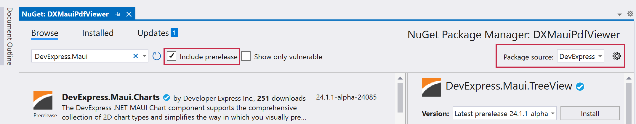
Early Access and CTP builds are provided solely for early testing purposes and are not ready for production use. This build can be installed side by side with other major versions of DevExpress products. Please back up your project and other important data before installing Early Access and CTP builds.
This EAP may not include all features/products we expect to ship in our v24.1 release cycle. As its name implies, the EAP offers an early preview of what we expect to ship in two months.
New TreeView Control
v24.1 will ship with a new .NET MAUI TreeView control. Designed to present hierarchical data, our .NET MAUI TreeView allows you to create intuitive and visually appealing user interfaces with ease. With our new .NET MAUI TreeView (DXTreeView), you can quickly visualize files structures, organization relationships, hierarchical data sets, navigation menus, and more.
DXTreeView ships with the following built-in capabilities:
- Hierarchical and self-referential data support
- Independent and recursive check box support
- Filtering
- Sorting
- Item template support

New SlideView Control
v24.1 ships with a new SlideView component - designed to leverage swipe gestures (right/left or up/down) to navigate between views. Our .NET MAUI SlideView component can help you create a variety of user interface solutions including application galleries or user tutorial screens.
SlideView features include:
- MVVM support (
ItemsSource, ItemTemplate, ShowNext/ShowPrevious commands)
- Item caching for better performance
- Horizontal/vertical orientation
- Looped and animated navigation
Documentation
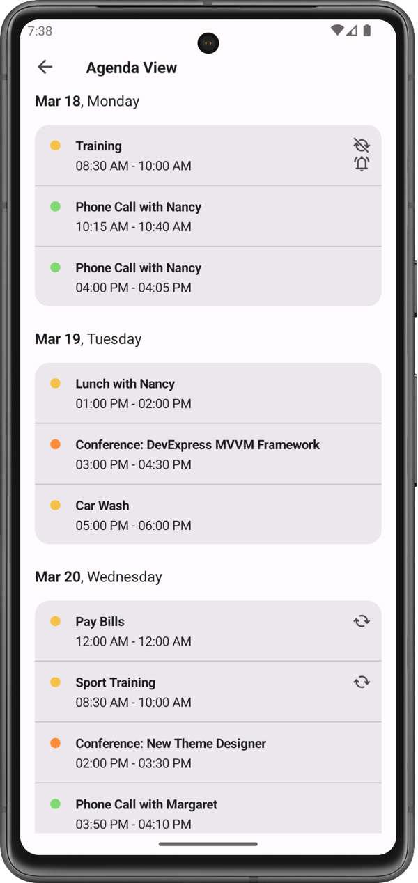
Scheduler – new Agenda View
Our new .NET MAUI AgendaView component allows you to display schedules, events, and appointments for as single day.
Features include:
- Ability to hide empty time slots to save the screen space
- Appointment and header appearance customization options
- Built-in button to create a new appointment
Documentation
PDFViewer — Document Signatures
With v24.1, users can sign PDF documents via our intuitive user interface (users can draw a signature at a given location or select a predefined signature). Signatures can be selected, moved and resized. Users can also specify ink color and line width.
To respond to user sign actions, our .NET MAUI PDF Viewer includes the following events:
SignatureAdded / SignatureAddingSignatureChangedSignatureDelete / SignatureDeletingSignatureSelectionChanged
PDFViewer — Text Selection
Users are now able to select text in a PDF document and highlight or copy it to the clipboard as requirements dictate. To help facilitate selection, we added a selection context menu that appears when text is selected (the menu includes copy and highlight commands).
You can also interact with selected content via new API methods and events.
PDFViewer — Text Formatting Annotations
v24.1 gives you the ability to highlight selected text with different markup text annotations. The following text decorations can be added via the interface or API:
- Highlight
- Underline
- Strikethrough
- Underline with a wavy line
PDFViewer — Graphic Annotations
Users can now add annotations to a PDF document, and then comment/collaborate with one another. Our .NET MAUI PDF viewer supports the following annotations:
- Sticky notes
- Free text
- Ellipses (Circle annotations)
- Rectangles (Square annotations)
- Free-hand drawing
Note: Our official release should give you the ability to apply all the annotations listed above via the control's UI.
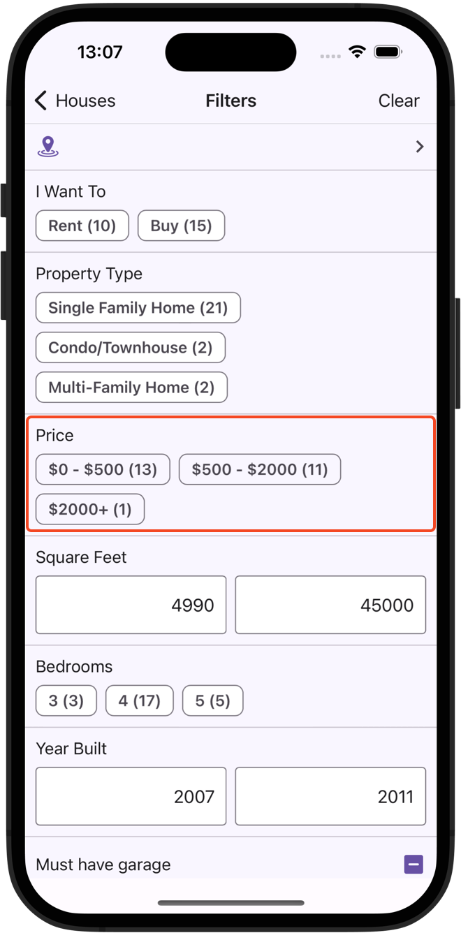
Fltering UI — Predefined Filters
v24.1 will ship with a new PredefinedFilterCheckedChipGroupItem component. You can leverage this new UI element to add quick chip filters. Each filter chip allows you to set display text and filter criterion. Common usage scenarios for this filter item include creating favorite user filters or filtering based on a predefined value range.
<ContentPage ...
             xmlns:dxe="clr-namespace:DevExpress.Maui.Editors;assembly=DevExpress.Maui.Editors">
             <!--...-->
                  <dxe:PredefinedFilterCheckedChipGroupItem Text="Price" FieldName="Price" ShowValueCounts="true">
                      <dx:PredefinedFilter Text="$0 - $500" FilterExpression="?p < 500"/>
                      <dx:PredefinedFilter Text="$500 - $2000" FilterExpression="?p >= 500 AND ?p < 2000"/>
                      <dx:PredefinedFilter Text="$2000+" FilterExpression="?p >= 2000"/>
                  </dxe:PredefinedFilterCheckedChipGroupItem>
             <!--...-->
</ContentPage>
Documentation
Minor Update (v23.2)
New Slider Controls
We added two slider controls to our .NET MAUI component suite:
DXSlider — allows users to select a numeric value.DXRangeSlider — allows users to select a range of numeric values.
Both controls adhere to the most recent Material Design 3 guideline.
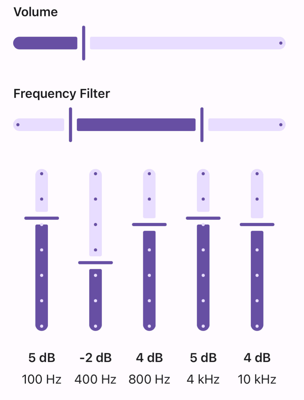
Features include:
- Configurable scale step
- Minimum and maximum values
- Customizable thumbs, tickmarks, and track
Documentation
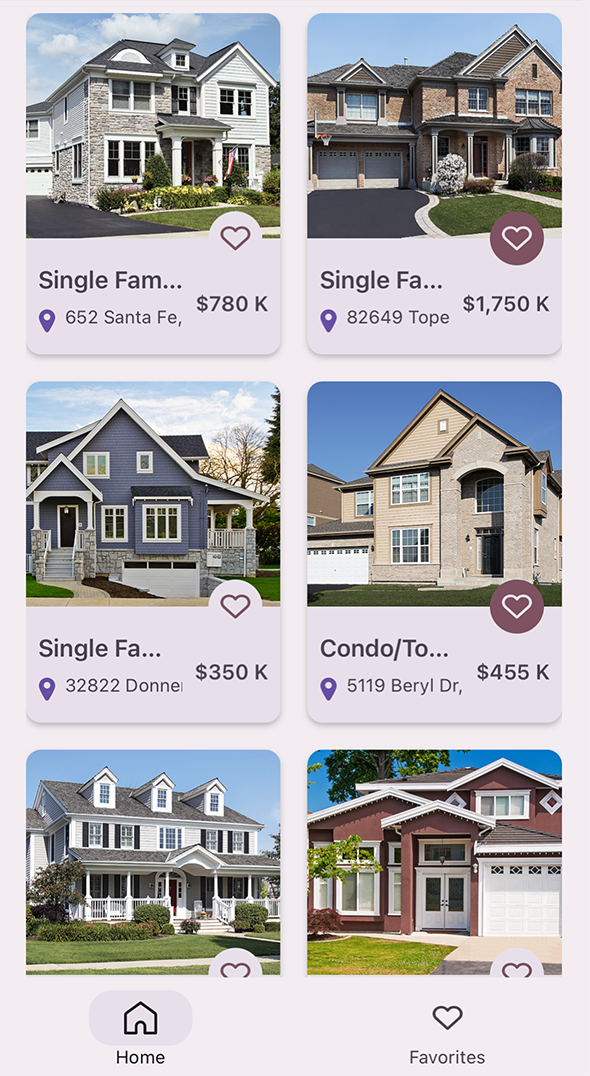
CollectionView — Multi-Column Layout
DXCollectionView now supports multiple items in a row/column. Our multi-span layout can simplify design if/when collection view items are displayed as cards (allowing you to display more items on screen).
For more information, please refer to the following API members:
CollectionView — Ripple Effect
DXCollectionView now supports ripple effects for tapped items. Ripple animations can help you create more intuitive user experiences. To activate ripple effects, enable the UseRippleEffect property.

CollectionView — Item and Group Separators
Separators are common elements and are used in most collections. With our most recent update, you no longer need to add a separator to your item template. This enhancement simplifies the XAML code and template arrangement logic. The following APIs will help you add separators to a DXCollectionView:
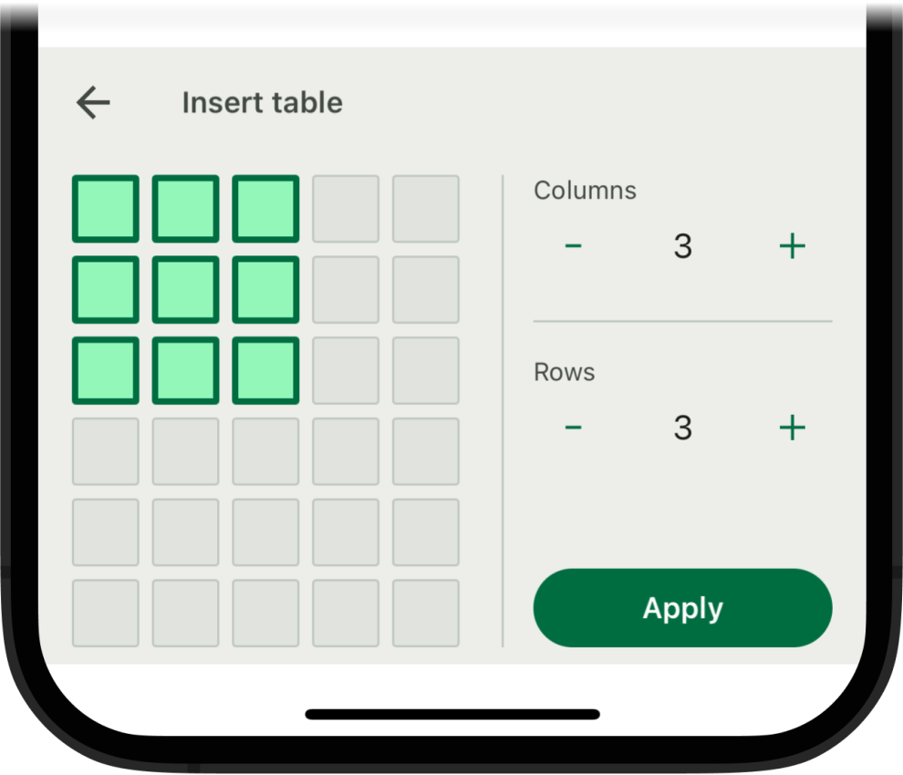
HTML Edit — Tables
Users can now add and edit tables within our .NET MAUI HTML Editor. Like other DevExpress .NET MAUI controls, user interface elements are designed to maximize ease-of-use on mobile devices/form factors.
Documentation
DXButton — Ripple Effect
We added ripple effect support to DXButton. Enable the UseRippleEffects property to activate ripple animations for individual buttons.
Target Standard .NET
As you may know, the XUnit testing library requires standard .NET 8 (not .NET 8.0 Android/iOS) to be referenced as a target framework within project settings. In previous versions, you could not use our controls in a standard .NET 8 project and therefore you could not use XUnit. With v23.2.5, you can target standard .NET 8 in projects when using DevExpress .NET MAUI component libraries.
<Project Sdk="Microsoft.NET.Sdk">
    <PropertyGroup>
        <TargetFrameworks>net8.0;net8.0-android;net8.0-ios</TargetFrameworks>
        <OutputType Condition="'$(TargetFramework)' != 'net8.0'">Exe</OutputType>
        <!-- ... -->
    </PropertyGroup>
    <!-- ... -->
</Project>
Documentation
Free DevExpress Products - Get Your Copy Today
The following free DevExpress product offers remain available. Should you have any questions about the free offers below, please submit a ticket via the
DevExpress Support Center at your convenience. We'll be happy to follow-up.