Today we have another post for the Tips&Tricks series - useful features you may have missed. Here are links to the previous parts:
Direct Access to Online Help
A warm-up hint to get us started, not related to any specific control or feature: in Visual Studio, lots of DevExpress elements provide direct access to F1 help. Select a visual element in the designer and hit F1 and you’ll see the related documentation page come up in a browser window. The same thing works in code, too! With your editing cursor on a type name or an API call, F1 will bring up the correct documentation as well. This is the easiest way of getting help when you need it!
Sort Animations in the Data Grid
Here’s a small feature that instantly applies an elegant appearance to your WinForms Data Grid: enable the OptionsBehavior.AllowSortAnimation property and some smooth animation effects will accompany the sorting process when a user clicks a header. The most noticeable effect is that for progress bars in grid cells:
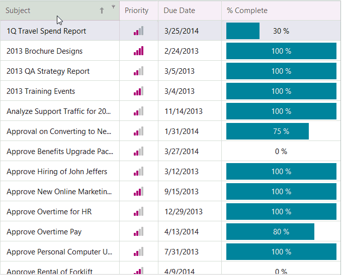
Note that these animation effects are disabled if you apply conditional formatting rules or you activate master-detail levels.
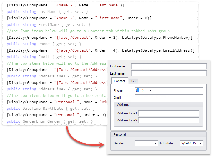
Data Annotation Attributes
Some DevExpress WinForms UI Controls have support for .NET standard Data Annotation Attributes. As usual, such attributes should be treated with care - keep in mind that it is hardly a good idea from an architectural point of view to specify visual aspects of data display on a low-level ORM type! However, especially with MVVM-ViewModel types in mind you can save a lot of time by marking up properties and relying on control features to interpret the attributes.
For example, the Data Layout control organizes its items in groups and tabs according to attributes:
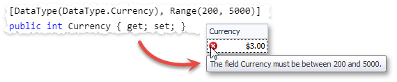
The Data Grid can set column orders, hints, formats and validation rules based on annotations:
Filtering UI Context
The FilteringUIContext component can generate an editor setup to filter data for an attached DevExpress data-aware control. Several controls are supported, please see the documentation page for a list. The data sources can even use Server Modes where supported and the FilteringUIContext integrates its criteria correctly!
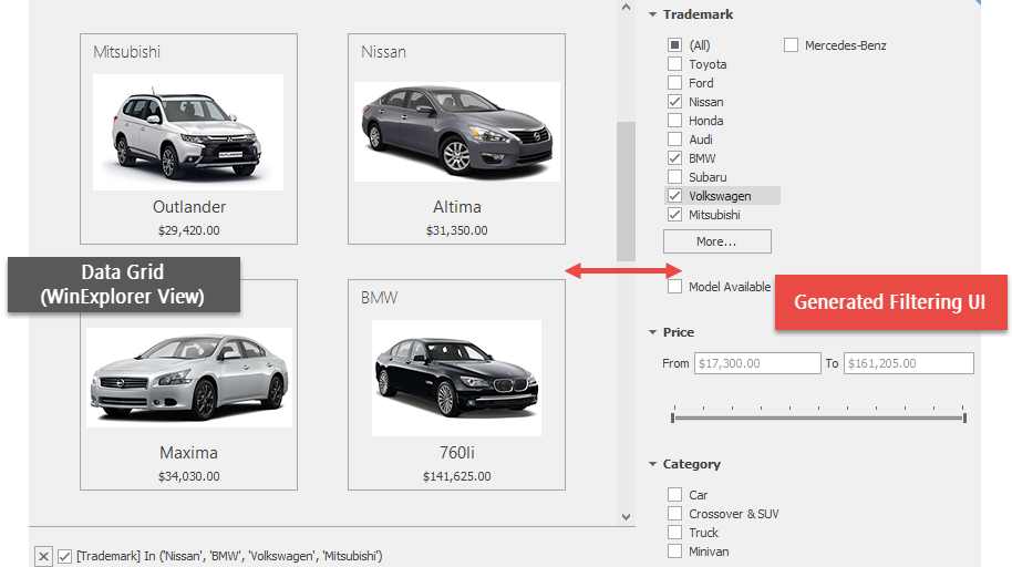
The generated filtering UI depends on a data model, which is retrieved directly from the control in simple cases. For more advanced scenarios, special models can be supplied. For each data field the component provides multiple editor options depending on the field type. For instance, numeric values are filtered using two text boxes and a track bar by default, but you can easily change a setting to use two SpinEdit editors instead.
Rename Layout Control Items
When you add controls to the Layout Control, it automatically wraps them into layout items with auto-generated names: layoutControlItem1, layoutControlItem2, etc. If you are using your controls from code, you may have assigned meaningful names to the controls and the automatic naming of the related layout items is not useful. You can invoke the Smart Tag menu on the Layout Control and click Rename Items to change the names to something more meaningful.
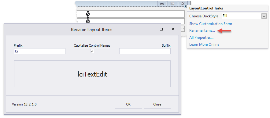
The dialog Rename Layout Items uses the naming pattern lci<Control Name> by default (lci stands for layout control item), but you can replace this prefix with your own and optionally add a suffix.
Any thoughts?
As always, we look forward to hearing back from you! What’s your favorite feature from this list?
Free DevExpress Products - Get Your Copy Today
The following free DevExpress product offers remain available. Should you have any questions about the free offers below, please submit a ticket via the
DevExpress Support Center at your convenience. We'll be happy to follow-up.