WinForms Tips & Tricks - What You May Have Missed (Part 2)

This post is a follow-up to the previous Tips & Tricks - What You May Have Missed post. In the same series, we also recently published Boosting Application Performance. Many of you commented and asked for more similar content - thank you very much! Here we go.
Import and Export for Appearances
A rather boring task well known to WinForms developers is that of applying changes to element appearances. For example, a button might require changes to its settings for visual states: normal, hovered, pressed, disabled. Easy enough to do if you have one button, and for multiple buttons on the same form you can Ctrl-Click them and change settings simultaneously. But for buttons anywhere else than the current form, the settings need to be transferred in some other way.
Look closely at the Appearance property section in the Properties tool window and you’ll notice an ellipsis button:
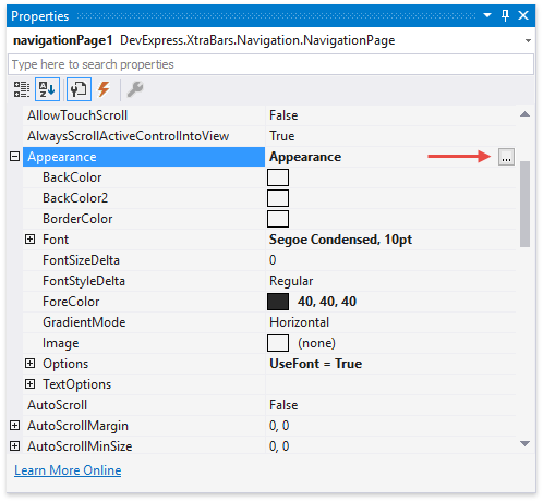
Click this button to bring up the Appearance Editor. In this dialog, you can save appearance settings as styles that can be applied to other elements.
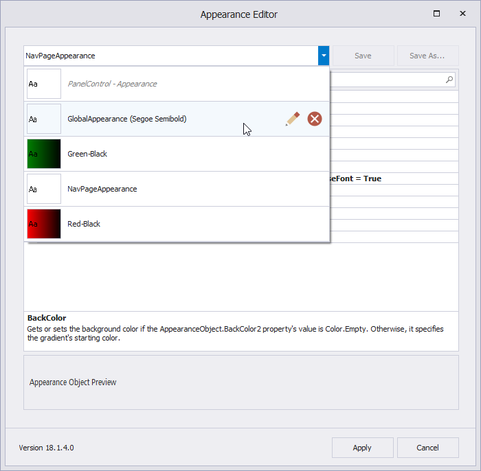
Appearance styles are saved as .xml files to the folder C:\Users\Public\Documents\DevExpress \AppearanceTemplates. The Appearance Editor tracks any changes to this folder, so you can save appearance settings in one Visual Studio project and instantly reuse them in another.
Adorner UI Manager
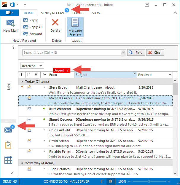
In WPF there is the concept of Adorners and the AdornerLayer, a transparent layer displayed on top of your forms. This layer can be used to draw secondary elements that often overlap controls on the primary layer. For instance, badges are circular or rectangular shapes that notify users about updates or states, like the number of unread emails in your inbox. Of course badges are widely used in web and mobile applications today!
The Adorner UI Manager is a component that implements this concept for your WinForms applications. Here are some examples for badges:
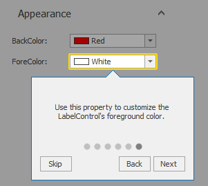
Hints can be attached to any control that supports validation. These elements notify users about the current validation state.

Finally, guides cover the parent container with a semi-transparent layer, leaving a configurable area untouched to highlight it. You can show an optional flyout panel, which makes guides a perfect tool to create interactive tours or to point out specific UI regions to the user.
(Data) Layout Control Secrets
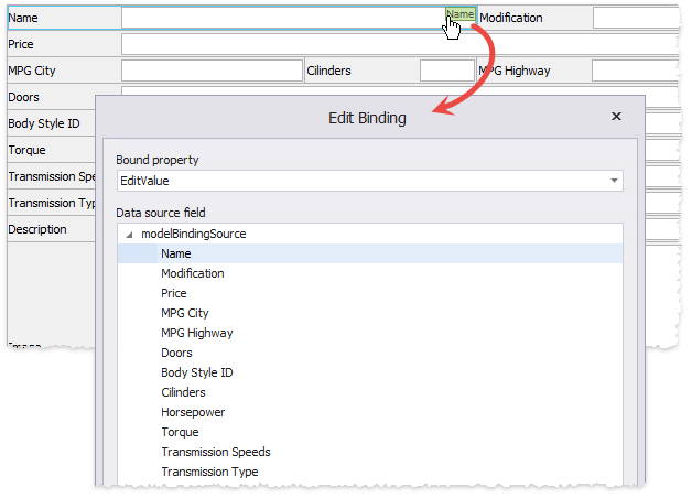
If you have used the Data Layout Control, you probably remember that each data layout item displays a green rectangle in the top right corner at design time. This rectangle shows the name of the bound data field. However, did you know you can also click this label? Try it and you’ll find a dialog that enables quick modifications to the binding settings and the bound field. This is a great feature when you need to modify binding configurations, perhaps due to changes in the data source.
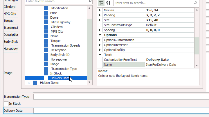
The second “secret” feature applies to the regular Layout Control as well as its data-aware equivalent: to quickly re-arrange layout items, the Layout Tree View tab in the customization dialog supports drag&drop for the elements.
As before, we are very curious about your thoughts and ideas! Did you find the tips helpful? Have you had your own experiences with useful features you didn’t discover right away?
Free DevExpress Products - Get Your Copy Today
 Oliver Sturm (DevExpress)