Blazor — June 2026 Roadmap (v26.1)

Blazor 2026 Strategy
As you will see below, we expect to continue extending the capabilities of individual components — but we also want to invest in larger initiatives that span multiple release cycles.
Many of these initiatives require foundational work (architecture, styling infrastructure, interaction layers, and design-system alignment) before we can commit to a specific release or prepare a complete feature list. Some of this work will not be delivered in the first half of the year (including v26.1).
Even with our evolving objectives, we want to be transparent about what we are focusing on, why some details are not available yet, and what direction we hope to move toward over time.
Styling and Layout Foundations
We want DevExpress Blazor components to address more UI needs out of the box, so you can build cohesive layouts with minimal custom CSS.
Historically, many apps relied on Bootstrap utility classes and layout patterns as the primary styling foundation. Bootstrap is still available, but it does not match modern theme requirements (for instance, misses runtime-configurable accent colors).
Our direction is to create theme-aware styling alternatives so you do not need to recreate these fundamentals yourself. We are exploring:
- DevExpress CSS helper classes for common spacing/layout patterns.
- Lightweight "primitive" components for element composition (for instance, Card, Badge, Avatar).
.png)
We also plan to reduce the amount of fine-tuning needed for complex layouts (alignment, consistent spacing, border/background treatments), especially when size mode can change at runtime. Our goal is to improve visual defaults and introduce new layout-focused settings. These settings will allow you to implement common layouts using component APIs, theme-aware patterns, and helper classes mentioned above.
Finally, we’ll build demos and project templates that recreate popular app layouts without custom styling.
.png)
Classic Theme Deprecation
Blazing Berry, Office White, Purple, Blazing Dark, and Bootstrap-based themes use an old architecture, are hard to maintain, and do not support new styling capabilities (accent colors, public CSS variables, and our UI Kit). We want to focus our efforts on new styling architecture and gradually move away from classic themes.
We plan to make this transition carefully. Before we deprecate any classic theme, we will prepare viable alternatives, publish clear migration guidance, and give you enough time to move at your own pace.
New Themes
We want to expand our modern theme lineup (starting with Fluent) and evolve our styling infrastructure. Theme directions that we are currently considering:
- Material — a frequent request, and a good fit for teams building hybrid solutions that mix UI stacks (including DevExtreme).
- A classic-inspired modern theme — a longer-term option for customers who prefer a look closer to our classic themes.
If you have strong preferences on one or the other, we would like to hear your thoughts (please submit a support ticket via the DevExpress Support Center at anytime).
Icon Library
We plan to make our DevExpress Icon Library available to Blazor developers and expand it with new icons. We also expect to introduce a new API that will simplify icon usage for built-in/custom icons, across multiple themes and size modes.
RTL Support
Right-to-left (RTL) support is an important direction for us and for many of you. We are researching RTL requirements across our Blazor component suite and do preliminary work so components behave more consistently in RTL mode (layout, alignment, and interaction patterns).
We do not expect RTL support to be available in v26.1, but we will work on it throughout this year.
Performance
We made significant performance improvements in 2025, and still performance remains an ongoing investment area. We plan to continue researching and testing optimizations across our Blazor component suite. Our focus areas include:
- Memory throughput and performance under a large number of concurrent sessions.
- Reducing Blazor logical and visual tree size.
- Reducing the number of WebSocket messages per interaction.
Once new optimizations are ready, we will add more info to this roadmap.
Security
Security is a core requirement for our components. We already use secure development practices, including automated security scans/reviews. We plan to continue strengthening this process, conducting even more penetration tests, and publish a software bill of materials (SBOM) for DevExpress Blazor.
Accessibility
Accessibility is another key focus area for us. We will continue delivering fixes and improvements across DevExpress Blazor components (keyboard navigation, semantics/ARIA, and visual states).
Share Feedback on the Strategy
We’d like your feedback on these strategic directions before we lock in detailed plans:
- Which directions are most important for you in 2026?
- Are we missing any strategic areas?
- Do you have concerns about tradeoffs (for example, themes vs. component features)?
- Any general comments on the strategy or where we should focus first?
Product Plans
Our mid-year Blazor roadmap will be updated regularly to reflect development progress. As we get closer to the release, we expect to add additional items and modify the status of planned features. Look for the following labels next to every feature:
Accessibility Enhancements
- Improvements and fixes for our Blazor Data Editors
- Screen reader support for the Blazor Rich Text Editor
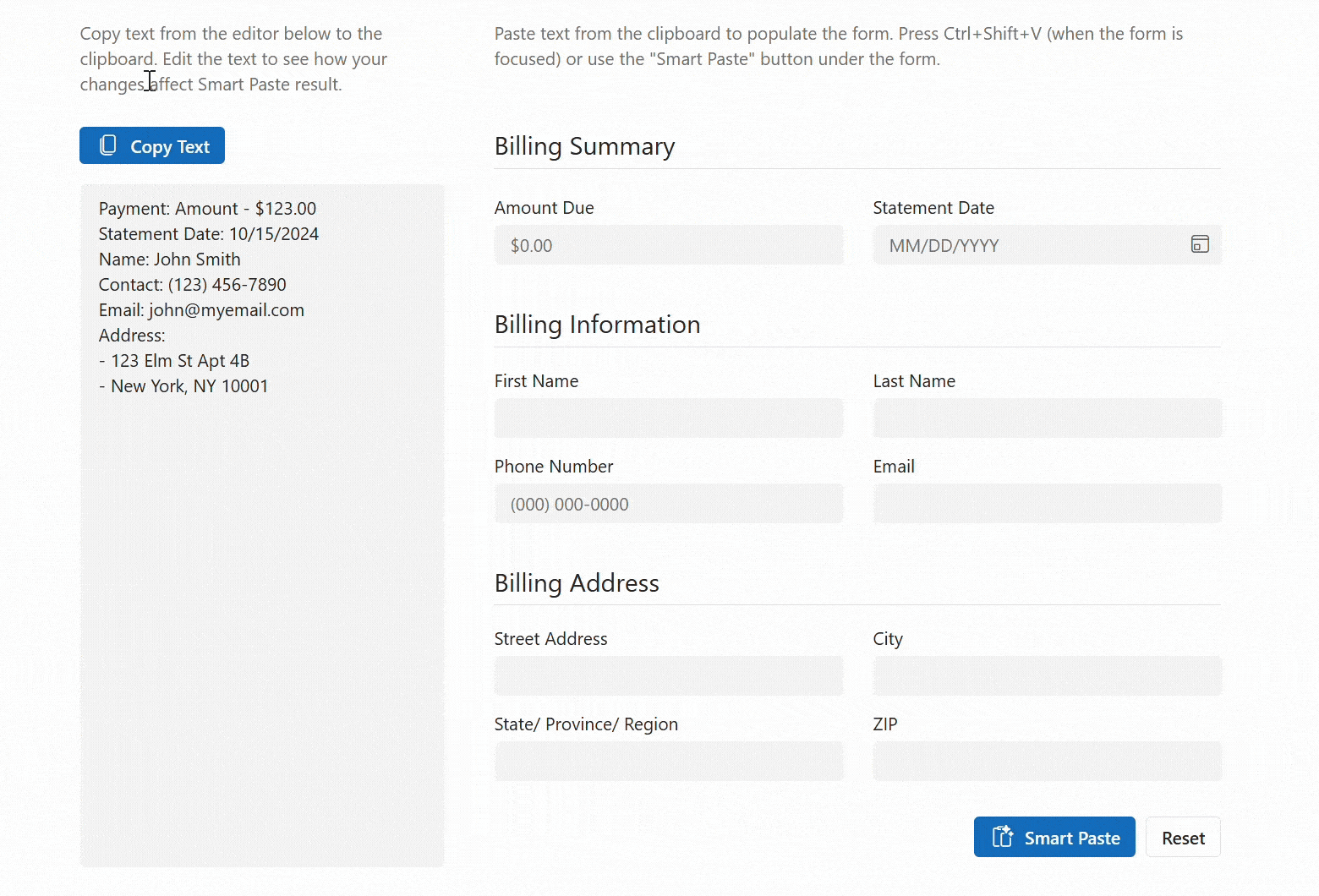
Blazor Smart Paste
We expect to add AI-powered Smart Paste functionality in v26.1.
Smart Paste will analyze clipboard content and populate each form field with relevant data (to transform traditional copy-and-paste operations).
Blazor Grid & TreeList
Focus Cells
DevExpress Blazor Grid and TreeList components will support focused cell highlighting. While these components already display focus borders during keyboard navigation, this feature adds a new highlight layer for the active cell (both when users navigate with the keyboard or select a cell with the mouse).
We will also introduce APIs to identify the focused cell, move focus to a specific cell, and react to focused cell changes.
Total Number of Records in Pager
DevExpress Blazor Grid and TreeList components will display the total number of records in the Pager to improve data navigation clarity.
.png)
Built-in Toolbar Items
We expect to add built-in toolbar items to the DevExpress Blazor Grid and TreeList components. Built-in items will include:
- Column Chooser
- Export Buttons (CSV, PDF, XLS, and XLSX)
- Search Box
Filter Row — Built-in criteria selector menu
We hope to introduce a Criteria Selector Menu for our Blazor Grid and TreeList Filter Row. This menu allows users to select filter conditions directly within the row editor and apply them to the entered value.
.png)
Filter Row — Bind Filter On Input Option
Filter Row Data Editors will support on‑input data binding mode. In this mode, DevExpress Blazor Grid and TreeList components apply filters as users type (no need to press Enter).
UI/UX Enhancements
Vertical Grid Line Visibility
We will add an option to hide column lines (vertical separators between adjacent columns) in our Blazor Grid and TreeList components.
.png)
Striped Rows
We plan to introduce an option to highlight alternating (odd) rows in our Blazor Grid and TreeList with a different style (to enhance readability).
.png)
Filter Menu Button — New On‑Hover Display Mode
DevExpress Blazor Grid and TreeList will support on‑hover display mode for Filter Menu buttons. When enabled, buttons will appear after users hover over column headers. This mode helps create a cleaner UI and avoid column caption truncation.
Custom Row Height
In v26.1, you will be able to specify a minimum row height for the DevExpress Blazor Grid and TreeList. This new option allows you to adjust visual density by increasing/decreasing row spacing and gives you more control over row appearance.
Blazor TreeList — Unbound Columns
We plan to introduce unbound column support for the DevExpress Blazor TreeList component. Unbound columns display values that are not stored in the underlying data source. Our TreeList can calculate these values on the fly or derive them from other fields. Use unbound columns to display supplementary/computed data without modifying the original data model.
Blazor Data Editors
TextBox — Password Button
v26.1 will include a built‑in button that displays/hides a password within the DevExpress Blazor TextBox editor. This button allows users to verify text they have entered.
SpinEdit & MaskedInput — Disable Arrow Keys
Both DevExpress Blazor SpinEdit and MaskedInput components will allow you to prevent a change to values when users press Up/Down arrow keys.
MaskedInput — Disable Mouse Wheel
Our Blazor MaskedInput will allow you to prevent a change to values when users scroll the mouse wheel. This option prevents accidental modifications during page/content scrolling.
Focusable Custom Buttons
Our Blazor Data Editors will include a new Focusable option for custom buttons. Once activated, users can interact with custom buttons using the keyboard.
Blazor FormLayout
New Caption Position Mode
We expect to extend the CaptionPosition property with a new Auto mode. In this mode, Form Layout will automatically switch the caption to a vertical position when horizontal space is insufficient. This behavior matches the current implementation of the Horizontal mode.
With this update:
- Auto becomes the new default caption position and enables automatic switching based on available space.
- Horizontal mode will no longer change caption position and will always display captions horizontally, regardless of layout constraints.
API Enhancements
The DevExpress Blazor FormLayout component will include the following new API members:
- TabsPosition — Specifies tab header position.
- AllowClose | AllowTabReorder — Allows users to close/reorder tabs.
- TabClosing | TabReordering — Allows you to handle tab closing/reordering actions.
- TabPageEnabled — Allows you to disable a tab page.
Blazor Dialog Service - Content Template
We hope to add a content template option for message dialogs displayed via the DevExpress Blazor Dialog Service. This option will allow you to customize the dialog body: format message text, add links, or display additional interactive elements.
private async Task OpenConfirmDialogAsync() {
    Result = await DialogService.ConfirmAsync(new MessageBoxOptions() {
        ContentTemplate = @<div>
            <p>Are you sure you want to delete this record?</p>
            <p><b>This action cannot be undone.</b></p>
        </div>,
        OkButtonText = "Yes",
        CancelButtonText = "No",
        RenderStyle = MessageBoxRenderStyle.Danger,
    });
}
Blazor Layout & Navigation
TreeView, Accordion, Menu & Toolbar — Data Mapping API Enhancements
We plan to extend Data Mapping APIs available for DevExpress Blazor TreeView, Accordion, Menu, and Toolbar components. New APIs will allow you to implement more business scenarios using data binding (instead of static Razor markup).
Use cases include:
- Build navigation from a shared model (for instance, a sitemap or route list).
- Display/hide items based on permissions/flags.
- Generate hierarchical structures (groups, child items) based on data.
<DxTreeView Data="@Data">
    <DataMappings>
        <DxTreeViewDataMapping Text="Name"
                               Key="Id"
                               BadgeText="Badge"
                               ParentKey="CategoryId"/>
    </DataMappings>
</DxTreeView>
Accordion — Cache Collapsed Content
The DevExpress Blazor Accordion will allow you to cache collapsed group content. When caching is active, the Accordion retains collapsed content and does not need to recreate it once the group is expanded.
This feature is useful for groups containing complex UI content that is costly to re-initialize (for instance, Forms with validation, Charts, or Data Grids).
Blazor Pivot Table
Server Mode
We expect to support Server Mode in the DevExpress Pivot Table component. In this mode, the Pivot Table retrieves data on demand and executes grouping, filtering, and summary calculations on the server. Server‑side data processing optimizes performance when working with large datasets and complex filters.
Drill‑Down Support
We plan to support drill‑down scenarios in the DevExpress Blazor Pivot Table. Drill‑down allows you to retrieve the underlying records used to calculate a specific summary value. This capability is useful when you need to examine the data behind aggregated results.
New APIs will include:
- CellClick — Provides access to the underlying data of the clicked cell.
- CreateDrillDownDataSource(options) — Returns a drill‑down data source.
You will be able to bind underlying data to our Blazor Grid component and allow users to review detailed records within the same page.
Blazor Themes
Fluent Themes — High Contrast Mode
DevExpress Blazor Fluent themes will support high contrast mode in our June release. They will automatically modify colors if Windows high contrast mode is active.
Blazor Reporting
Learn more: Reporting & BI Dashboard — June 2026 Roadmap (v26.1)
