Our Chart Control provides a rich set of data processing options including filtering, sorting, summary calculation and data aggregation. Based on the survey we ran in December, we decided to provide built-in support for one of the most requested features: the Histogram chart.
A typical Histogram is created by processing a one-dimensional array of values and displaying the distribution using bars of equal width. In other words, each bar represents a group with a start and an end value, and the length of the bar shows the number of data items from the source that fit into the group. In the context of Histogram charts, the groups are called bins.
We decided to implement the feature by extending our data aggregation mechanism with a new Histogram function and by introducing additional Axis Scale options to customize the Histogram layout. If you are curious about the background of these design decisions, you may be interested in the article Create a histogram that describes a similar concept used in Microsoft Excel.
Here’s how the new features work on all supported platforms.
Note: The Histogram aggregation mode is supported by the XRChart control in an XtraReport document, as well as the Web Chart Control in ASP.NET and the Chart extension for ASP.NET MVC. Since all these charting components share the same base API, the Histogram configuration methods are all very similar.
Here is some demo code to add random values to a sampleData array.
double[] sampleData = new double[500];
Random rnd = new Random();
for (int i = 0; i < sampleData.Length; i++)
  sampleData[i] = rnd.NextDouble() * 100.0;
This code adds a new Bar Series to the ChartControl.Series collection, with the DataSource property referring to the data array.
var histogram = new Series("Histogram", ViewType.Bar);
histogram.DataSource = sampleData;
chartControl1.Series.Add(histogram);
For a Histogram chart, you don’t need a Value field, since the value is calculated by the aggregation. If you use a one-dimensional value array as a data source, you don’t need to specify an Argument field either. On the other hand, if you use a .NET collection of objects as a data source, you can specify the Series.ArgumentDataMember property to refer to the required field of your object type.
Finally, these lines configure the AggregateFunction and ScaleMode properties for the Histogram chart:
var diagram = (XYDiagram) chartControl1.Diagram;
var scaleOptions = diagram.AxisX.NumericScaleOptions;
scaleOptions.AggregateFunction = AggregateFunction.Histogram;
scaleOptions.ScaleMode = ScaleMode.Interval;
The resulting chart looks like this:
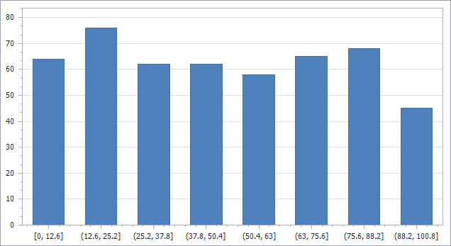
The number of bins is automatically calculated by default, using Scott’s Normal Reference Rule, which is the same method used by Microsoft Excel 2016 and later.
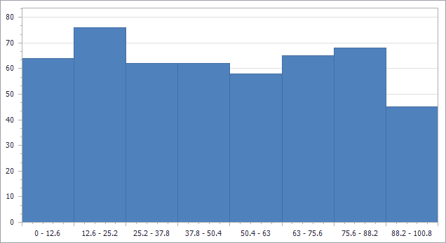
The following piece of code configures the BarWidth Property of the series to remove the gaps between the bars. We also change the tickmark position by setting the GridLayoutMode.
((SideBySideBarSeriesView) histogram.View).BarWidth = 1;
scaleOptions.IntervalOptions.GridLayoutMode =
  GridLayoutMode.GridShiftedLabelCentered;
To specify the number of bins or customize the interval size manually, use the properties DivisionMode, Count and Width of the AxisX.NumericScaleOptions.IntervalOptions object. You can also customize the Axis Label format and display the interval start and end values in a single label using a pattern like {A1} - {A2}.
scaleOptions.IntervalOptions.Pattern = "{A1} - {A2}";With these changes in place, here’s the Histogram chart:
Finally note that you can set up a Histogram chart in design mode, for instance using the Chart Designer dialog. The code samples above show all the required property settings.
Implementation For WPF
To create a Histogram chart in a WPF project, you can define the chart layout in XAML:
<dxc:ChartControl>
  <dxc:XYDiagram2D>
    <dxc:XYDiagram2D.AxisX>
      <dxc:AxisX2D>
        <dxc:AxisX2D.NumericScaleOptions>
          <dxc:IntervalNumericScaleOptions AggregateFunction="Histogram" />
        </dxc:AxisX2D.NumericScaleOptions>
      </dxc:AxisX2D>
    </dxc:XYDiagram2D.AxisX>
    <dxc:BarSideBySideSeries2D BarWidth="1" DisplayName="Series 1"
      DataSource="{Binding SampleData}" />
  </dxc:XYDiagram2D>
</dxc:ChartControl>
This code declares a property to be used as a data source and fills it with random data as before.
public List<double> SampleData { get; set; }

...

SampleData = new List<double>();
Random rnd = new Random();
for (int i = 0; i < 500; i++)
  SampleData.Add(rnd.NextDouble() * 100.0);
As you can see, the approach is similar to that for the other platforms: specify the Histogram aggregation function and enable the Interval scale mode (by using the IntervalNumericScaleOptions type). Of course the other options used above can be set in XAML as well:
<dxc:AxisX2D.NumericScaleOptions>
<dxc:IntervalNumericScaleOptions AggregateFunction="Histogram"
Pattern="{}{A1} - {A2}" GridLayoutMode="GridShiftedLabelCentered" />
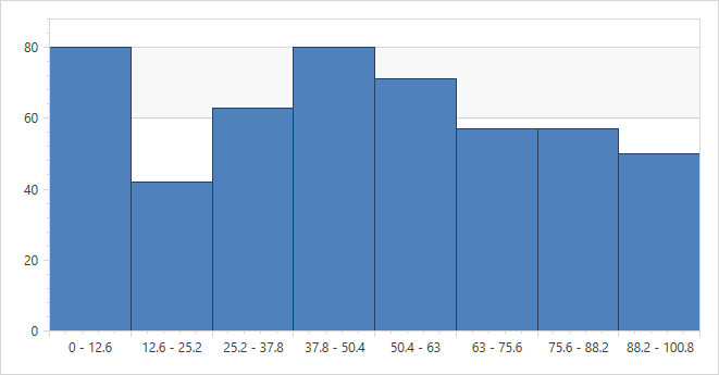
</dxc:AxisX2D.NumericScaleOptions>As expected, the resulting chart looks the same in WPF:
Please Let Us Know Your Thoughts
Please feel free to contact us if you have any feedback to share regarding the Histogram feature set. We try to cover as many common charting scenarios as possible and we are always open to suggestions.
Free DevExpress Products - Get Your Copy Today
The following free DevExpress product offers remain available. Should you have any questions about the free offers below, please submit a ticket via the
DevExpress Support Center at your convenience. We'll be happy to follow-up.