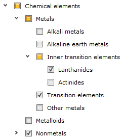
The DevExpress ASP.NET Check Box control is getting a slick new feature that's available now in the DXperience v2011.1 release. Check out the new 'Grayed' state for the ASP.NET check box that allows you to display stylish new check box controls:

Two or Three Check Box States
A check box indicates whether a particular condition is on or off. Therefore, it's just a Boolean value used to present a Yes/No or True/False selection to your end-user.
A new property called AllowGrayed has been added to our ASP.NET Check box editor control, the ASPxCheckBox. The AllowGrayed property allows a third indeterminate state for the check box. And to determine the state of the new ASPxCheckBox feature, we've added a new property called CheckState property:
- CheckState.Checked
- CheckState.Unchecked
- CheckState.Indeterminate
The third, indeterminate, state is available if the AllowGrayed property is set to true. In three-states mode, you can also use the AllowGrayedByClick property to control whether your end-users are allowed to switch the editor to the indeterminate state or whether this can only be done programmatically. Of course, the default Boolean Checked property is still there for the ASPxCheckBox. However, it only holds 2 values: {true, false}.
And we've also added the following client side methods to help check the state: ASPxClientCheckBox.SetCheckState(), ASPxClientCheckBox.GetCheckState()
Use Custom Images

Use custom images and make your check box appear more interesting and appealing. By default, a check box is represented by an image within the ASPxCheckBox editor. So it's possible to assign your own images for different check box states. Use the new CheckedImage, UncheckedImage and GrayedImage properties. And customization is easy because everything you need can be done right in the markup:
<dx:ASPxCheckBox runat="server" Text="ASPxCheckBox">
    <CheckedImage Url="Images/Checked.png" ToolTip="Checked" Width="30px" Height="30px" />
    <UncheckedImage Url="Images/Unchecked.png" ToolTip="Unchecked" Width="30px" Height="30px" />
    <GrayedImage Url="Images/Grayed.png" ToolTip="Grayed" Width="30px" Height="30px" />
</dx:ASPxCheckBox>
Bonus: Once the DXperience v2011 volume 1 is released, you can use our sample above, the custom demo check box images for your website with DevExpress ASPxCheckBox! #Winning!
Native Rendering
Our ASP.NET check box control doesn't use the HTML INPUT element and so we're able to give you themes and three check box states. However, the ASPxCheckBox also supports native rendering by exposing the Native property. Set this property to true to render ASPxCheckBox as a native HTML INPUT element of the CHECKBOX type. This reduces the render size and improves the editor's overall performance. But remember, in the native mode, the ASPxCheckBox behaves and appears as a standard HTML check box. So, it only works in two states and it does not display check box images.
Other Controls Benefit Too
Because the ASPxCheckBox control and it's code is used in other controls, you'll get added benefit of the new customization and CheckState in our other popular ASP.NET controls like:
ASP.NET RadioButton and RadioButtonList

Like the ASPxCheckBox, the DevExpress ASPxRadioButton and ASPxRadioButtonList controls both have the following new customization properties:
- CheckedImage
- UncheckedImage
- RadioButtonFocusedStyle
- RadioButtonStyle
ASP.NET TreeView

Our ASP.NET TreeView control, the ASPxTreeView, also supports the third check box state. If you turn on the TreeView 's recursive selection feature then the TreeView will set the Indeterminate state for nodes for which it's child elements have different states. Therefore, if only a few subitems in the tree hierarchy is partially selected then you'll see the 'indeterminate' state for their parent node.
And you customize the images and style for these check boxes too by using the following properties:
- ASPxTreeView.Images.CheckBoxChecked
- ASPxTreeView.Images.CheckBoxUnchecked
- ASPxTreeView.Images.CheckBoxGrayed
- ASPxTreeView.Styles.NodeCheckBox
- ASPxTreeView.Styles.NodeCheckBoxFocused
Use the server-side CheckState property to work with the third state check box in the TreeViewNode and TreeViewVirtualNode objects. And their corresponding client-side equivalent: ASPxClientTreeViewNode.GetCheckState().
ASP.NET GridView & ASP.NET GridLookup
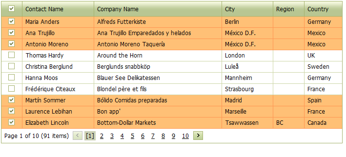
Check out the custom image improvements for the ASPxGridView and ASPxGridLookup controls:


Use custom images for the ASPxGridView using the following properties:
For single selection (ASPxGridView.SettingsBehavior.AllowSelectSingleRowOnly = true):
- ASPxGridView.ImagesEditors.RadioButtonChecked
- ASPxGridView.ImagesEditors.RadioButtonUnchecked
- ASPxGridView.StylesEditors.RadioButton
- ASPxGridView.StylesEditors.RadioButtonFocused
For multi-selection (ASPxGridView.SettingsBehavior.AllowSelectSingleRowOnly = false):
- ASPxGridView.ImagesEditors.CheckBoxChecked
- ASPxGridView.ImagesEditors.CheckBoxUnchecked
- ASPxGridView.StylesEditors.CheckBox
- ASPxGridView.StylesEditors.CheckBoxFocused
ASP.NET TreeList
The DevExpress ASPxTreeList is also getting the benefits of the new ASP.NET check box:

Like the ASPxTreeView, if you turn on the TreeList 's recursive selection feature then the TreeList will set the Indeterminate state for nodes for which it's child elements have different states. Therefore, if only a few subitems in the tree hierarchy is partially selected then you'll see the 'indeterminate' state for their parent node.
And you customize the images and style for these check boxes too by using the following properties:
For check boxes customization you can use the following properties:
- ASPxTreeList.ImagesEditors.CheckBoxChecked
- ASPxTreeList.ImagesEditors.CheckBoxUnchecked
- ASPxTreeList.ImagesEditors.CheckBoxGrayed
- ASPxTreeList.StylesEditors.CheckBox
- ASPxTreeList.StylesEditors.CheckBoxFocused
Wow, these improvements will enhance several controls at once!
What do you think of these slick improvements in the DevExpress ASP.NET CheckBox control? Drop me a line below, thanks.
Save time and money...
Save time and money with high quality pre-built components for ASP.NET, Windows Forms, WPF, Silverlight and VCL as well as IDE Productivity Tools and Business Application Frameworks, all backed by world-class service and support. Our technologies help you build your best, see complex software with greater clarity, increase your productivity and create stunning applications for Windows and Web in the shortest possible time.
Try a fully-functional version of DXperience for free now: http://www.devexpress.com/Downloads/NET/

Free DevExpress Products - Get Your Copy Today
The following free DevExpress product offers remain available. Should you have any questions about the free offers below, please submit a ticket via the
DevExpress Support Center at your convenience. We'll be happy to follow-up.