DevExtreme: Advanced Responsive Layout

Mobile devices come in different screen sizes and resolutions and nearly all of them are connected to the world wide web (aka internet). Due to this variety, web developers have a tough job to make sure our websites look good for both desktop and mobile browsers.
To help you make responsive websites, these DevExtreme widgets have features that are optimized for use on a mobile device: dxDataGrid, dxForm, dxMenu, dxToolBar and dxScheduler. For example, compare the dxDataGrid on tablet and phone devices:
Advanced Responsive Layout
Starting with the v16.1 release, we added options that allow you to control and adjust the appearance of the widgets for different resolutions. In this post, I'll highlight the different widgets and the code you need to take advantage of the new responsive features.
dxDataGrid - Hide Columns
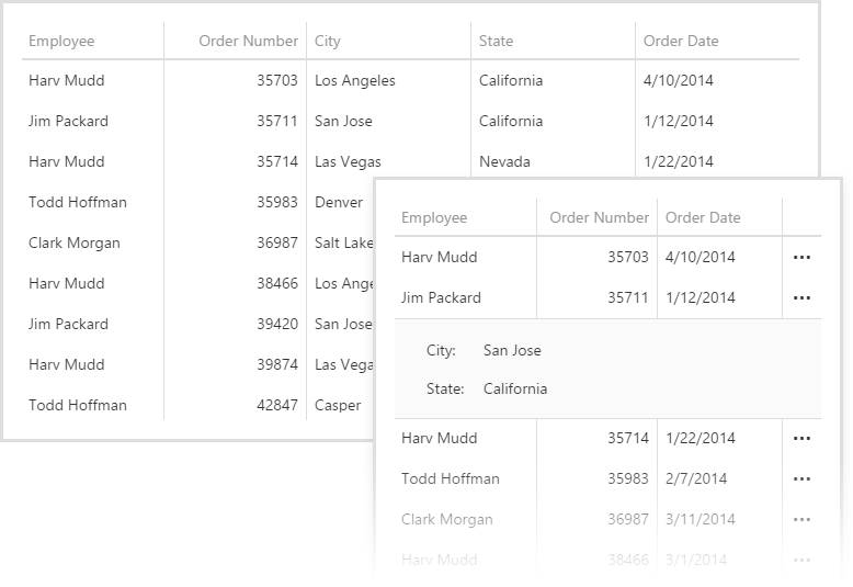
Advanced responsive layout is our term for providing you several ways to adapt the dxDataGrid widget for different resolutions. If you have a smaller screen size then you can decrease the overall grid's width by hiding columns:
gridOptions: {
    // …
    columnHidingEnabled: true
}
By default, the columns on the right will be hidden first when the widget width is reduced. You can change the order that the columns are hidden in. For example, here the 'State' column will be hidden first, then 'City', and finally it will default back to right most columns hidden first:
gridOptions: {
    // …
    columns: [{
        dataField: "Employee",
        width: 130
    }, {
        dataField: "OrderNumber",
        width: 130
    }, {
        caption: "City",
        dataField: "CustomerStoreCity",
        hidingPriority: 1
    }, {
        caption: "State",
        dataField: "CustomerStoreState",
        hidingPriority: 0
    }, {
        dataField: "OrderDate",
        dataType: "date"
    }]
}
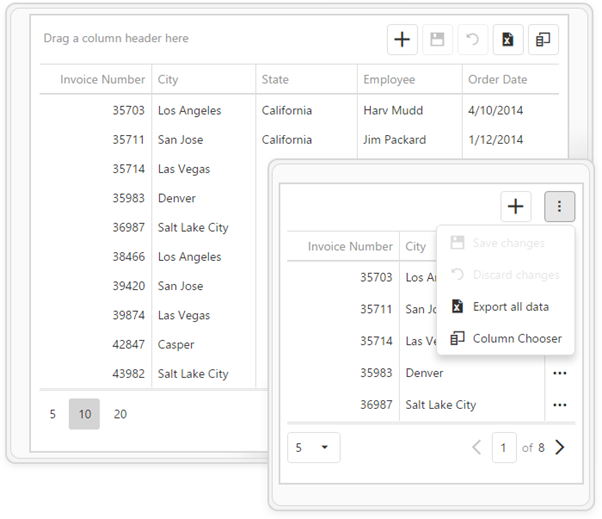
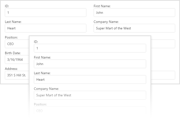
dxDataGrid - Column Chooser
For mobile devices, it's useful to use checkboxes for the 'Column Chooser' dialog:
gridOptions: {
    // …
    columnChooser: {
        enabled: true,
        mode: "select"
    },
}

dxDataGrid - Context Menu
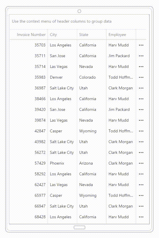
To group data by a column, typically, you would drag the column header and drop it over the group panel. When you have a larger screen size, this works great. However, this becomes harder when the screens are smaller. Therefore, we added a context menu option for mobile devices which makes grouping easy:
gridOptions: {
    // …
    grouping: {
        contextMenuEnabled: true,
        expandMode: "rowClick"
    }
}
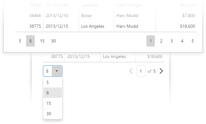
dxDataGrid - Pager
The dxDataGrid's pager has also been adapted to display as a dropdown if there are several pages and the screen size is smaller. This saves room and works great for mobile devices:
dxForm - Columns and Screen Size
By default, the dxForm widget has the same layout for all screen resolutions. However, you can manually specify the dependency between screen size and column count. In the sample below, we've defined the dxForm to only display a single column when the screen width is less than 600 pixels.
formOptions: {
    // …
    screenByWidth: function(width) {
        if( width < 450)
          return 'xs';
        if( width < 600)
          return 'sm';
        if( width < 750)
            return 'md';
        return 'lg';
    },
    colCountByScreen: {
         lg: 2,
         md: 2,
         sm: 1,
         xs: 1
    },
}
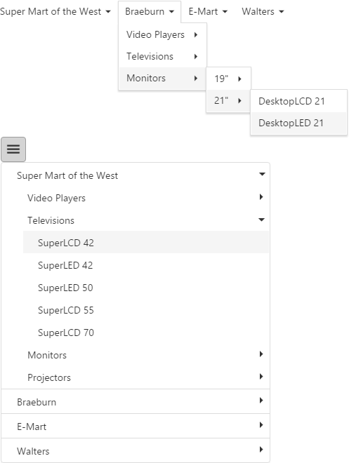
dxMenu - Hamburger Style
By default, the dxMenu widget will collapse the root menu to a list icon (hamburger menu icon). This saves space on mobile devices as all the submenus are displayed as a tree structure similar to dxTreeView widget.
To enable it:
menuOptions: {
    // …
    adaptivityEnabled: true
}
dxToolbar - Hide Items
The dxToolbar provides you the capability to display several items in the toolbar. However, for smaller screens, the dxToolbar may become too wide to fit on the screen. To help you solve this dilemma, dxToolbar can hide its items inside a drop down menu using the default item template.
To hide items in a dropdown, assign "auto" to the locateInMenu field of an item object. This will move the item to the context menu if the screen is not wide enough to display all toolbar items.
toolbarOptions: {
    // …
    items: [{
        location: 'center',
        locateInMenu: 'never',
        text: "Caption"
    }, {
        location: 'after',
        widget: 'dxButton',
        locateInMenu: 'auto',
        options: {
           icon: "plus",
        }
    }, {
        location: 'after',
        widget: 'dxButton',
        locateInMenu: 'auto',
        options: {
          icon: "edit",
          text: "Edit",
        }
    }, {
        locateInMenu: 'always',
        text: 'Save',
    }, {
        locateInMenu: 'always',
        text: 'Print',
    }, {
        locateInMenu: 'always',
        text: 'Settings',
 }]
}

dxScheduler - Agenda Mobile View
The dxScheduler widget is fantastic for displaying appointments and schedules. However, it can be too large for mobile screens. To help you, the dxScheduler provides the Agenda view that supports small screen sizes:
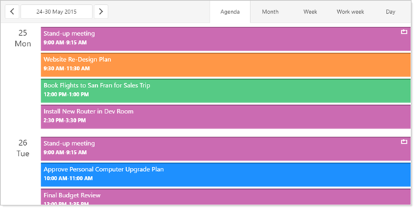
You can learn more about dxScheduler's Agenda view here.
Advanced Responsive Layout, ftw!
The code samples and images above highlight how useful the DevExtreme widgets are in designing a rich client-side website that provides responsive behavior.
What do you think about the 'Advanced Responsive Layout' feature of the DevExtreme widgets? Drop me a line below, thanks.
Create highly responsive web apps for touch-enabled devices and traditional desktops.
From desktops to mobile devices, DevExtreme HTML5 Data Grid delivers the flexibility you’ll need to build apps that reach the widest audience and deliver touch-first user experiences to power your next great interactive website.
Download a free and fully-functional version of DevExtreme now: Download DevExtreme
Free DevExpress Products - Get Your Copy Today
 The DevExpress Team