The third Beta of the DevExpress UI for Blazor is now available. This update includes a series of enhancements for both our Blazor Data Grid and Scheduler component (see below). It also includes support for Blazor Preview 9 and updates to our online documentation.
Blazor Preview 9 Support
Last week, Microsoft announced the release of .NET Core 3.0 Preview 9. Our Blazor components fully support Preview 9 with our Beta 3 release.
Data Grid
We've added four major features to our Blazor Data Grid:
Column Reorder
You can now drag a column header and reposition it to change column order. Two arrows indicate valid drop positions.

Note: The edit form displays editors in the same order as columns in the grid. You can use the EditFormVisibleIndex property to arrange editors in the edit form as needed.
Column Groups
Enable the Group Panel within the Blazor Data Grid to allow end-users to group data by individual columns.
<DxDataGrid … ShowGroupPanel="true">
Note: Group panel column order is of consequence whenever you group data against multiple columns. The grid groups data by column values sequentially (starting from the leftmost column in the group panel).
Column order in the group panel matters when you group data by several columns. The grid groups data by each column one by one (starting from the left).
To exclude a column from grouping, set its AllowGroup property to false.
<DxDataGridColumn AllowGroup="false"></DxDataGridColumn>
To group data in code, specify the column's GroupIndex property to define its grouping priority. The lower the value, the higher a column's priority in grouping. In the following example, our Blazor Data Grid first groups data by a column with GroupIndex = 0 and then - by a column with GroupIndex = 1.
<DxDataGridComboBoxColumn GroupIndex="0"></DxDataGridComboBoxColumn>
<DxDataGridColumn GroupIndex="1"></DxDataGridColumn>
To see this feature in action, please refer to our Data Grid online demo.
By default, grouped column data is not displayed. Set the ShowGroupedColumns property to true to display data.
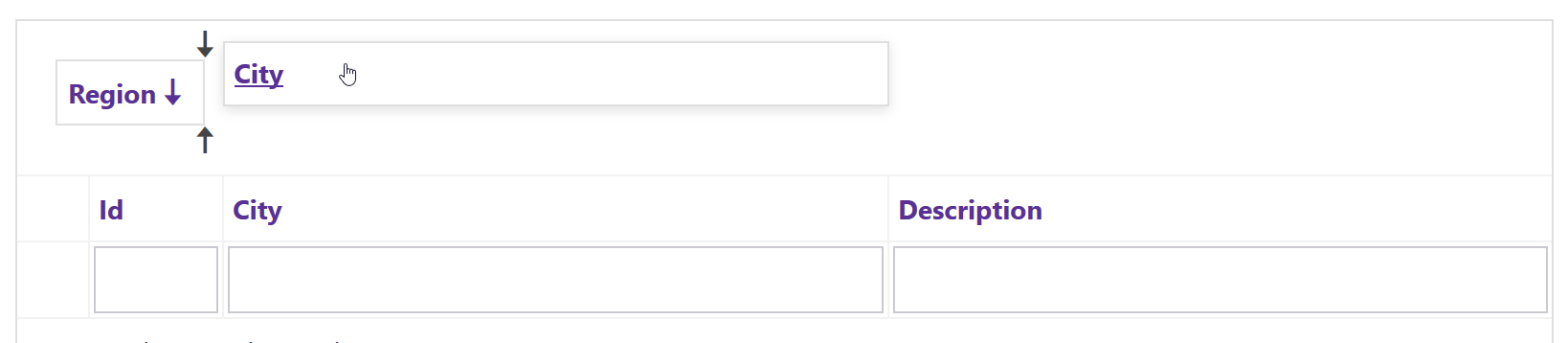
Master-Detail Layout
Our Blazor Data Grid allows you to build master-detail layouts ( DetailRowTemplate ) of any complexity and depth. Our template implementation is not limited and allows you to address a broad range of usage scenarios..
To see our master-detail implementation in action, please review our online Master-Detail View demo. The template used within this demo contains a detailed Data Grid inside a plain HTML.
Multiple Row Selection
To select multiple rows in the DevExpress Blazor Data Grid, click a row, a command checkbox (if shown), or use our Data Grid API. The SelectionMode property allows you to specify selection mode:
-
Single Selection (default behavior) - Only one data row can be selected at any one time. See our Single Data Row Selection online demo.
-
Multiple Selection - Multiple data rows can be selected at any one time. See our Multiple Data Rows Selection online demo.
-
Optimized Multiple Selection - In this mode, the component does not store row data objects and information about all selected rows - The grid maintains row key values instead (make sure the KeyFieldName property is initialized). If you select all rows via the Grid’s UI or its API and then unselect multiple rows, the component only stores unselected row keys (and vice versa). This reduces the amount of stored data. We recommend you use this mode if your Blazor Grid contains a significant number of rows. See our online demo for more information.
-
None - Row selection is disabled.
Scheduler
Appointment Editing
DevExpress Scheduler for Blazor now includes a popup edit form to edit appointment data. The default edit form only displays primary data input fields (it hides others). Click the "Expand Form" button in the top-right corner to display all available fields.
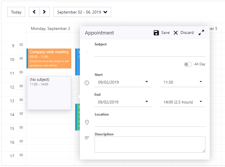
To create a new appointment quickly, select a time range in the Scheduler. The Scheduler component displays an appointment within the view and automatically invokes the edit form:

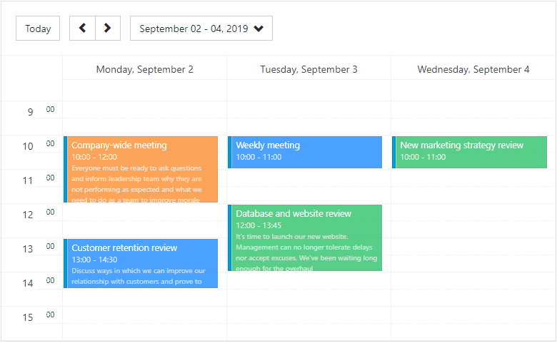
Drag-And-Drop and Resize Appointments
Though you can change appointment time range within the Edit Form, our Blazor Scheduler component allows you to reschedule the appointment via drag & Drop (drag the appointment to a new time cell within the current view or resize the appointment to change the current time range):
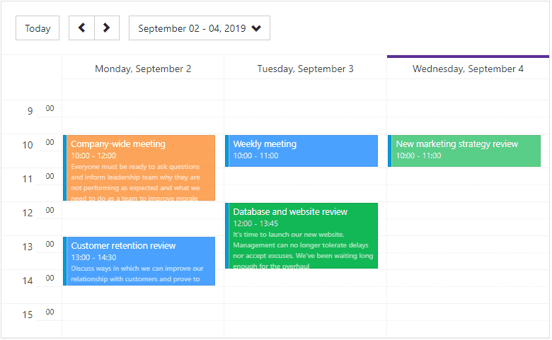
Tooltip
Click or tap on an appointment to view its full description. In addition, the Scheduler displays a tooltip with detailed appointment information:
Note: At present, all Scheduler features described herein are enabled by default. We will give you the ability to customize and disable these features in future versions.
Documentation
I am happy to announce that our online Blazor documentation is now available.
Feedback
Your feedback matters and I would love to hear how you plan to use these new features in your next Blazor application.
Free DevExpress Products - Get Your Copy Today
The following free DevExpress product offers remain available. Should you have any questions about the free offers below, please submit a ticket via the
DevExpress Support Center at your convenience. We'll be happy to follow-up.