Blazor Components - .NET Core 3.1 Support and Enhancements for the Data Grid, TreeView, and Editors (v19.1.10)

In this post, I'll discuss enhancements to the DevExpress UI for Blazor in the v19.1.10 release.
.NET Core 3.1 Support
Microsoft recently announced the release of .NET Core 3.1:
It’s really just a small set of fixes and refinements over .NET Core 3.0, which we released just over two months ago. The most important feature is that .NET Core 3.1 is an long-term supported (LTS) release and will be supported for three years.- Richard Lander, PM .NET Team
With the v19.1.10 release, our Blazor components now support .NET Core 3.1.
Data Grid Enhancements
HTML Decoration
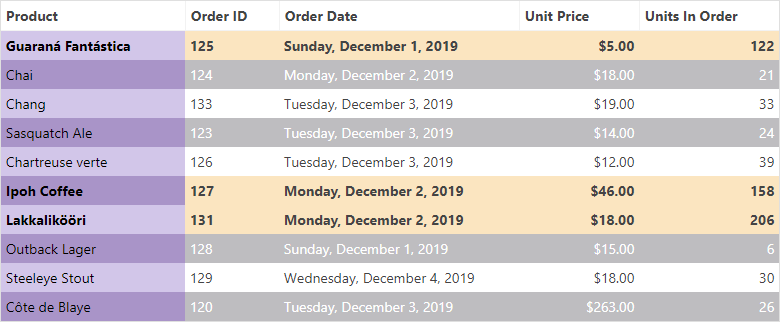
Our Blazor Data Grid now allows you to decorate row and cell styles. For example, you can highlight important rows or cells using this new feature.
Our Data Grid ships with two new events: HtmlRowDecoration and HtmlDataCellDecoration. They can be used to customize row and cell appearance as needed. DataGridHtmlRowDecorationEventArgs and DataGridHtmlDataCellDecorationEventArgs event arguments provide information about the current row and cell.
Row Click
A popular customer request is the ability to respond when the end-user clicks on a row. This release includes a new RowClick event that fires when a grid data row is clicked. The DataGridRowClickEventArgs event argument object provides information about the current row and cell.
The code sample below illustrates how to use the RowClick event to start data editing:
<DxDataGrid @ref="@grid"
            Data="@forecasts"
            RowClick="@OnRowClick" ...>
    ...
</DxDataGrid>

@code {
    DxDataGrid<WeatherForecast> grid;
    WeatherForecast[] forecasts;    ...
    void OnRowClick(DataGridRowClickEventArgs<WeatherForecast> args)
    {
        grid.StartRowEdit(args.DataItem);
        args.Handled = true;
    }
}
TreeView - Load Nodes on Demand
With this release, you can bind our Blazor TreeView component with complex or dynamically generated hierarchical structures in a more effective manner. When the LoadChildNodesOnDemand setting is enabled, the component does not load child nodes until a parent node is expanded for the first time. This optimizes performance because the TreeView will only request the required data from your data source.
You can also load child nodes on demand in either bound or unbound modes. If you bind the Blazor TreeView component to a data source, make sure to assign a lambda expression that specifies whether the data item has children (using the HasChildrenExpression property).
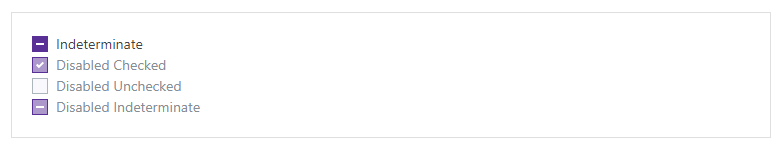
New Blazor CheckBox Component
We now offer a Blazor СheckBox component with extended state support: checked, unchecked and indeterminate:
Bind to a Model
You can bind the CheckBox to a specific model property using the Checked property:
<DxCheckBox @bind-Checked="@Value">...</DxCheckBox>

@code {
    bool Value;
}
The CheckBox component can also be bound to the following standard data types:
Bind to a Custom Type
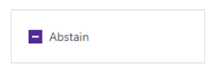
If you want to bind our CheckBox to a custom type, set the ValueChecked, ValueUnchecked and ValueIndeterminate properties as necessary.
The following example demonstrates how to bind our Blazor CheckBox to a custom enumeration using the three properties:
<DxCheckBox @bind-Checked="@Value"
    ValueChecked="@Opinion.Yes"
    ValueUnchecked="@Opinion.No"
    ValueIndeterminate="@Opinion.Abstain">@Value.ToString()</DxCheckBox>

@code{
    enum Opinion { Yes, No, Abstain }
    Opinion Value = Opinion.Abstain;
}
Toggle View for Mobile
Our Blazor CheckBox also provides a toggle to change its appearance on mobile and tablet devices. Use the CheckType property to use either the standard Checkbox component or the Switch component for mobile:
<DxCheckBox CheckType="@CheckType.Checkbox"/>
<DxCheckBox CheckType="@CheckType.Switch""/>

Custom Appearance
You can customize the appearance of our Blazor CheckBox using images and other HTML content:

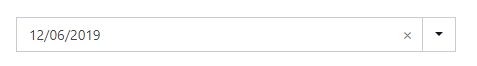
Blazor Data Editors - Null Values and Clear buttons
You can bind the Spin Edit and Date Edit components to nullable data types. Currently, the following Blazor components can be bound to nullable properties:
- Check Box
- Combo Box
- Date Edit
- Spin Edit
- Text Box
The following code demonstrates how to bind to a nullable member:
<DxDateEdit @bind-Date="@DateTimeValue"
    ClearButtonDisplayMode="DataEditorClearButtonDisplayMode.Auto">
</DxDateEdit>

@code {
    DateTime? DateTimeValue { get; set; }
}
In the sample above, the ClearButtonDisplayMode setting is optional. This setting allows the editor to display a Clear button when the editor has a non-null value:
Form Layout - CaptionFor
With this release, our Blazor Form Layout component will automatically bind a layout item's caption to a DevExpress editor located inside it. If you wish to assign a custom identifier to the caption's for attribute, use the CaptionFor property.
If you place a custom editor inside the item template, assign a unique identifier to the layout item's CaptionFor setting and to your custom editor's ID property:
<DxFormLayoutItem Caption="Contact Name:" CaptionFor="name_text_box">
    <Template>
        <input value="@Name" id="name_text_box">
    </Template>
</DxFormLayoutItem>
XAF Blazor
For our XAF customers, we have begun rigorous testing of the DevExpress Blazor control suite within XAF, our business application framework for .NET developers. For more information, please follow the XAF Team blog.
Feedback
As always, your feedback matters. Please share your thoughts with us - we want to do everything possible to earn your business now and into the future.
Free DevExpress Products - Get Your Copy Today
 The DevExpress Team