Blazor UI - 2020 Roadmap

In this post, I’ll summarize our Blazor UI release plans for the first half of 2020. Should you have any questions about the products/features listed herein, feel free to submit your comments/questions below.
As always, thank you for your continued support. Go Blazor!
Localization
(available in 19.2 Beta)
You will be able to localize Blazor components (Blazor Server or Blazor WebAssembly) using predefined translations. You can create custom translations for your app via the DevExpress Localization Service.

New Components
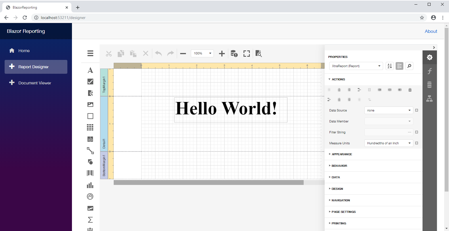
Reporting Components
Last December, we detailed how you can use our reporting tools within your blazor apps. By mid-year, we'll introduce new Blazor Reporting components which will provide better integration to help you create and manage reports.
File Manager
We're creating a new Blazor File Manager component to manage remote file system using standard file management operations.

Upload
Upload files to your server or a remote service. Our Blazor Upload component will ship with asynchronous multiple file upload, large file upload, and file extension validation support.

Toolbar
Our upcoming toolbar component will allow you to create useful tool buttons for popular end-user actions.

TagBox
The Tag Box control will allow your users to select values from a drop-down list or to enter them manually.

Button
Our Blazor Button component will support Contained, Outline, and Text render styles. It will ship with ten Bootstrap styles. You’ll also be able to assign icons or use a template to create a fully customized appearance.

Data Grid
Asynchronous Data-Aware Operations
(available in 19.2 Beta)
This new API will allow you to execute database operations and await completion without blocking app code execution. Asynch data-aware operations will help you deliver more responsive solutions - even when connected to remote databases over slow networks.
Custom Data Binding
(available in 19.2 Beta)
You'll be able to bind our Blazor Data Grid to a custom data source, including Web API services.
CheckBox Column
(available in 19.2 Beta)
Our new Blazor CheckBox column will allow you to display Boolean values within the Blazor Data Grid.
Page Size Selector
Your end-users will be able to change data page size for the Data Grid using a drop-down UI element on the pager.

Go To Page
End-users will be able to open a specific data page using the "Go To Page" edit box (displayed within the Data Grid's pager).
Keyboard Support
This feature will allow your end-users to navigate Data Grid rows via the keyboard.
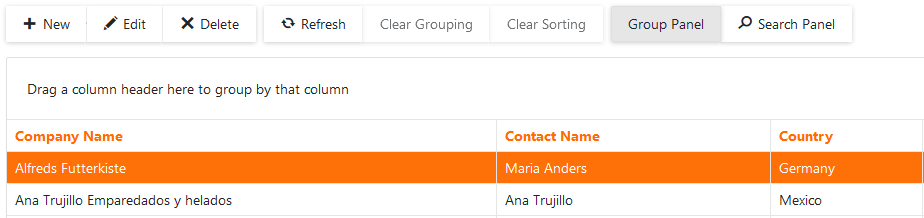
New Header Filter menu
End users will be able to filter data by selecting a corresponding item in the Header Filter menu. You will be able to add custom items to the Header Filter menu as needed.

New Binary Image column
The Binary Column will allow you to display image data. You can bind this column to a property that contains images. To replace an image, the end-user should start row editing and upload a new image using the default Upload component available within the edit form.
New Unbound column
You will be able to use unbound columns to calculate column values based on custom algorithms (after retrieving data from the database).
Inline Edit Mode
Inline Edit mode will allow you to directly edit an individual row without displaying the Grid’s edit form.
Row Template
Row templates will allow you to create custom layouts for Data Grid rows.
Automatically Resize to 100% Height
When set to 100%, our Blazor Data Grid will automatically fill available height within the container element.
Built-In Edit Forms validation
If you use an edit form with default column editors, you no longer need to use the Blazor’s built-in validation. Our Blazor Data Grid will validate data automatically.
Custom Values in New Rows
At present, our Blazor Data Grid displays default values in new row cells. We will give you the ability to set custom values for new rows.
Search Panel
This UI element is useful when an end-user needs to search a specific value by several columns at the same time.Specific columns can be programmatically excluded from the user search.
Toolbar
This UI element will allow you to display toolbar buttons for custom operations and also popular operations used by your end-users.
Context Menu
The context menu displays popular user actions based on the user interaction, for example, a mouse click or finger tap on a UI element. You can hide default items or add custom ones to the popup menu.
ComboBox
Multiple Columns
The highly requested multi-column layout feature will be available for our Blazor ComboBox in the next major release.
Filtering Across Columns
This feature will allow you to find items by a specific value.
Templates
You'll be able to create custom appearances for ComboBox elements using item, header or footer templates.
Drop-Down Position Correction
When a ComboBox is located at the bottom of a web page, the component’s drop-down window might partially appear outside of the page. We plan to correct the window’s position automatically to always display within the available page space.
Calendar
Gestures
A new gesture will allow you to change months by swiping the current month in our Calendar.
Month and Year Navigation
Your end-user will be able to quickly navigate between months and/or years to find a specific date.
Common Editor Enhancements
Interactive Null Text
(available in 19.2 Beta)
Many of you use null text to display an editor's placeholder. However, it disappears once the component has focus. We are going to keep null text visible until the user enters values.
Loading Image
If ComboBox or List Box is bound to a large data set, data loading operation may take some time. We plan to display a loading image for these editors to indicate the loading process.
Free DevExpress Products - Get Your Copy Today
 The DevExpress Team