Data Grid for Blazor - Group and Total summary, Column Resize, Fixed Columns, and more (available in v20.2)

As you may know, last week marked the official release of v20.2, our next major update. If you missed the announcement or would like to know more about this release, please refer to the following webpage for more information: "What's New in v20.2".
v20.2 includes several new Blazor UI components. It also includes a series of new features/capabilities for existing DevExpress Blazor UI controls. In this post, I'll focus on the most recent enhancements to our Blazor Data Grid and Blazor Data Editor components. Rest assured, I'll discuss other Blazor enhancements in future posts.
Before I proceed, a quick word about v20.1 and our expired free Blazor UI component offer. If you downloaded v20.1 free-of-charge, you are entitled to use v20.1 as long as you wish. With our v20.2, our Blazor UI controls are no longer available free-of-charge. Should you require additional information on v20.1, please forward your comments to clientservices@devexpress.com.
.NET 5.0 Support
Microsoft should launch .NET 5.0 in November, but you can test .NET 5.0 with our Blazor components today. v20.2.3 supports .NET 5.0 Release Candidate 2.
To learn more about what's new for Blazor in .NET 5, watch this interview with Microsoft PM for Blazor, Dan Roth.
Once .NET 5 ships officially, we’ll update our v20.2 Blazor product line accordingly.
DevExpress Installer
We've made our Blazor components easier to download and install. DevExpress Blazor UI components can now be installed via the DevExpress Unified Installer.
If you own an active ASP.NET/DXperience/Universal Subscription, you can download our Unified Installer here: Download Manager.
While you can still install our Blazor components with NuGet, consider using our Unified Installer if the following is of value to your business:
- Demos: When you install our Blazor UI components via our Unified Installer, you’ll have access to all DevExpress Blazor demos locally. Full demo source code is also installed so you can load any demo within your local Visual Studio environment.
- Project Templates: The DevExpress Unified Installer includes our Blazor project templates. If you require project templates, installation via our Unified Installer is the way to go.

Blazor Data Grid
Total and Group Summary Computation
Our Blazor Grid can compute summaries (using aggregate functions such as SUM, MIN, MAX, etc) for both the entire contents of the grid and each individual group level. "Total" summaries are calculated across all grid records and displayed within the grid’s footer. "Group" summaries are calculated across rows in individual groups and displayed within group rows. If you have questions about this particular capability, please post your question in the comment section below.
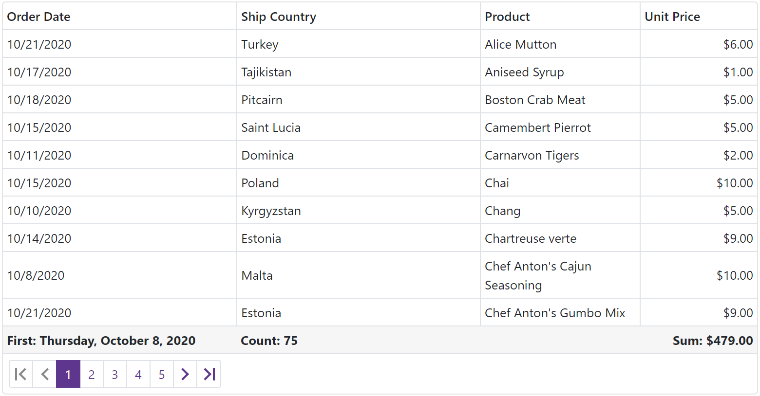
Blazor Data Grid – How to Create Total or Group Summaries
To create Total or Group summaries, simply add DxDataGridSummaryItem objects to the TotalSummary or GroupSummary collection.
Key DxDataGridSummaryItem properties are summarized below.
- Field – Specifies the name of the data field whose values are used to calculate the summary.
- SummaryType – Specifies the aggregate function (SUM, MIN, MAX, AVG, etc) used. – Specifies the appropriate aggregate function (SUM, MIN, MAX, AVG, etc) used.
- ShowInColumn – Specifies the name of the column used to display the summary.
- DisplayFormat – Specifies the desired summary display format. The ‘{0}’ placeholder returns the summary value and ‘{1}’ returns the parent column’s caption.
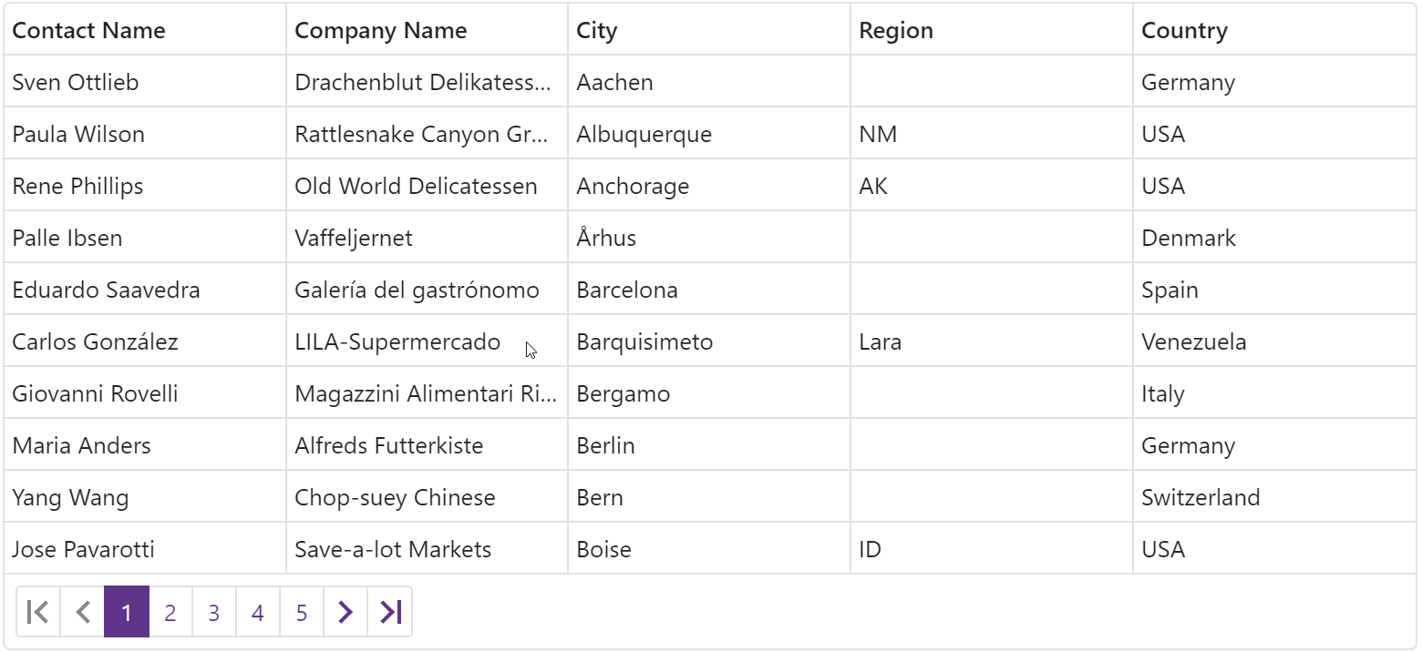
Resize Columns
The Data Grid allows users to resize columns as needed. Users can move the mouse pointer over the right border of a column to display a double-sided arrow. Users can drag column border to change column width.
To enable column resize operations, set the ColumnResizeMode property to one of the following values:
- DataGridColumnResizeMode.NextColumn – The width of the column to the right changes, but the Data Grid's width does not change.
- DataGridColumnResizeMode.Component – The Data Grid's width changes, but the width of other columns does not change.
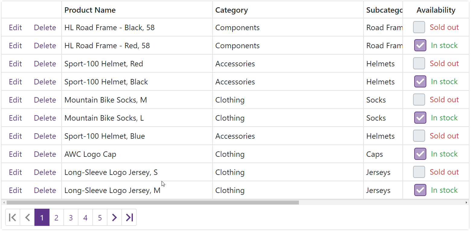
Fixed Columns
Our Blazor Data Grid allows you to anchor columns to its left or rightmost edge. Fixed columns can help improve data readability as columns fixed to the right or left remain visible when users scroll the grid horizontally. To fix a column, set its FixedStyle property to DataGridFixedStyle.Left or DataGridFixedStyle.Right.
Other Recent Enhancements
In case you missed it, we added the following Data Grid features in a recent minor release:
New Popup Edit Form
End-users can now edit column values within a popup form. To activate Popup Edit Form mode, set the EditMode property to PopupEditForm.

Incremental Filtering
End-users can filter list items dynamically, based upon the text typed into the editor's input box. Filter modes include: Contains and StartsWith.

Blazor Data Editors
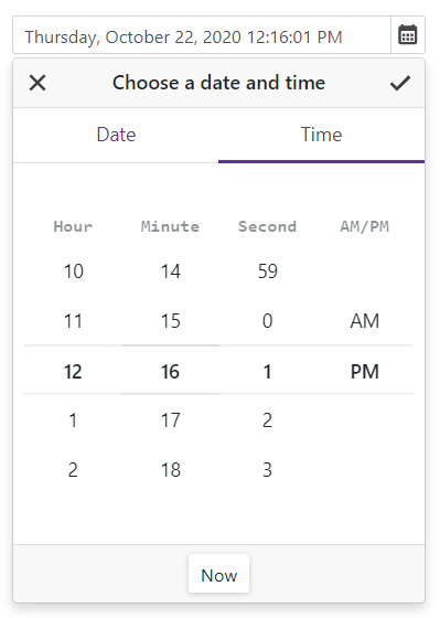
New Time Editor
This release ships with a new time editor for Blazor:

Our Time Edit component includes the following features:
- TimeSpan / DateTime binding
- Integrated drop-down time picker
- 12 / 24-hour format support
- Min / max time support
- Read-only and disabled states
- Nullable time
- Clear button
Date Edit - Display Time
The Date Edit component can now display time. Set the TimeSectionVisible property to true to add the time section to the component.
To format a time value in display and edit modes, use the DisplayFormat and Format properties.
Should you have any questions about these new features, or if you require assistance on our Blazor product line, please comment below. Please remember, that the features described in this post relate to v20.2. v20.2 is not available free-of-charge. The capabilities described in this post are available to those who own an active ASP.NET/DXperience/Universal Subscription.
Free DevExpress Products - Get Your Copy Today
 The DevExpress Team