Blazor UI Components - Grid and Stack Layout for Blazor - Responsive Page Layouts (available in v20.2)

As you may already know, v20.2 includes three new Blazor components - 'Grid Layout', 'Stack Layout', and 'Layout Breakpoint'. Use the first two layout components to create custom page layouts as needed. Once complete, use our new Layout Breakpoint component to deliver responsive layouts that adapt to different screen sizes.
New Blazor Grid Layout
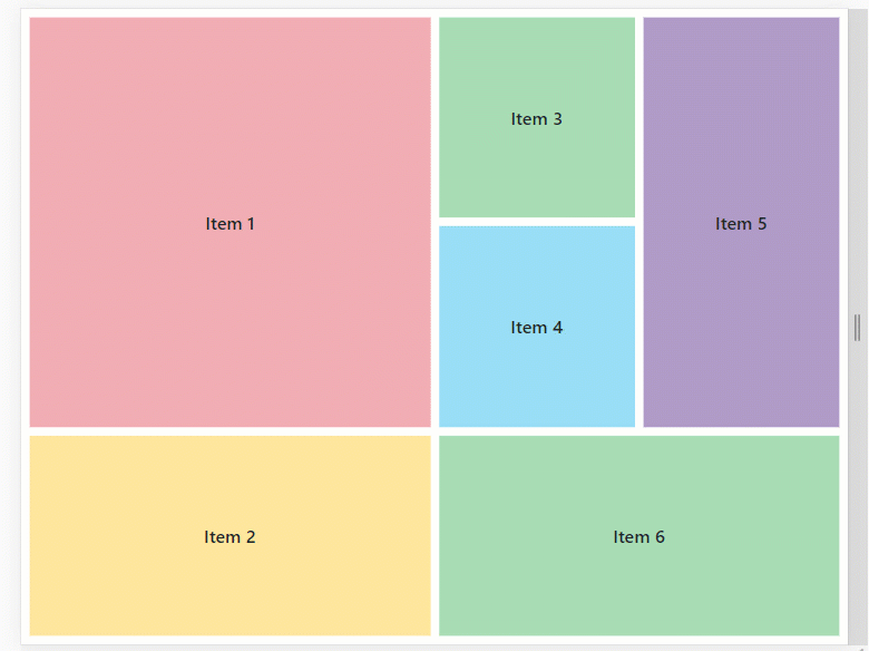
Our new Grid Layout for Blazor allows you to arrange UI elements across a page. The component is based on CSS Grid Layout. To create a layout, simply define rows and columns, specify their size (Height, Width) and distance between them (RowSpacing, ColumnSpacing). Once ready, position layout items such as our Blazor Data Grid or other Blazor component within individual cells. A single item can span multiple rows and columns:

With this new UI element, you can address a variety of use cases. In the following image we use the Grid Layout to create a Dashboard style UI:

Demo | Documentation | GitHub Example
Adaptive Blazor Apps
Use the new LayoutBreakpoint component to create a responsive grid layout.
New Blazor Stack Layout
The new Stack Layout for Blazor allows you to organize UI elements across a one-dimensional stack.
You can stack items using a vertical or horizontal orientation. To specify the item size (auto, pixel, percentage, etc.), use the Length property.
You can also use the LayoutBreakpoint component to adapt a stack layout to different screen sizes.
Layout Breakpoints
The new Blazor Layout Breakpoint component allows you to adapt a page layout to different screen sizes. You can use breakpoints to create a responsive Grid Layout and Stack Layout (or apply to any other component as necessary).
You can set up breakpoints in two different ways: either select from predefined sizes (DeviceSize) or set custom limits for width (MinWidth / MaxWidth).
Demo | Documentation | GitHub Example
Should you have any questions about these new features, or if you require assistance on our Blazor product line, please comment below. Please remember, that the features described in this post relate to v20.2. v20.2 is not available free-of-charge. The capabilities described in this post are available to those who own an active ASP.NET/DXperience/Universal Subscription.
Free DevExpress Products - Get Your Copy Today
 The DevExpress Team