Blazor UI Components - New Menu (Available now in v20.2.5)

In this post, I'll discuss our new Blazor Menu component available as part of the DevExpress UI for Blazor (v20.2.5).
New Menu
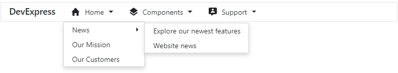
Our Menu for Blazor allows you to add an adaptive menu to your Blazor application. Blazor Menu items are stored in the Items collection. Each item can display an icon, text, or both.
Orientation
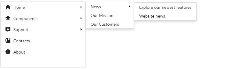
The Menu's default orientation is Horizontal (menu items are side-by-side). Use the Orientation property to change the menu to Vertical (menu items are stacked).
Adaptive
The DisplayMode property allows you to optimize component layout based on device type:
- Desktop – Use this mode for devices with large screens.
- Mobile – Use this mode for mobile devices.
- Auto – In this mode, the component adapts to device type automatically.
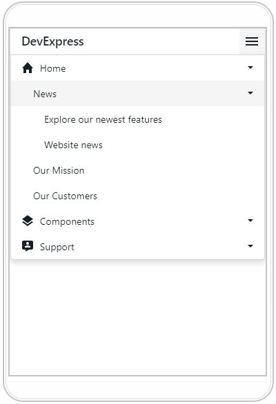
The CollapseItemToIconMode, CollapseItemToHamburgerMenu, and AdaptivePriority properties allow you to fine-tune adaptive mode to address specific business needs.

Templates
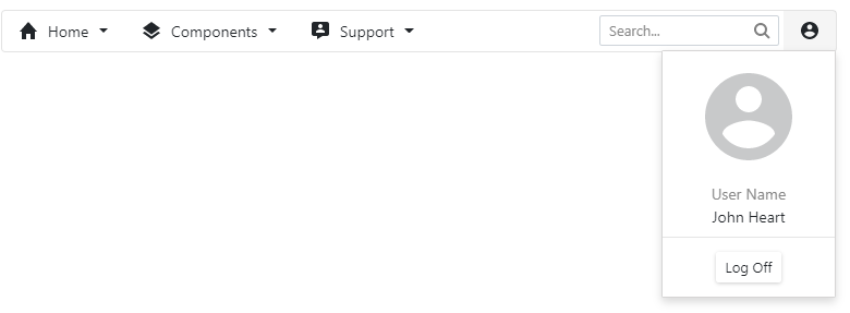
Our Blazor Menu component allows you to customize the layout and appearance of menu items and associated elements via templates. You can apply a template to all items or to an individual item. Individual templates override common templates.
- DxMenuItem.Template and DxMenu.ItemTemplate - A entire item
- DxMenu.ItemTextTemplate and DxMenuItem.TextTemplate - Item text
- DxMenu.SubMenuTemplate and DxMenuItem.SubMenuTemplate - Item submenu
Feedback
Leave a comment below and let us know how you're using our Blazor Layout components in your web applications.
Free DevExpress Products - Get Your Copy Today
 The DevExpress Team