As you may already know, our most recent release (v21.2) includes several enhancements for the DevExpress Blazor Scheduler component. In this post, I'll summarize these new features and briefly describe their use.
Templates
With v21.2, we added three new templates that allow you customize the appearance of our Blazor Scheduler:
- Resource Header Template
- Date Header Template
- Time Cell Template
These flexible templates allow you to add simple HTML elements (such as images) or other Blazor components.
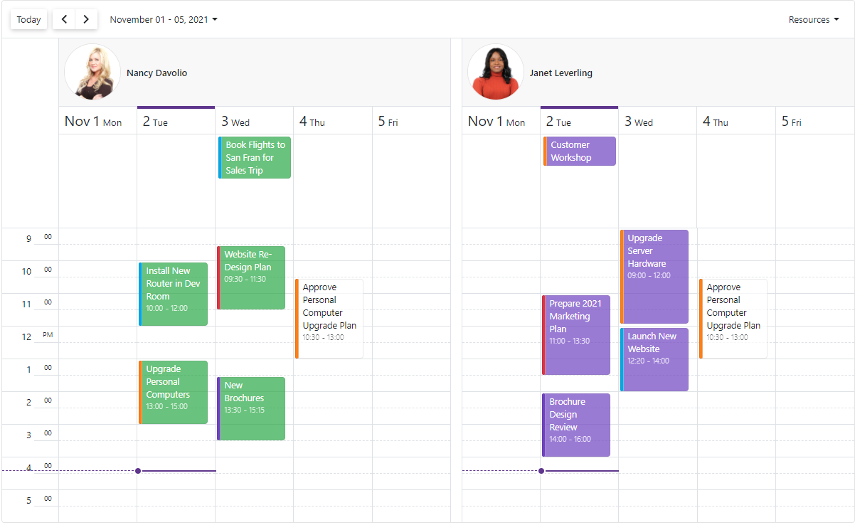
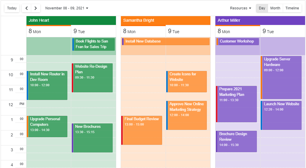
1. Resource Header Template
You can use the new ResourceHeaderCellTemplate to customize our Blazor Scheduler's resource header area. Here's an example that uses ResourceHeaderCellTemplate to display an employee's profile image and name into the resource header region:
Demo | Documentation
2. Date Header Template
A new DateHeaderCellTemplate will be of help when you need to display additional content in the date header cell region or if simply you want to change the header's default date format:
Demo | Documentation
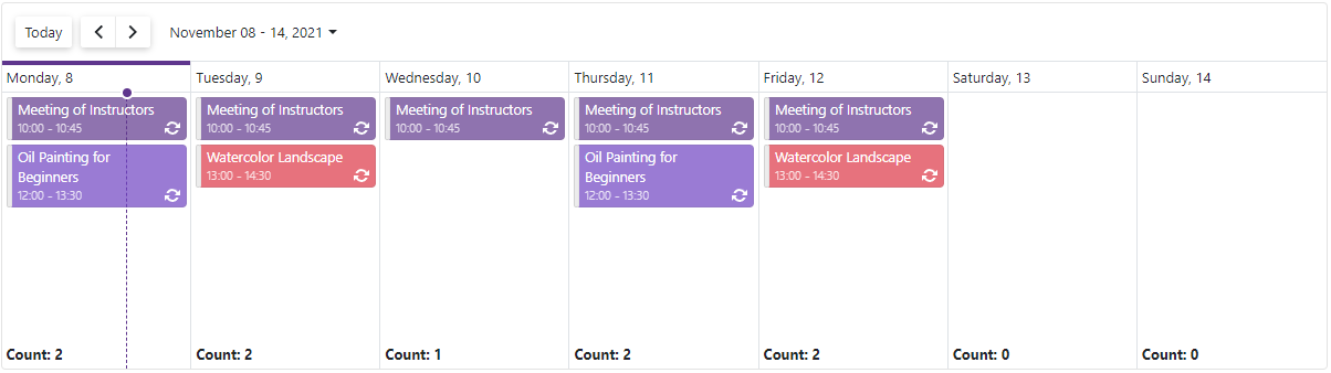
3. Time Cell Template
Use the new TimeCellTemplate to customize our Blazor Scheduler's time cells. For example, you can use this template to display the total number of appointments by day within the component's footer area:
Demo | Documentation
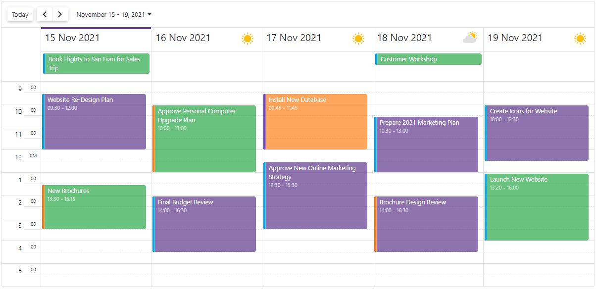
Responsive Layout Enhancements
Our Blazor Scheduler component's Day, Week, and Work Week Views now have compact date headers. These Views also adapt date headers and the time ruler depending on screen size.
In addition, all Scheduler Views can hide appointment captions (when space limits the component's ability to display the caption in full).
Cell Customization API
Our new HtmlCellDecoration event allows you to customize the appearance of Scheduler cells.
Use this new API for scenarios such as highlighting cells within a specific interval for a specific resource, assigning different colors to different date header cells, highlighting the all-day area, etc.
The HtmlCellDecoration event also provides several data arguments to assign CSS classes and inline styles for cell customization:
| Property |
Description |
| CellType |
Specifies the Scheduler cell's type. |
| CssClass |
Specifies the name of a CSS class applied to the Scheduler cell. |
| Intervals |
Specifies the interval(s) to which the Scheduler cell belongs. |
| Resources |
Specifies resources associated with the Scheduler cell. |
| Style |
Specifies the name of an HTML style attribute applied to the cell. |
Other API Enhancements
The DevExpress Scheduler for Blazor (v21.1) also includes these following API enhancements:
- All Blazor Scheduler Views now include a SnapToCellsMode property. With this property, you can enable/disable the snapping of appointments to time cells or enable automatic snapping (based on appointment time intervals). By default, appointments stretch to the nearest cell borders. You can change this behavior so that an appointment's width is proportional to its duration (SnapToCellsMode= SchedulerSnapToCellsMode.Never):

- The AppointmentFormShowing event's arguments now include a Title property. Use it to change the Appointment Form title.
Your Feedback Matters
As always, we welcome your thoughts/feedback/suggestion. Please comment below or create a new DevExpress Support Center ticket to share feedback with us.
Happy Holidays and a Happy New Year!
Free DevExpress Products - Get Your Copy Today
The following free DevExpress product offers remain available. Should you have any questions about the free offers below, please submit a ticket via the
DevExpress Support Center at your convenience. We'll be happy to follow-up.