Blazor - New Flyout Control (v22.1)

Our most recent release (v22.1) ships with a new Blazor Flyout control - a popup window with an arrow displayed next to its element. The DevExpress Blazor Flyout controls's base functionality mimics those found in our Blazor Popup and DropDown UI controls. While similar in some respects, the Flyout is more suitable for the following use cases:
- Display additional information, such as hints or educational tips next to an element
- Display a context popup window with actions next to an element
- Display tooltips
Display Hints & Educational Tips with Flyout
You can use the Flyout to display hints in your Blazor-powered web application. For instance, you can highlight new functionality available in your Blazor app.
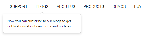
To add the Flyout to your application, you must add the necessary control markup, specify target position, and write code to manage component visibility.
<DxMenu>
    <Items>
        <DxMenuItem Text="SUPPORT" />
        <DxMenuItem Text="BLOGS" id="blog-item" />
        <DxMenuItem Text="ABOUT US" />
        <DxMenuItem Text="PRODUCTS" />
        <DxMenuItem Text="DEMOS" />
        <DxMenuItem Text="BUY" />
    </Items>
</DxMenu>
<DxFlyout
    IsOpen="true"
    PositionTarget="#blog-item"
    BodyText="Now you can subscribe to our blogs to get notifications about new posts and updates."
    Width="300px">
</DxFlyout>
Our Blazor Flyout will appear at the most suitable position around the target element and will recalculate its position when the page is scrolled or resized. If needs dictate, you can specify an exact position, a list of allowed positions, or restrict control position with custom boundaries.
Contextual Popups with Complex Content
Another Flyout use case is to display the control as a context popup window with actions next to an element. For instance, you can display detailed information about an individual.
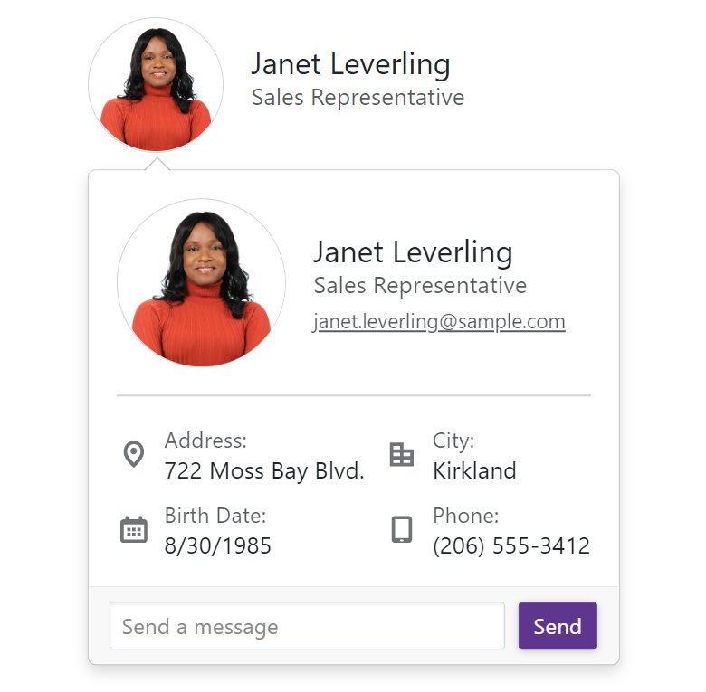
The Flyout window includes a header and a footer and you can populate these elements with text or implement custom templated content. Each element (header, body, and footer) is fully customizable with CSS rules.
<DxFlyout @bind-IsOpen=IsOpen
          PositionTarget=@($"#employee-{CurrentEmployee?.EmployeeId}")
          FooterVisible="true"
          FooterCssClass="custom-flyout-footer"
          Position=@(FlyoutPosition.BottomStart | FlyoutPosition.TopStart)>
    <BodyTemplate>
        <div class="custom-flyout-body">
            <EmployeeCard EmployeeInfo=@CurrentEmployee CustomDetails=true/>
        </div>
    </BodyTemplate>
    <FooterTextTemplate>
        <div class="w-100">
            <div class="custom-flyout-footer">
                <DxTextBox NullText="Send a message" CssClass="flex-grow-1"/>
                <DxButton CssClass="popup-button" Text="Send" Click=@(()=> IsOpen = false)/>
            </div>
        </div>
    </FooterTextTemplate>
</DxFlyout>

@code {
 bool IsOpen { get; set; } = false;.
}
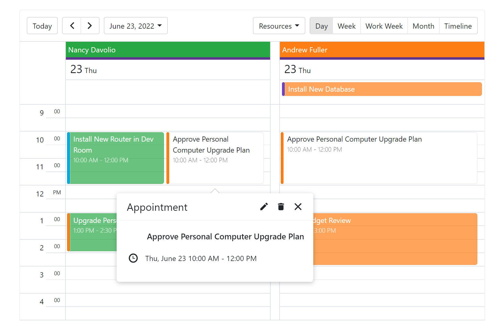
Note: We use the DevExpress Blazor Flyout control for similar tasks within our Scheduler component (to help deliver consistent and predictable behaviors, position recalculation, etc within the Scheduler).
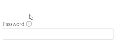
Display Tooltips with Flyout
To incorporate tooltip functionality in your application, use the control's mouseover and mouseout event handlers.
<div class="d-flex align-items-center" style="padding-bottom: 2px">
    <span class="opacity-75 pe-1">Password</span>
    <span id="position-target" @onmouseover=@(()=> IsOpen = true) @onmouseout=@(()=> IsOpen = false) class="p-warning" ></span>
</div>
<DxTextBox Password=true/>
<DxFlyout @bind-IsOpen=IsOpen
    Position="FlyoutPosition.Right"
    PositionTarget="#position-target"
    Width="200px"
    BodyText="@Text"/>

@code {
    string Text { get; set; } = "Password must contain at least 10 characters and include uppercase and lowercase letters, numbers, and special characters.";
    bool IsOpen { get; set; } = false;
}
To learn more about our Blazor Flyout control, please explore our online demos or review the following help topic.
Your Feedback Matters
We'd love to know what you think of our new Flyout control.