Blazor Grid — Cell/Data Editor API (v23.1)

Our most recent major update (v23.1) ships with a number of new Blazor Grid-related features/capabilities. In this blog post, I'll describe cell editing enhancements you can leverage in your current/upcoming Blazor project.
Auto-Generated Cell Editors
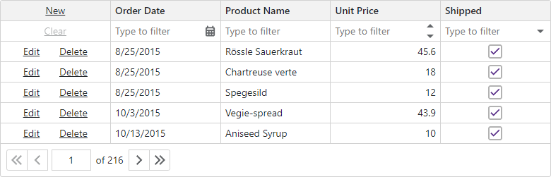
In previous versions, the DevExpress Blazor Grid did not auto-generate editors for its data rows (templates were used to manually add editors). For the Grid's filter row, the DevExpress Blazor Grid displayed standard text box editors for all columns (you could manually replace standard text boxes with more suitable editors as needed).
Before I describe auto-generated cell editor enhancements introduced in our v23.1 release cycle, let's look at the code snippet used to configure edit/filter operations for 3 columns in previous versions of our Blazor Grid (v22.2 and earlier).
<DxGrid Data="GridData" ShowFilterRow="true" EditMode="GridEditMode.EditRow" ... >
    <Columns>
        <DxGridCommandColumn MinWidth="120" />
        <DxGridDataColumn FieldName="OrderDate">
            <CellEditTemplate>
                @{
                    var invoice = (Invoice)context.EditModel;
                }
                <DxDateEdit @bind-Date="invoice.OrderDate" />
            </CellEditTemplate>
            <FilterRowCellTemplate>
                <DxDateEdit Date="(DateTime?)context.FilterRowValue"
                            DateChanged="(DateTime? v) => context.FilterRowValue = v"/>
            </FilterRowCellTemplate>
        </DxGridDataColumn>
        <DxGridDataColumn FieldName="ProductName">
            <CellEditTemplate>
                @{
                    var invoice = (Invoice)context.EditModel;
                }
                <DxTextBox @bind-Text="invoice.ProductName" />
            </CellEditTemplate>
        </DxGridDataColumn>
        <DxGridDataColumn FieldName="UnitPrice">
            <CellEditTemplate>
                @{
                    var invoice = (Invoice)context.EditModel;
                }
                <DxSpinEdit @bind-Value="invoice.UnitPrice" />
            </CellEditTemplate>
            <FilterRowCellTemplate>
                <DxSpinEdit Value="(decimal?)context.FilterRowValue"
                            ValueChanged="(decimal? v) => context.FilterRowValue = v"/>
            </FilterRowCellTemplate>
        </DxGridDataColumn>
    </Columns>
</DxGrid>
To maximize productivity, v23.1 ships with our new auto-generated cell editor option. As its name implies, our Blazor Grid can now generate/configure its cell editors automatically. The following code snippet illustrates the code you'll need to write for the same 3 columns when using v23.1:
<DxGrid Data="GridData" ShowFilterRow="true" EditMode="GridEditMode.EditRow" ... >
    <Columns>
        <DxGridCommandColumn MinWidth="120" />
        <DxGridDataColumn FieldName="OrderDate" />
        <DxGridDataColumn FieldName="ProductName" />
        <DxGridDataColumn FieldName="UnitPrice" />
    </Columns>
</DxGrid>
Our data editing-related algorithms were designed for maximum flexibility. For columns containing Enum values, the algorithm generates combo box editors and populates them with appropriate items. For editors used within the Grid's Filter Row, the algorithm displays a Clear button (but hides the clear button for editors used within data rows).
Cell Editor API
While auto-generated cell editors save time, you may still need to customize editors to address specific business requirements. For advanced usage scenarios, we've implemented editor-related settings designed to change editor appearance and behavior. For example, the code snippet below customizes an auto-generated spin editor:
<DxGridDataColumn FieldName="UnitPrice">
    <EditSettings>
        <DxSpinEditSettings Mask="n3" />
    </EditSettings>
</DxGridDataColumn>
The primary advantage of editor-based settings (when compared to templates) is that modifications affect not just the editor used for editing or filtering, but the entire column. You'll find more examples of this behavior later in this post.
To customize editor settings for your app, you can use the Grid's CustomizeDataRowEditor and CustomizeFilterRowEditor events. The Grid fires these events once an editor appears in the data or filter row. In the following example, we've customized all filter row editors:
<DxGrid Data="@products" CustomizeFilterRowEditor="Grid_CustomizeFilterRowEditor" ... >
    <Columns>
        <DxGridCommandColumn MinWidth="120" />
        <DxGridDataColumn FieldName="OrderDate" />
        <DxGridDataColumn FieldName="ProductName" />
        <DxGridDataColumn FieldName="UnitPrice" />
    </Columns>
</DxGrid>
@code {
    void Grid_CustomizeFilterRowEditor(GridCustomizeFilterRowEditorEventArgs e) {
        if(e.EditSettings is ITextEditSettings textEditSettings)
            textEditSettings.NullText="Type to filter";
    }
}
Auto-Generated Editors within the Grid's Edit Form
In Edit Form mode, you may need to fully control form appearance - including setting form size, defining the number of editors per line, and setting editor order. Even for advanced usage scenarios such as this, you won't have to configure editors yourself. Simply call the GetEditor method to obtain the editor generated for an individual column and place it in your Grid's Edit Form.
<DxGrid Data ="GridData" ShowFilterRow="true" ... >
    <Columns>
        <DxGridCommandColumn MinWidth="120" />
        <DxGridDataColumn FieldName="OrderDate" />
        <DxGridDataColumn FieldName="ProductName" />
        <DxGridDataColumn FieldName="UnitPrice">
            <EditSettings>
                <DxSpinEditSettings Mask="n3" />
            </EditSettings>
        </DxGridDataColumn>
    </Columns>
    <EditFormTemplate Context="editFormContext">
        <DxFormLayout>
            <DxFormLayoutItem Caption="Order Date:">
                @editFormContext.GetEditor("OrderDate")
            </DxFormLayoutItem>
            <DxFormLayoutItem Caption="Product Name:">
                @editFormContext.GetEditor("ProductName")
            </DxFormLayoutItem>
            <DxFormLayoutItem Caption="Unit Price:">
                @editFormContext.GetEditor("UnitPrice")
            </DxFormLayoutItem>
        </DxFormLayout>
    </EditFormTemplate>
</DxGrid>
Foreign Key (Combo Box) Column
Combo box settings are a great example of how editor settings affect the entire column.
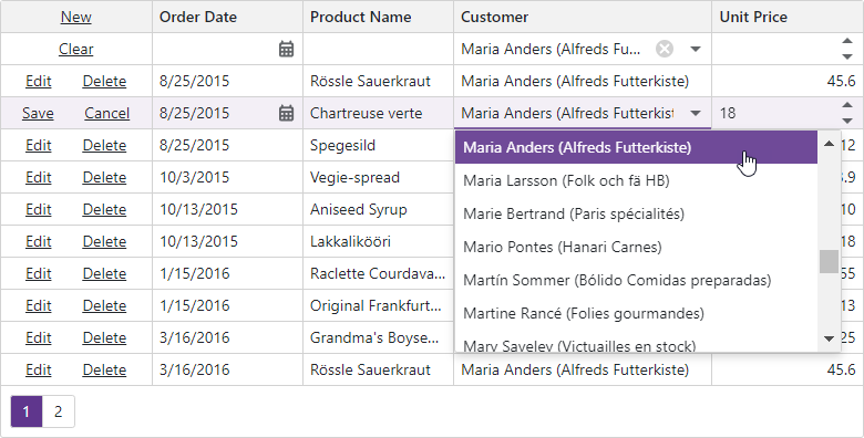
Our Blazor Grid generates combo box editors for columns associated with Enum data types. You can also replace a column's default editor with a combo box and implement a foreign key column. The column displays values from an external collection in the following elements:
- Column cells
- Group rows
- Editors in data rows and filter row
- Column filter menu
You can search for these values in the built-in search box. By default, the Grid sorts combo box columns by display text, while other columns are sorted against actual values.
The following code snippet configures a foreign key column:
<DxGridDataColumn FieldName="CategoryId" Caption="Category Name">
    <EditSettings>
       <DxComboBoxSettings Data="Categories" ValueFieldName="Id" TextFieldName="Name"/>
    </EditSettings>
</DxGridDataColumn>
Click the following link to learn more and download our foreign key column sample: GitHub example.
Checkbox Column
A Checkbox editor is yet another example of an editor whose settings affect the entire column.
In display mode, the Grid displays read-only checkboxes for Checkbox columns. In the filter row, the Grid replaces checkboxes with combo box editors. This allows users to easily clear a filter using the Clear button built into the combo box.
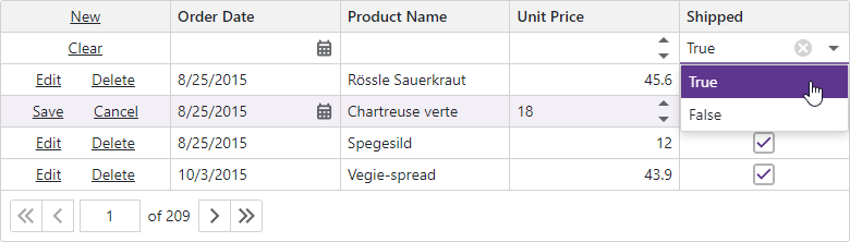
The DevExpress Blazor Grid automatically displays strings that correspond to checkbox states within the filter row, column filter menu, and group rows. You can use the ShowCheckBoxInDisplayMode property to display text strings within column cells. To customize these strings across all elements simultaneously, simply specify the following properties:
Your Feedback Counts
As always, we highly appreciate your feedback.
