DevExtreme – New Drawer Component (v18.2)

The Drawer component is a fairly new UI component which, these days, is used widely on apps and websites optimized for phone-sized devices. The Drawer is a panel on the left or right (or even top or bottom) side of the screen.
In its normal state this panel is not visible, but when triggered by e.g. a button, it slides over the main view content of your app to provide you with additional features.
One of the most well known examples is the Hamburger menu.

For all of you familiar with CSS/JavaScript development, you know it’s absolutely possible with CSS and a tiny bit of JavaScript to accomplish this task, but it’s a bit of work. In fact, I’ve done a conference session on this particular subject some time ago which some of you might have attended to.
In our v18.2 release we’ve decided to include this Drawer as a component with some useful features.
Note: This feature is available in DevExtreme for Angular, Vue, React, jQuery, and ASP.NET MVC and ASP.NET Core.
How does it work?
It’s quite simple to add a Drawer to your App. Just wrap the main view content inside the dx-drawer. This will make sure that the Drawer drops a nice shadow over the main view content and it will properly update size and position when opened.
The drawer’s content is specified inside a dxTemplate.
<dx-drawer>
    <div *dxTemplate="let data of 'template'">
        Drawer Panel Content
    </div>

    <div>
        Main Content
    </div>
</dx-drawer>
The example above is for Angular. However, this applies to React, Vue and jQuery as well.
Customizing the appearance and behavior
There are a couple of really nice things that can be configured like:
Drawer position
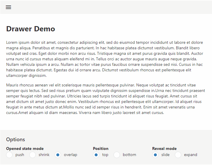
The position of the Drawer can be set to:
- left
- right
- top
- bottom
Drawer open behavior
The open behavior determines how the Drawer appears and what happens with the main view content.

The following options are available:
- push
the Drawer causes the main view content to be displaced (pushed out of the view area) - shrink
The main view content is being resized - overlap
The Drawer overlaps the main view content
Drawer reveal mode
This determines how the Drawer will show up:
- slide
The drawer is sliding during the open/close animation - expand
The drawer is static during open/close. Only the width is animating
Some other interesting behavior options are:
- Enable/Disable Drawer shadow
- Specifying a minSize and maxSize
- Setting the duration of the animations
- Target element to where to position the Drawer
- Response options to determine whether to always show the Drawer (persistent) or to hide/show it.
Are there limitations?
In some mobile apps, a navigation panel/drawer can be shown/hidden with a swipe gesture. This feature makes it difficult to enable swipe gestures in the main view content as well. This is not supported in this version of the Drawer and we consider this to be a bad practise.
Try it?
You can test the Drawer Component by visiting our DevExtreme Demo Center by clicking here for the left and right positions, and click here for the top and bottom positions.
Alternatively, our v18.2 release is already available for our customers so login at our web-site and head to the My Downloads section from where you can download and install DevExtreme v18.2.
What do you think?
Let me know what you think of this by replying on this article or if you have questions or suggestions, then please share them on GitHub or via our Support Center.
Free DevExpress Products - Get Your Copy Today
 Don Wibier (DevExpress)