DevExtreme Angular, React, Vue, jQuery & ASP.NET Core — Early Access Preview (v23.1)

We are two months away from our next major update (v23.1). The purpose of this post is to preview upcoming features and give you the opportunity to test new functionality before we wrap up our current dev cycle.
Please, use the DevExpress Support Center and survey questions embedded within this post to share Early Access Preview (EAP)-related feedback with us.
To get started, install the devextreme@23.1-next NPM package or use the online demo links below to explore our newest features.
npm install devextreme@23.1-next --save-exact Early Access and CTP builds are provided solely for early testing purposes and are not ready for production use. This build can be installed side by side with other major versions of DevExpress products. Please backup your project and other important data before installing Early Access and CTP builds.
This EAP may not include all features/products we expect to ship in our v23.1 release cycle. As its name implies, the EAP offers an early preview of what we expect to ship in two months.
UI/UX Customization Enhancements
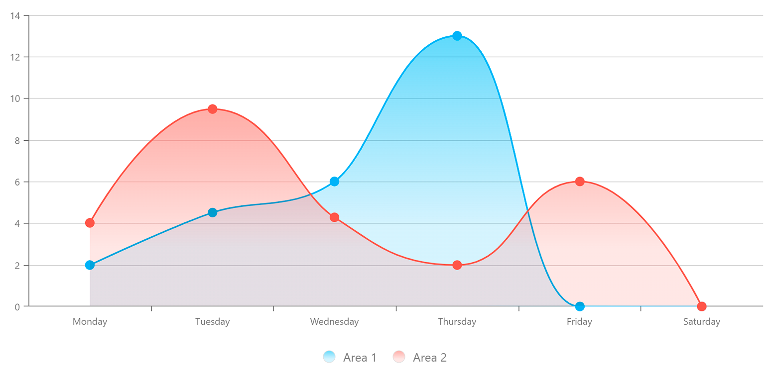
Charts — Сolor Gradients and Patterns
You can now customize styles and apply gradients, patterns, and images to your Charts.

Use the registerGradient() method to declare linear and radial gradient styles, and the registerPattern() method to declare pattern and image styles. These methods return a unique id for declared styles. In the series/point color object, specify base color for labels and connectors and apply your generated id to the fillId field.
app.component.ts
import { registerGradient, registerPattern } from "devextreme/common/charts";

export class AppComponent {
    getGradientId = () =>
        registerGradient("linear", {
            colors: [{
                offset: "20%",
                color: "#97c95c"
            }, {
                offset: "90%",
                color: "#eb3573"
            }]
        });

    getPatternId = () =>
        registerPattern(
            // Specify pattern width, height and template
        );

    seriesColor = {
        base: "#f5564a",
        fillId: this.getGradientId()
    };
}
app.component.html
<dx-chart ... >
    <dxo-common-series-settings [color]="seriesColor">
    </dxo-common-series-settings>
</dx-chart>
Demo - Select one of the following frameworks to explore the capabilities of this new feature:
Angular | React | Vue | jQuery
Gauge — Custom Content Inside the Component
You can now add custom SVG content (such as text and images) inside the DevExpress Gauge component.
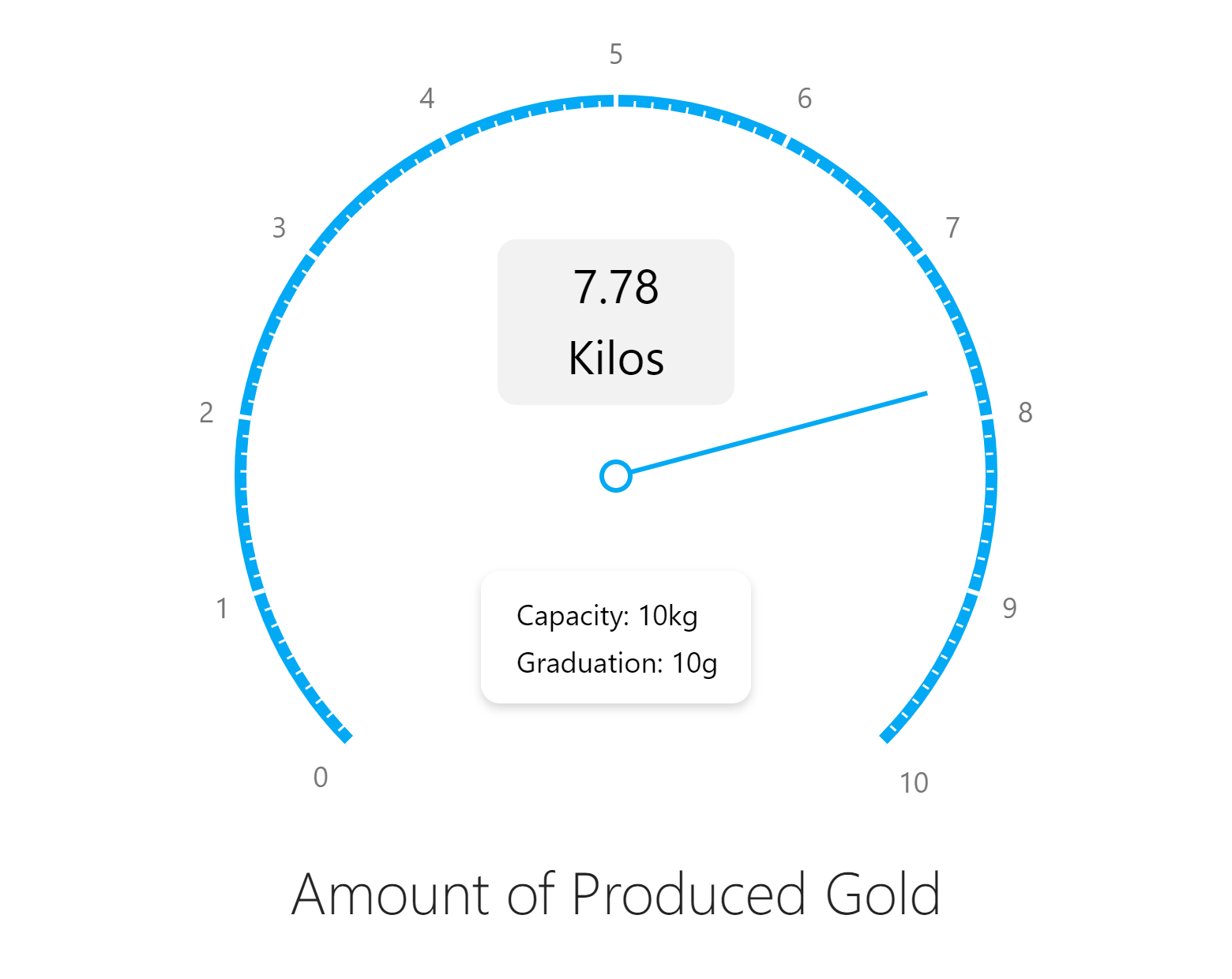
To add custom SVG content, use our new centerTemplate property.
<dx-circular-gauge centerTemplate="centerTemplate" ... >
    <svg *dxTemplate="let gauge of 'centerTemplate'">
        <!-- 'gauge' is an instance of the widget. You can use it to obtain gauge size and associated values -->
        <!-- ... -->
    </svg>
</dx-circular-gauge>
Demo - Select one of the following frameworks to explore the capabilities of this new feature:
Angular | React | Vue | jQuery
BarGauge — Support 'Shift' Mode to Address Overlapping Labels
If a BarGauge displays multiple values close to one another, corresponding labels may overlap. If you want to avoid overlapped labels, use the resolveLabelOverlapping property to specify how the DevExpress Gauge component adjusts label position or visibility.
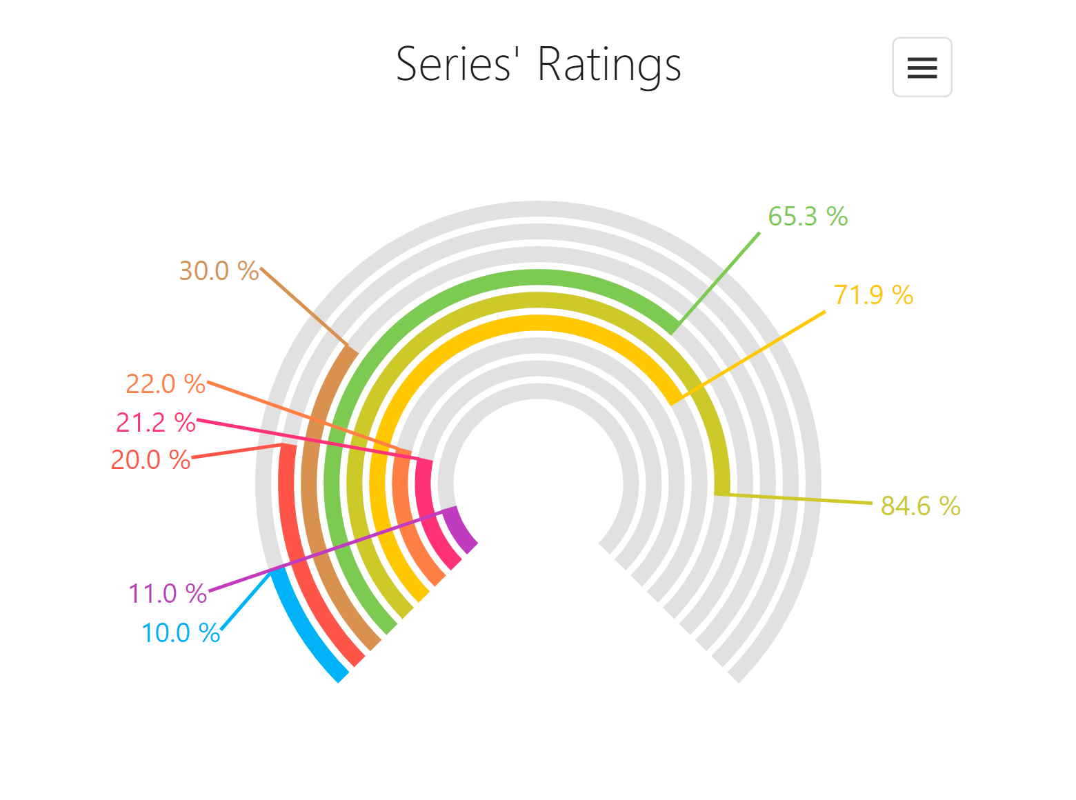
With our new shift mode, BarGauge labels can shift position when necessary.
<dx-bar-gauge ...
    resolveLabelOverlapping="shift"
>
</dx-bar-gauge>
Demo - Select one of the following frameworks to explore the capabilities of this new feature:
Angular | React | Vue | jQuery
Overlay Components — Native Scrolling
Our Popup and Popover components now support native scroll operations. When Popup/Popover height content is greater than Popup/Popover height, a native browser scrollbar will appear on-screen. You will not have to wrap content into our ScrollView component manually. This feature also improves usability on mobile devices. Touch gestures against Popup/Popover content now work properly.
Demo - Select one of the following frameworks to explore the capabilities of this new feature:
Angular | React | Vue | jQuery
TreeView — Support Custom Expand/Collapse Icons
You can now specify custom expand/collapse icons for our TreeView component.
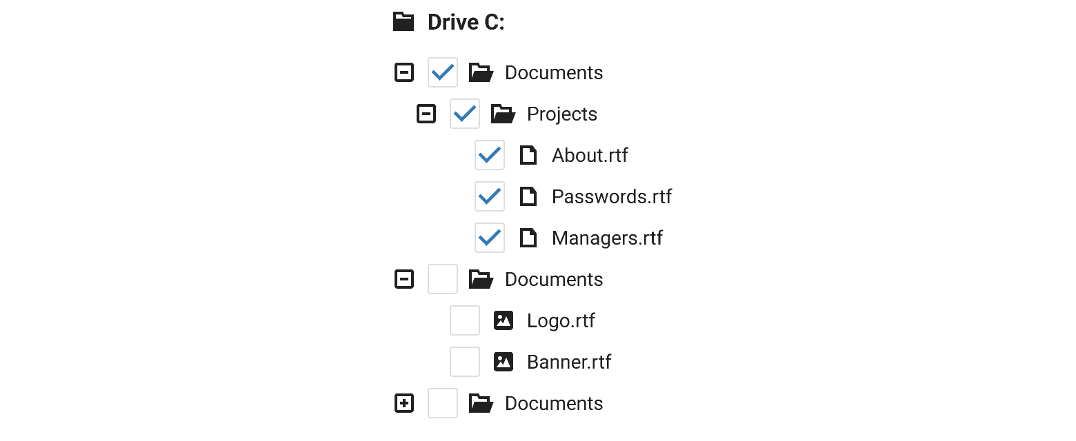
Use the new collapseIcon and expandIcon properties to specify the icon path, a DevExtreme icon, or CSS class (if working with external libraries).
<dx-tree-view ...
    collapseIcon="minus" "--Icon from the DevExtreme icon library"
    expandIcon="https://path/to/the/expand_icon.svg" "--Icon in the SVG format"
>
</dx-tree-view>
Demo - Select one of the following frameworks to explore the capabilities of this new feature:
Angular | React | Vue | jQuery
API Enhancements
List — Select Items via a Click
Use the new selectByClick property to specify whether a click on a List item caption selects the item.
Demo - Select one of the following frameworks to explore the capabilities of this new feature:
Angular | React | Vue | JQuery
ColorBox – Hexadecimal 8-digit RGBA Format Support
Our ColorBox component accepts the following formats:
- 3- and 6-digit hexadecimal ("#F00", "#FF0000")
- RGB ("rgb(255, 0, 0)")
- RGBA ("rgba(255, 0, 0, 1)")
- color names
- 4- and 8-digit ("#F00F", "#FF0000FF")
The last item in this list ships as part of our EAP build. You can add values using this format into the ColorBox editor or you can use the value property to specify the initial value.
<dx-color-box ...
value="#0d62e0ff" "--or "#FFFF""
[editAlphaChannel]="true"
>
</dx-color-box>
TypeScript Support Enhancements
Simplified Type Imports in Angular, React, and Vue Apps
Previously, you had to import certain types from a separate devextreme package, while other types had to be imported from specific framework packages like devextreme-angular. With v23.1, you can export all required types from framework specific packages. We expect to simplify more type imports in the future.
Before
import { ColumnChooserMode } from 'devextreme/common/grids';
import DataGrid from 'devextreme-react/data-grid';
After
import DataGrid, { DataGridTypes } from 'devextreme-react/data-grid';
const currentMode: DataGridTypes.ColumnChooserMode;
Demo - Select one of the following frameworks to explore the capabilities of this new feature:
Free DevExpress Products - Get Your Copy Today
 Vlada Skorokhodova (DevExpress)