DevExtreme DateRangeBox Component Released (v23.1)

As you may already know, we officially released the DevExtreme DateRangeBox widget for all supported JavaScript frameworks including Angular, React, Vue and jQuery.
This new control allows end users to select a date range. The component inherits features from our DateBox component: masked input, flexible popup and calendar customization, input label/styling modes, etc.
Formatting
You can use one of our predefined formats or specify a custom format as needs dictate.
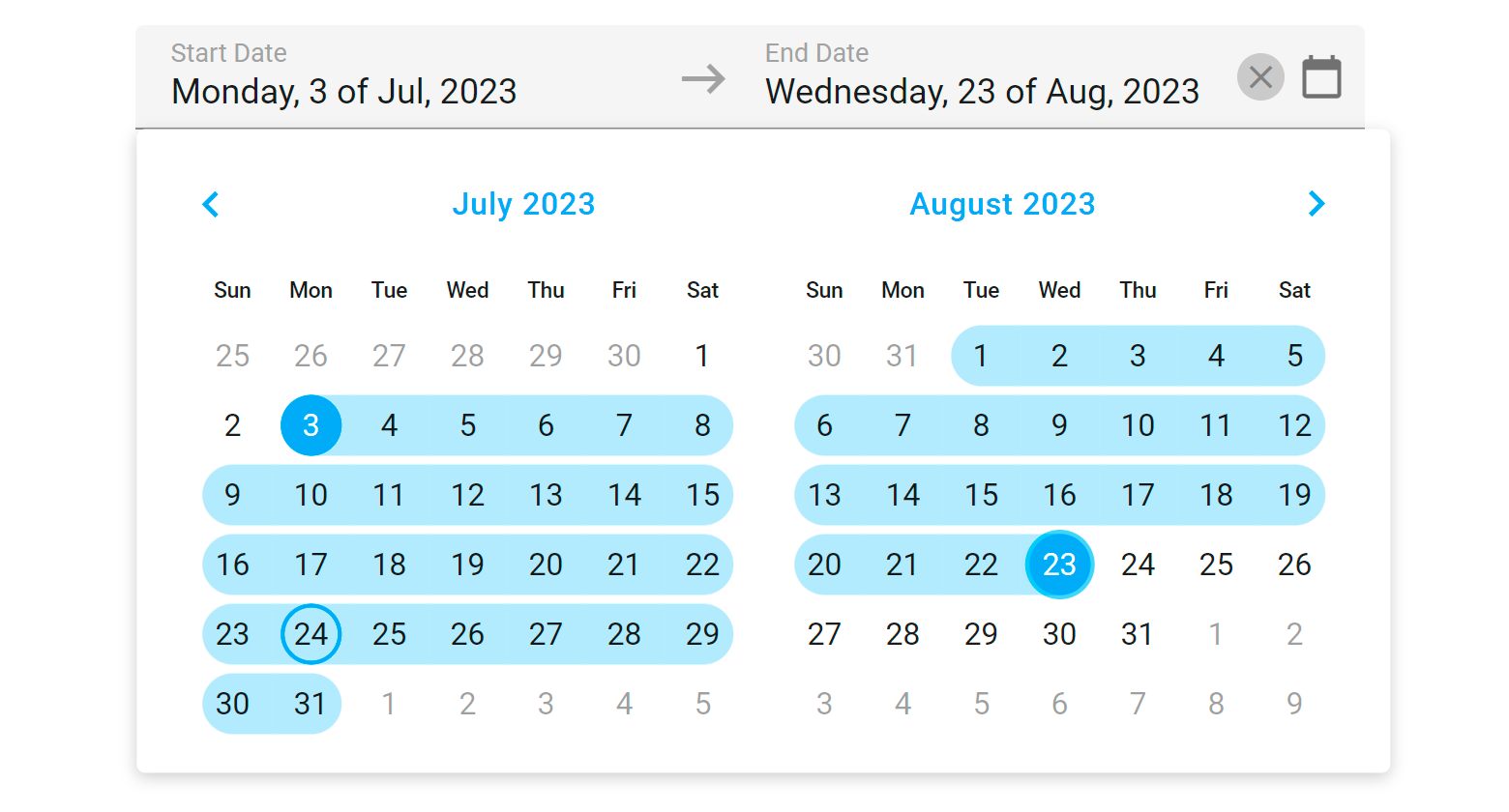
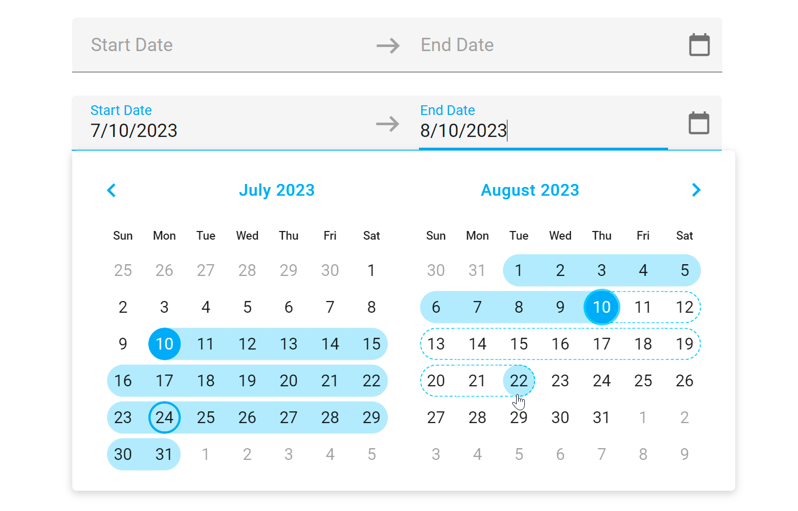
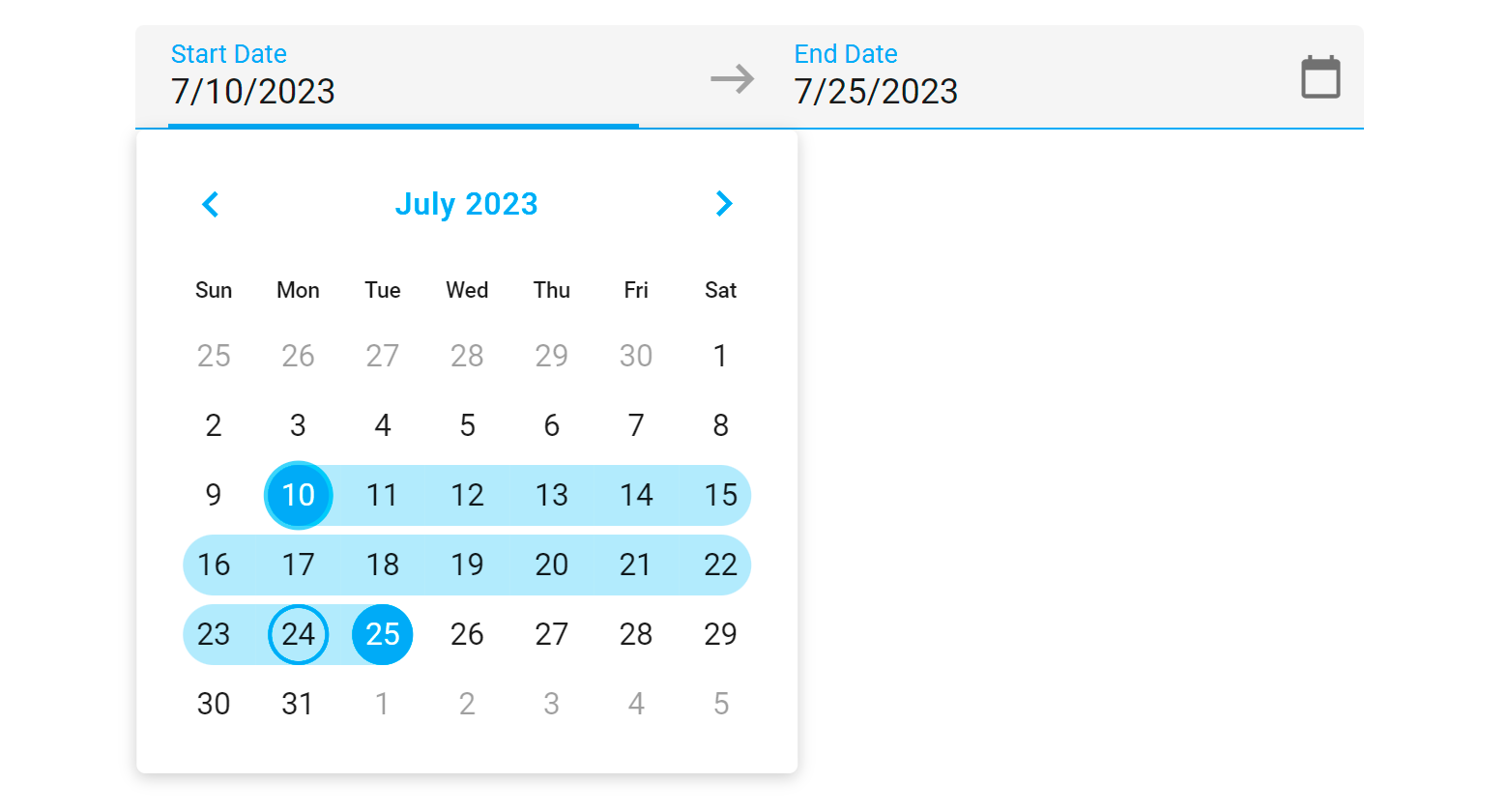
Popup and Calendar Customization
Our DateRangeBox allows you to customize calendar appearance and switch between a single-month and two-month drop-down calendar.
To specify a single view, disable the multiView property. Use the calendarOptions property to customize calendar appearance/behavior.
You can also disable date selection before the start date and after the end date. To do so, assign trueto the disableOutOfRangeSelection property.

Free DevExpress Products - Get Your Copy Today
 Vlada Skorokhodova (DevExpress)