React Data Grid for Google Material Design

Material-UI (the Material Design React component library) version 1.0 is about to release, and so is our DevExtreme React Grid v1.0 (at the same time as DevExtreme v17.2). The very first pull request that started our work on Material UI integration was merged four months ago. Since then, our Material UI data grid has caught up to its Bootstrap counterpart. In this post I’d like to sum up what has been done to support the Google Material Design Data Table in the DevExtreme React Grid.
Editing UI
Editing is one of the most demanded features of any data grid. It allows users to create, update and delete rows right in the visual data table. To provide this functionality, the React Grid renders specific editing controls if the editing-related plugins are used. You can customize the appearance of editing controls. For instance, you can specify the text and icons you want to see in your application, or provide custom value editors for certain columns.
Read our React Grid docs about editing (they apply for Bootstrap and Material UI)

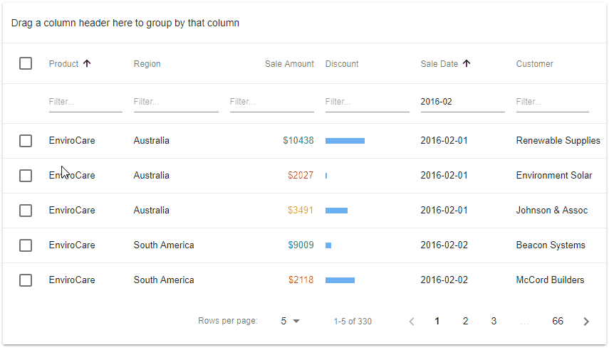
Filtering UI
A typical real-world LOB application visualizes and manages a lot of data. Search capabilities are crucial to the end-user experience. Our Material UI data grid has a set of plugins that implement filtering functionality, such as the Filter Row, special row shown right underneath the table header, containing filter editors used to enter filter values.
Read our React Grid docs about filtering (they apply for Bootstrap and Material UI)
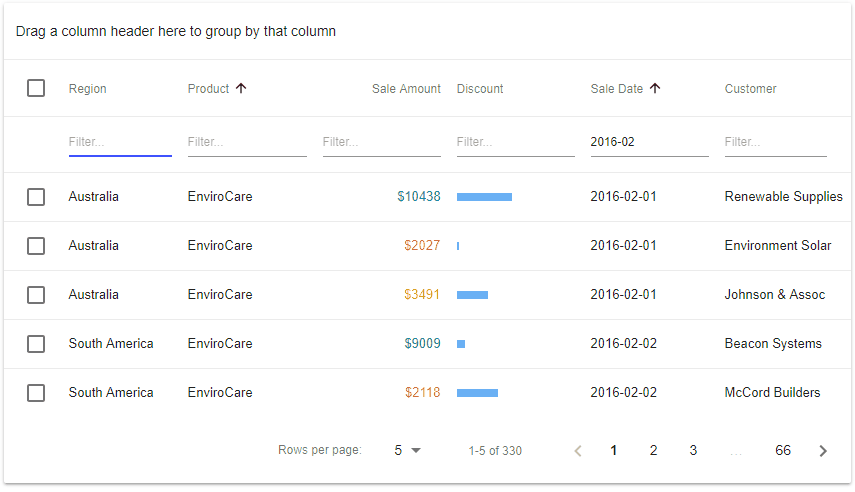
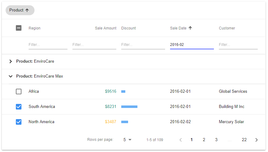
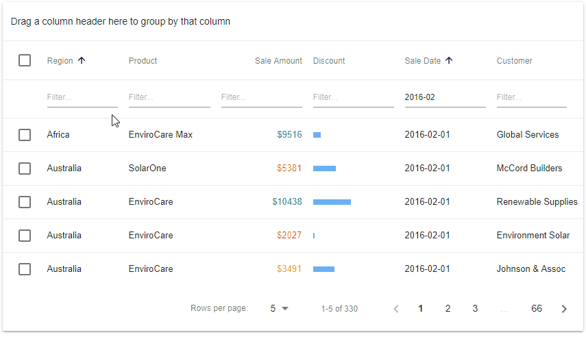
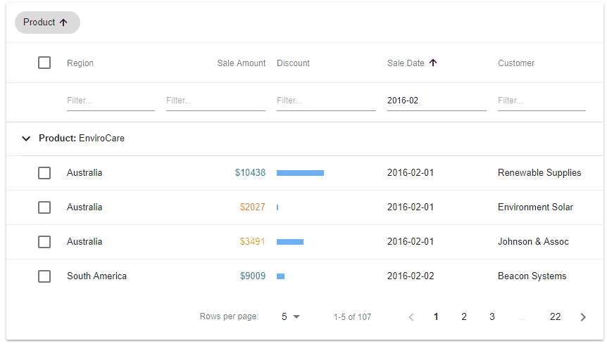
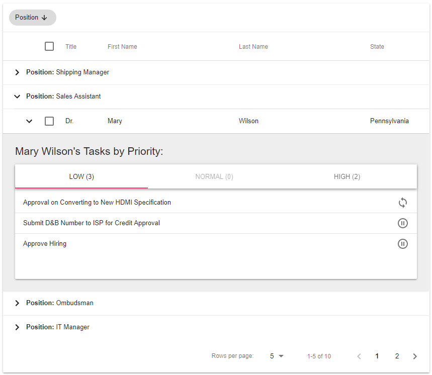
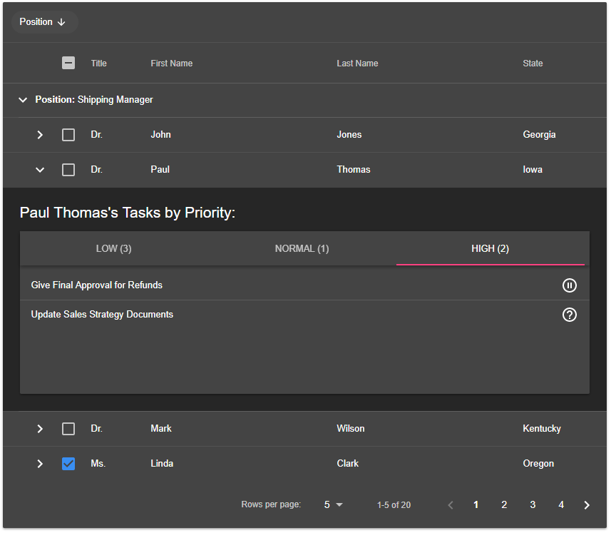
Grouping UI
Another technique that simplifies work with large amount of data is to group information by criteria. End users can browse grouped rows and expand or collapse them as needed. The Google Material Design guidelines don’t contain specifications for a data table grouping UI. We did our best to provide UI for this feature that would be consistent with the guideline intentions. Multi-level grouping by several columns or custom values is also available.
Read our React Grid docs about grouping (they apply for Bootstrap and Material UI)
Paging UI
Row paging is a must-have common feature that is expected by almost every data grid user. As you would expect, the Google Material Design guidelines contain specifications for this feature and we observe them in our Material UI Data Grid for React. The Grid provides controls to change page size, switch the current page and to display the number of available pages as well as the range of visible rows. Paging is integrated with the Grouping feature, so the Grid shows the current page group header on each page, if grouping is configured.
Read our React Grid docs about paging (they apply for Bootstrap and Material UI)
Selection UI
In web applications that allow data manipulation, you usually need row selection capabilities. An end-user might want to delete rows or perform batch updates, for which rows need to be selectable. Selections can incorporate individual rows, all rows on the current page, or all rows loaded in the Grid. The appearance of row selection in data tables is specified in the Material Design guidelines and we have implemented it for the DevExtreme React Grid accordingly.
Read our React Grid docs about selection (they apply for Bootstrap and Material UI)
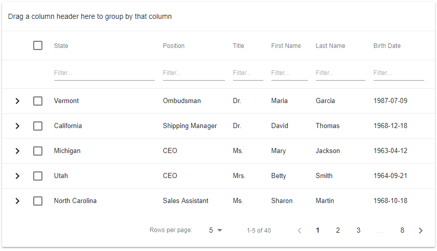
Row Detail UI
When your data row is represented as a complex structure, the Detail Row feature can be very helpful. It allows the Grid to display many rows in a compact view when collapsed, but end users can expand individual rows as required to display row details. You can also implement master/detail scenarios using the Detail Row feature.
Read our React Grid docs about row details (they apply for Bootstrap and Material UI)
Light, Dark and Custom Material Design Themes
There are two standard Material Design themes: Light and Dark. They are both supported by the React Data Grid for Material UI. If you don’t like these standard themes you can configure your own, for instance to reflect the colors of your company branding.
Update: A link to a theming demo has been removed, because all our React Grid demos support several themes now. Just click the selector in the top right corner of any demo!
Lots of other features
In time for our final release we expect all other React Grid features supported by the Bootstrap Grid to be available for Material Design as well. Sorting, column reordering, column resizing, the column chooser and others are available now, while virtual scrolling for Material UI will be implemented soon.
Feel free to download your copy from npm and let us know what you think!
Free DevExpress Products - Get Your Copy Today
Oliver Sturm (DevExpress)