We are constantly improving the API of our WPF Data Grid and WPF Tree List to make it easier to use and more powerful for customization scenarios. Examples of this work are described in posts about our Drag & Drop, Master/Detail, and Data Paging features, and most recently we introduced some new data filtering functionality.
This post is about the Custom Cell Editor API. We had requests to support end-user navigation and data validation in non-DevExpress editors, including your own custom ones.
End-User Navigation
In previous versions, implementing end-user navigation in custom editors was harder than it should be, because the Data Grid overrode navigation keys internally. It was necessary to handle the event GridControl.PreviewKeyDown, find your editor in the visual tree and manually focused the inner elements.
In v18.2 we added some special events to make this easier.
An Example: Using a ListBoxEdit
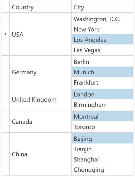
To specify a custom cell editor, you use the CellTemplate property.
<dxg:GridColumn FieldName="City">
  <dxg:GridColumn.CellTemplate>
    <DataTemplate>
      <dxe:ListBoxEdit x:Name="PART_Editor"
        ItemsSource="{Binding RowData.Row.Cities}"/>
    </DataTemplate>
  </dxg:GridColumn.CellTemplate>
</dxg:GridColumn>
With this custom editor in place, it makes sense to enable the Up and Down keys to navigate the items in the editor.
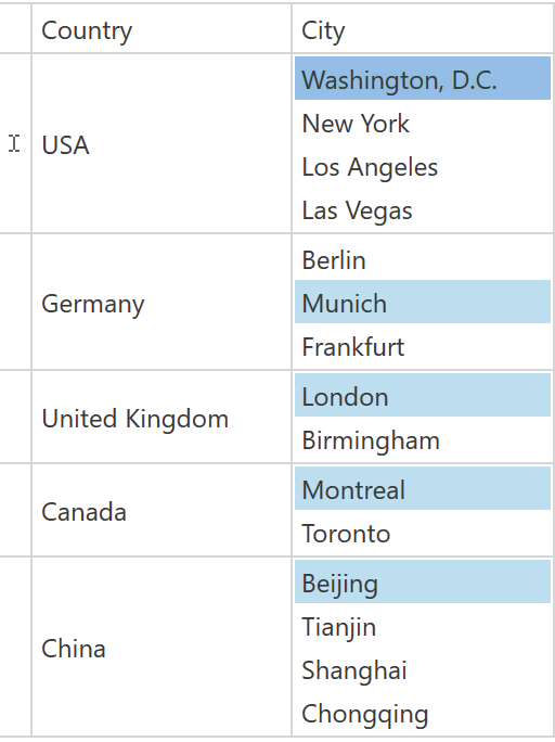
Starting with v18.2, you can use the event GetActiveEditorNeedsKey. Here’s how to reserve the Up and Down keys for the editor:
void TableView_GetActiveEditorNeedsKey(object sender, DevExpress.Xpf.Grid.GetActiveEditorNeedsKeyEventArgs e) {
  if (e.Key == System.Windows.Input.Key.Up ||
      e.Key == System.Windows.Input.Key.Down)
    e.NeedsKey = true;
}
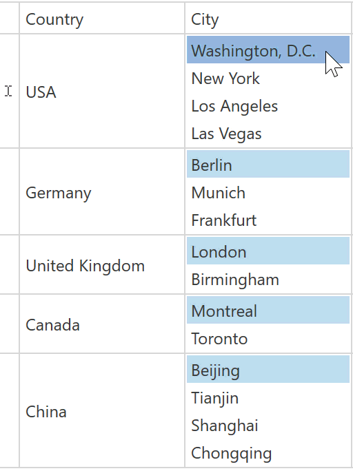
When an end user clicks a cell, the default behavior is only to activate the cell editor. The Grid grabs the click event and the editor doesn’t receive it, so the click does not select an item inside the editor. However, now you can handle the new event ProcessEditorActivationAction to make the Data Grid raise the click event again after handling it. The cell editor can then handle the event as well.
void TableView_ProcessEditorActivationAction(object sender,
  DevExpress.Xpf.Grid.ProcessEditorActivationActionEventArgs e) {
  if (e.Column.FieldName == "City" &&
      (e.ActivationAction == ActivationAction.MouseLeftButtonDown &&
        e.MouseLeftButtonEventArgs.LeftButton ==
          System.Windows.Input.MouseButtonState.Pressed))
    e.RaiseEventAgain = true;
}
A complete sample project is available in this GitHub repository.
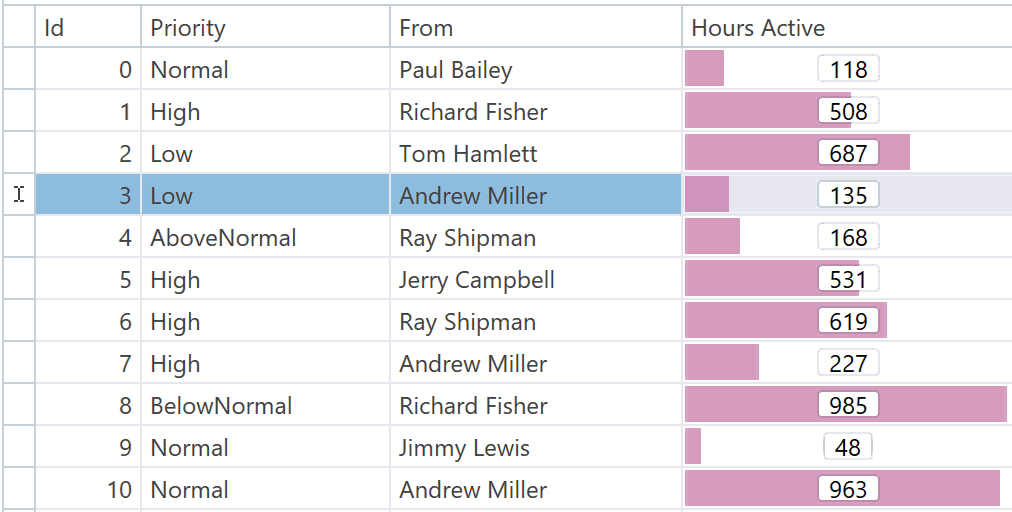
A Second Example: Using a Slider
Sometimes you need to use separate editors to display and edit values. You configure the CellDisplayTemplate and CellEditTemplate properties to achieve this.
In this example, bars are used to display values but a Slider is shown to edit them.

End users can activate an editor in several ways:
- Click the cell
- Press
Enter or F2
- Start typing
Sliders work with +/– (plus, minus) keys, so it would be useful to activate the editor when these keys are pressed.
Using the new event GetIsEditorActivationAction, you can specify actions that activate an editor.
void TableView_GetIsEditorActivationAction(object sender,
  GetIsEditorActivationActionEventArgs e) {
  if (e.Column.FieldName == "HoursActive" &&
      e.ActivationAction == ActivationAction.KeyDown)
    e.IsActivationAction = IsSliderCommand(e.KeyDownEventArgs.Key);
}

bool IsSliderCommand(Key key) {
  switch(key) {
    case Key.Add:
    case Key.Subtract:
    case Key.OemPlus:
    case Key.OemMinus:
      return true;
    default:
      return false;
  }
}
If you want the +/- keys to not only activate the Slider but increase or decrease the value at the same time, handle the event ProcessEditorActivationAction that was already used in the previous example.
void TableView_ProcessEditorActivationAction(object sender,
  ProcessEditorActivationActionEventArgs e) {
  if (e.Column.FieldName == "HoursActive" &&
      e.ActivationAction == ActivationAction.KeyDown)
    e.RaiseEventAgain = IsSliderCommand(e.KeyDownEventArgs.Key);
}
You can see a sample setup in the Cell Editors demo included in your installation. If you are reading this post on a machine that has the WPF demos installed, please follow this link to start the demo.
Data Validation
We now fully support data validation for non-DevExpress editors used in cell templates, including validation on the Grid control level.
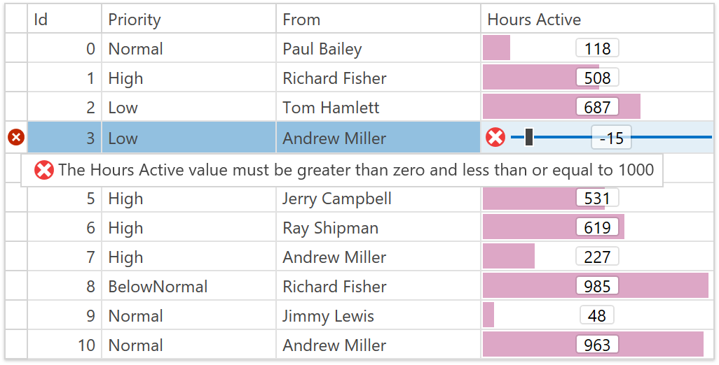
Using the same Slider example as before, you can now prevent end users from setting incorrect values. Simply handle the event GridColumn.Validate, detect invalid values and use the validation API to provide feedback.
void colHoursActive_Validate(object sender, GridCellValidationEventArgs e) {
  double value = Convert.ToDouble(e.Value, e.Culture);
  if (value <= 0 || 1000 < value)
    e.SetError("The Hours Active value must be greater than zero and less than or equal to 1000", ErrorType.Default);
}
To Summarize
You can now use CellTemplate, CellDisplayTemplate and CellEditTemplate to specify any custom editor control with navigation and validation support.
We also improved one small technical detail. You know that you can set an editor name to PART_Editor to make the Data Grid automatically adjust its appearance and synchronize the editor with the source field specified by the ColumnBase.FieldName or ColumnBase.Binding properties.
In previous versions, when you set PART_Editor, the Data Grid ignored any binding specified on your custom editor. In v18.2, you can specify PART_Editor and a binding simultaneously, and the Data Grid will still adjust the appearance but use your own binding.
Finally, we recommend reading the In-Place Editors document about all different cell editor customization techniques.
Your Feedback Counts
All the features and usage scenarios described in this post are based on your feedback. Please let us know if you have any thoughts about our implementation. Do you have other ideas for enhancements to our Data Grid and Tree List?
Join the Webinar
If you would like to see all the new v18.2 WPF features in action and ask our devs questions, please sign up for the upcoming webinar.
Here is the link to register today
Free DevExpress Products - Get Your Copy Today
The following free DevExpress product offers remain available. Should you have any questions about the free offers below, please submit a ticket via the
DevExpress Support Center at your convenience. We'll be happy to follow-up.