WPF MessageBox — Text Selection, Button Images, Closing Timer (v22.2)

In our last major release (v22.2), we introduced a series of features to help improve the user experience for a very common WPF UI element - MessageBox. New MessageBox-related options include:
-
Text selection support
-
Custom image support
-
A button with a timer that closes a window automatically
The ThemedMessageBox class allows you to implement all these options within your WPF-powered app.
Text Selection
The standard MessageBox doesn’t allow users to select text displayed within the message box. While this may seem inconsequential, the ability to copy message box text can help an organization better serve the needs of its users. Text selection will be helpful if users need to reference a message, copy error message text, or share the contents of a message with colleagues.
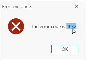
For example, you may want to use a message box with text selection to display an error message alongside an error number. With our WPF MessageBox, users can select and copy error message text, and share the number for troubleshooting purposes.
Implementation
To incorporate this feature in your next WPF app, use the ThemedMessageBox class. Set the AllowTextSelection property to true in a ThemedMessageBoxParameters object:
void Button_Click(object sender, RoutedEventArgs e) {
    var parameters = new ThemedMessageBoxParameters() {
        AllowTextSelection = true
    };
    ThemedMessageBox.Show(
        title: "Error message",
        text: $"The error code is {errorCode}",
        messageBoxButtons: MessageBoxButton.OK,
        messageBoxParameters: parameters
    );
}
In this example, the message box appears when a user clicks a button. The AllowTextSelection property activates text selection in the message box.
Custom Images
Custom images can be used to communicate the importance of a given message. By using custom images, you can deliver more intuitive user interfaces – and offer visual context for the message itself.
For example, a warning message can be displayed with a yellow exclamation mark to alert users to potential problems. An error message may be displayed with a red icon to indicate the seriousness of an issue. A confirmation message may be displayed with a green/blue icon to indicate that the operation was executed successfully.
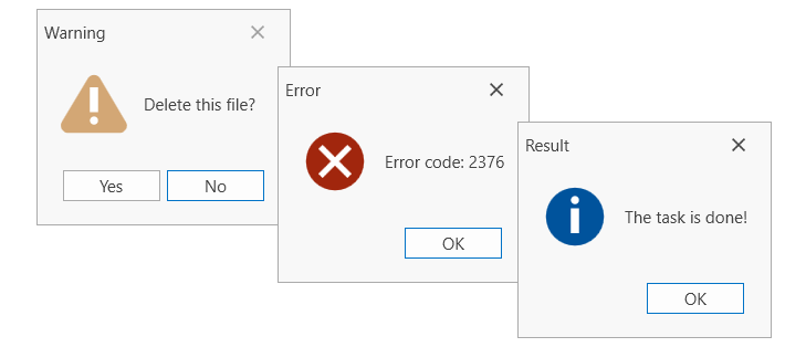
Additionally, custom icons help differentiate buttons from one another (making it easier for users to identify which button performs what action). This option can be especially useful when buttons have similar or identical labels.

Implementation
To add custom images to a message box, use the ThemedMessageBox class. Use one of the following Show method parameters to define theimage displayed within the ThemedMessageBox:
-
The icon parameter allows you to select an message box image from the MessageBoxImage enumeration.
-
The image parameter allows you to specify a custom image.
ThemedMessageBox.Show(
    // ...

    icon: MessageBoxImage.Warning,

    // OR

    image: new BitmapImage(new System.Uri("pack://application:,,,/WarningImage.png"))
);
You can also specify an image in a ThemedMessageBoxParameters object:
void Button_Click(object sender, RoutedEventArgs e) {
    var parameters = new ThemedMessageBoxParameters(MessageBoxImage.Warning) { };

    // OR

    var parameters = new ThemedMessageBoxParameters(new BitmapImage(new System.Uri("pack://application:,,,/WarningImage.png"))) { };

    ThemedMessageBox.Show(

        // ...

        messageBoxParameters: parameters
    );
}
void Button_Click(object sender, RoutedEventArgs e) {
    var buttonApply = new UICommand() {

        // ...

        Glyph = new System.Uri("pack://application:,,,/DevExpress.Images.v22.2;component/SvgImages/Icon Builder/Actions_Check.svg")

    };
    var buttonCancel = new UICommand() {

        // ...

        Glyph = new System.Uri("pack://application:,,,/DevExpress.Images.v22.2;component/SvgImages/Icon Builder/Actions_Delete.svg")
    };
Close the Message Box Automatically
You can incorporate message boxes that close automatically (after a specified time frame) to display a brief notification to users. This option can help convey important information to users - without necessitating additional actions.
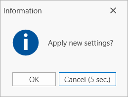
A message box that closes automatically will help prevent the message box from remaining on screen indefinitely. This can be of value if a user has made settings-related changes and the system needs to confirm whether changes should be applied.
For example, a message box that closes automatically can alert users about new settings or notify them that changes can be applied. In such instances, users will receive status feedback, without the need to take additional actions.
Implementation
To display a message box and close it automatically, set the time frame used for the ThemedMessageBox to automatically click its default button. To set this time frame, specify the TimerTimeout and TimerFormat properties in a ThemedMessageBoxParameters object.
The following code sample clicks the Cancel button 5 seconds after the ThemedMessageBox is displayed on screen:
void Button_Click(object sender, RoutedEventArgs e) {
    var parameters = new ThemedMessageBoxParameters(MessageBoxImage.Information) {
        TimerTimeout = new System.TimeSpan(0, 0, 5),
        TimerFormat = "{0} ({1:%s} sec.)"
    };

    ThemedMessageBox.Show(
        title: "Information",
        text: "Apply new settings?",
        messageBoxButtons: MessageBoxButton.OKCancel,
        defaultButton: MessageBoxResult.Cancel,
        messageBoxParameters: parameters
    );
}
Free DevExpress Products - Get Your Copy Today
 The DevExpress Team