As you may know by now, we are a few months away from our next major release (v20.2). In this post, I’ll summarize some of the WPF-related features/capabilities we expect to ship in November.
If you own an active DevExpress Universal or DXperience Subscription, you can download and install our v20.2 Early Access Preview (EAP) today. Visit the DownloadManager page to obtain the EAP build.
And please remember - your feedback matters. Once you’ve installed the EAP and had the opportunity to explore its capabilities, reach out to us via the DevExpress Support Center and tell us how we can improve our implementation and better serve your business needs going forward.
Early Access and CTP builds are provided solely for early testing purposes and are not ready for production use. This build can be installed side by side with other major versions of DevExpress products. Please backup your project and important data before installing Early Access and CTP builds.
Perhaps most importantly, this EAP may not include all features/products we expect to ship in our v20.2 release cycle. We are working hard to finalize all v20.2 features/capabilities and once we have more information to share, we’ll post updates on this channel.
Table of Contents
WPF Data Grid and TreeList
Filter Panel Enhancements
We enabled our new Filter Panel by default. This panel highlights individual field names, field values, and date-time functions to help improve filter expression readability/usability.

If your WPF Data Grid displays detail views, the Filter Panel indents expressions so they visually correspond to individual detail views.

We also changed colors used within our Filter Editor - they now mirror Filter Panel colors.

Demo Documentation
Disabled and Read-Only Cells
Our WPF Data Grid and WPF TreeList allows you to disable cells or mark them as read-only (based on a specific condition). Use the BaseColumn.IsEnabledBinding and BaseColumn.IsReadOnlyBinding properties to associate the cell state with a property in the data source.

GitHub Example Documentation
Bulk Updates
We added AddRange methods so you can add multiple columns, summaries, and conditional formats as needed. AddRange updates the WPF Data Grid or TreeList once all relevant items have been added. With this new feature, you no longer need to enclose changes within BeginUpdate and EndUpdate method calls.
Documentation
WPF Gantt
Print and Export
This release extends the print/export capabilities of our WPF Gantt control. You can now print and export both the Gantt TreeList and the Gantt Timeline.

Demo Documentation
WPF Scheduler
Updated TimelineView
We updated the look and feel of our WPF Scheduler's TimelineView. The redesign features dynamic time scales, per-pixel horizontal scrolling, and improved zoom operations. You can switch between the previous implementation and our new design by setting the TimelineView.ViewMode property.
Demo Documentation
Fetch Data-On-Demand
You can now handle our new DataSource.FetchAppointments event to load data for a specific date range and resource set. The DevExpress WPF Scheduler caches loaded data to reduce the number of requests.
public void FetchAppointments(FetchDataEventArgs args) {
    using(var dbContext = new DbContext()) {
        args.Result = dbContext.AppointmentEntities
            .Where(x => x.QueryStart <= args.Interval.End
                && x.QueryEnd >= args.Interval.Start)  ||
                (x.Start <= args.Interval.End && x.End >= args.Interval.Start))
            .ToArray();
    }
}
Demo Documentation
Horizontal Scroll Operations
You can scroll the WPF Scheduler horizontally via the Shift+Mouse scroll wheel. If your mouse wheel has tilt buttons, you can also scroll by moving the wheel side to side.
WPF Diagram
SVG Export
The WPF Diagram control now supports vector (SVG) file export.

Documentation
Measure Units
You can enable the DiagramControl.ShowMeasureUnit option to display measure units in the Properties Panel, Page Setup Window, and Bottom Panel. In addition to pixels (used by default), users can specify values in other measurement units (inches and millimeters).
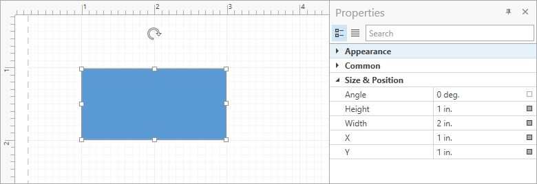
Documentation
Miscellaneous
- This update includes a new OrgChartLayoutIsCompact option for the Org Chart's automatic layout. Set this option to
false to calculate the offset for all tip-over subtrees rather than individual levels of the hierarchy. This improves readability for diagrams with extensive use of subtrees.
- You can now hold the middle mouse button and drag to pan the diagram. The AllowMiddleButtonDrag option allows you to disable this behavior.
WPF Pivot Grid
Filter Panel Enhancements
We enabled our new Filter Panel by default. This panel highlights individual field names, field values, and date-time functions to help improve the filter expression readability/usability.

Demo Documentation
WPF Gauges
Template for Custom Labels
Our WPF Gauge control allows you to generate custom labels from a template. Use the Scale.CustomLabelsSource and Scale.CustomLabelTemplate properties as needed.

<Style TargetType="{x:Type dxga:ArcScale}">
    <Setter Property="CustomLabelsSource" Value="{Binding RomanLabels}"/>
    <Setter Property="CustomLabelTemplate">
        <Setter.Value>
            <DataTemplate>
                <dxga:ScaleCustomLabel Value="{Binding Hour}"
                                       Content="{Binding RomanHour}"
                                       Visible="{Binding Visible}"/>
            </DataTemplate>
        </Setter.Value>
    </Setter>
</Style>
Demo Documentation
Snap Indicator Values to Tickmarks
Set the ValueIndicatorBase.SnapMode property to MinorTickmarks / MajorTickmarks to integrate this capability in your WPF app. Once set, the WPF Gauge control will snap its value to minor or major tickmarks.

Demo Documentation
WPF Docking
You can now use the FloatGroup.WindowStyle and FloatingPaneWindow.OverlapTaskbar properties to specify whether a maximized FloatGroup overlaps the Windows Taskbar.
<dxdo:DockLayoutManager FloatingMode="Desktop">
	<dxdo:FloatGroup xmlns:platform="http://schemas.devexpress.com/winfx/2008/xaml/docking/platform">
	    <dxdo:FloatGroup.WindowStyle>
	        <Style TargetType="platform:FloatingPaneWindow">
	            <Setter Property="OverlapTaskbar" Value="True"/>
	        </Style>
	    </dxdo:FloatGroup.WindowStyle>
	</dxdo:FloatGroup>
</dxdo:DockLayoutManager>

Documentation
WPF MVVM
The EnumItemsSourceBehavior's ImageSize property allows you to specify an item's image size.
<dxe:ComboBoxEdit>
    <dxmvvm:Interaction.Behaviors>
        <dxmvvm:EnumItemsSourceBehavior EnumType="{x:Type common:UserRole}"
                                        SortMode="DisplayName"
                                        ImageSize="20,20"/>
    </dxmvvm:Interaction.Behaviors>
</dxe:ComboBoxEdit>
Documentation
WPF Themes
Predefined Palettes for VS2019 Themes
We added the following predefined palettes to our VS2019 themes:

Documentation
Your Feedback Matters
We realize beta-testing is a time consuming process and we are grateful to those who invest time with our preview builds. Find the current implementation lacking flexibility? Feel we've overlooked a valuable usage scenario? Does our current implementation fail to address your business requirements? Please post your thoughts in the comment section below or create a Support Center ticket. We will happily follow-up and do what we can to extend the capabilities of our new products/features.
Free DevExpress Products - Get Your Copy Today
The following free DevExpress product offers remain available. Should you have any questions about the free offers below, please submit a ticket via the
DevExpress Support Center at your convenience. We'll be happy to follow-up.