WPF TreeView Control (v21.1)

As you may already know, the DevExpress WPF TreeView was first introduced in October 2020 as a community technology preview (CTP). v21.1 update marks its official release. You can use this control to display hierarchical data and allow users to navigate through individual nodes.
The TreeView is based on our multi-column WPF TreeList.
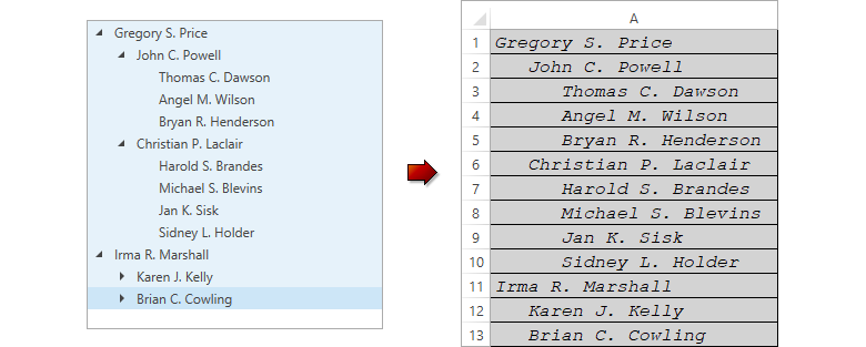
With the WPF TreeView control, you can allow users to navigate throughout specific sections of your application. To illustrate the possibilities in this regard, take a look at our Solution Explorer demo. As you can see in the image below, once a user selects a member in the TreeView, the app navigates to this member's description:
Consider the following TreeView demo: Report Library. This demo uses the TreeView to create a hierarchical folder structure and organize report items. You can drag and drop reports and folders, change names, and select the reports you wish to export:
For information on how to add a TreeView control to your project, refer to the following help topic: TreeView – Getting Started.
With that brief overview, let’s review specific functionality:
Bind to Data
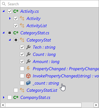
You can create an unbound tree or bind the TreeView to a data source with a self-referential or hierarchical data structure.
<dxg:TreeViewControl ItemsSource="{Binding Nodes}"
                     ChildNodesPath="Children"
                     TreeViewFieldName="DisplayName"/>
Search and Filter
The TreeView allows you and your users to search and filter data. You can display the Search Panel and customize its UI and behavior as needed.

Edit and Validate
You can assign an editor to display and edit node values. Handle the ValidateNode event to validate entered text values.

Select Nodes
The TreeView allows you to select one node at a time. If you wish to select multiple nodes, set the SelectionMode property to Row / MultipleRow.
Copy to Clipboard
Your users can copy TreeView data to the clipboard. You can customize copied data within the ClipboardNodeCopying event handler.
Drag & Drop
You can allow users to drag and drop nodes. To enable drag and drop, set the AllowDragDrop property to true.

Customize Appearance
The TreeView includes multiple styles, templates, and customization properties that allow you to change control appearance, display custom content within nodes, and show/hide visual elements.
Navigation – Your Way
The DevExpress WPF Component Suite includes a second UI component you can use to display hierarchical data and incorporate navigation functionality in your WPF application: WPF AccordionControl.

Which should you choose for your next WPF app? Here are a couple of things to consider:
- If you want a compact and customizable control to display data with 1 or 2 nesting levels, the AccordionControl is your best choice. You can set the View Mode to suit your needs.
- If you want to display multiple nesting levels and require extended functionality (data editing, checkboxes, multiple selection, etc), choose the TreeViewControl.
Your Feedback
We welcome your thoughts/feedback. If you have already used the TreeView control please comment below or contact us via the Support Center. We appreciate your continued support.
