WPF v23.1 — June 2023 Roadmap

This post outlines WPF-related enhancements we expect to ship in the first half of 2023. As always, we formulate our development strategy based on incoming feedback (via the DevExpress Support Center and recent surveys). Thank you for your continued support.
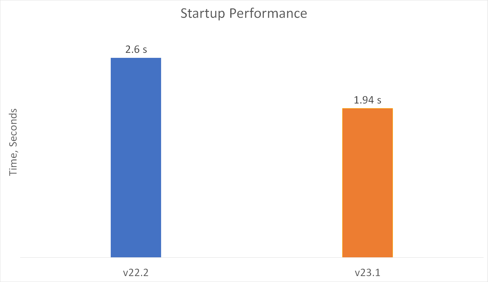
WPF Cold Start Performance
Performance remains a top priority here at DevExpress. As you may know, we introduced a series of WPF performance-related enhancements in our v22.2 release cycle:
- Data Filtering Performance Enhancements
- Date Navigator Performance Improvements
- Tree List Performance Improvements
- Tree List Asynchronous Loading of Child Nodes
- Data Grid Asynchronous Data Editing
- Scheduler On-Demand Data Loading
These enhancements notwithstanding, we want to improve startup performance further. In our next major release (v23.1), we will focus on cold start optimization. This involves reworking XAML resources and rethinking how themes are applied. Based on initial research, v23.1 changes should help decrease startup time by 25%. And of course, these changes will give us a solid foundation for further performance enhancements in the second half of the year.
WPF Data Grid — Filter Text in Column Headers
Our WPF Data Grid’s Auto Filter Row allows users to enter/apply filter text for specific columns. Based on feedback, its only drawback is the use of a separate row to input filter values. If your WPF application already incorporates service rows (such as our New Item Row), users may be confused as to the purpose of each service row. In our next release (v23.1), we will allow you to display the Auto Filter Row within Data Grid headers:

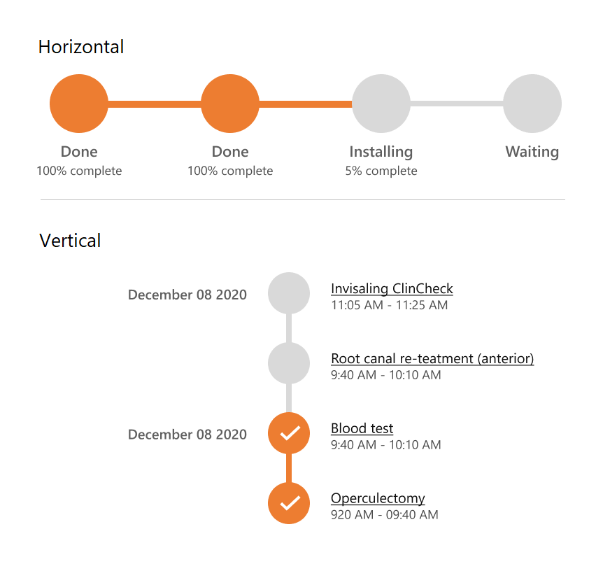
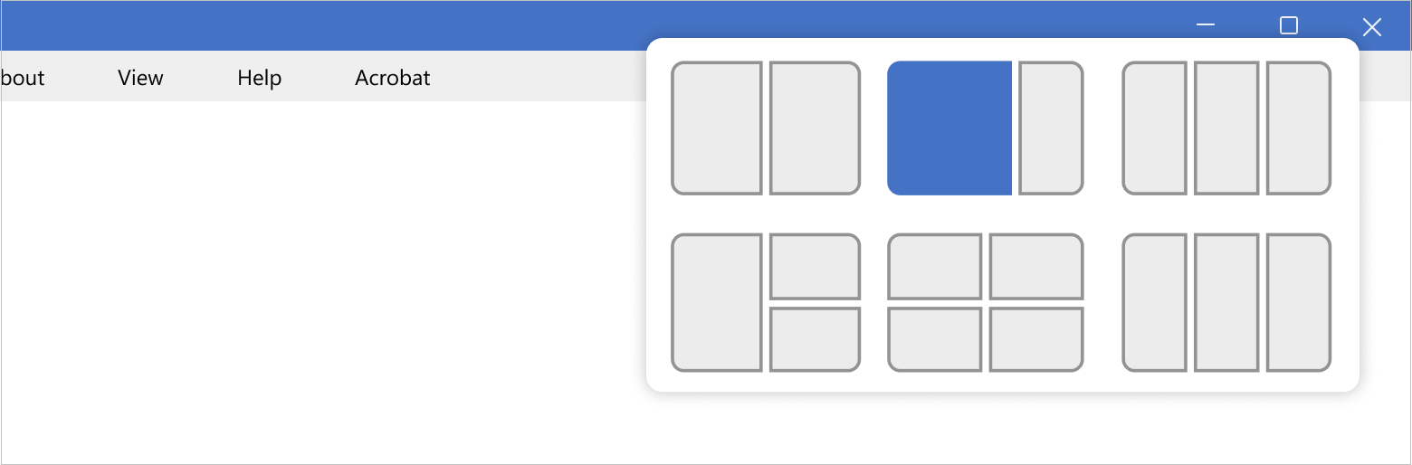
New WPF Step Progress Bar Control
To help visualize event chains, we expect to release a new WPF Step Progress Bar UI control in our v23.1 release cycle. You will have the option to to display event chains horizontally or vertically:
New WPF Date Range Editor Control
Our new WPF Date Range Editor will allow you to address a variety of usage scenarios - from entering departure/return dates to modifying range values within custom filters.
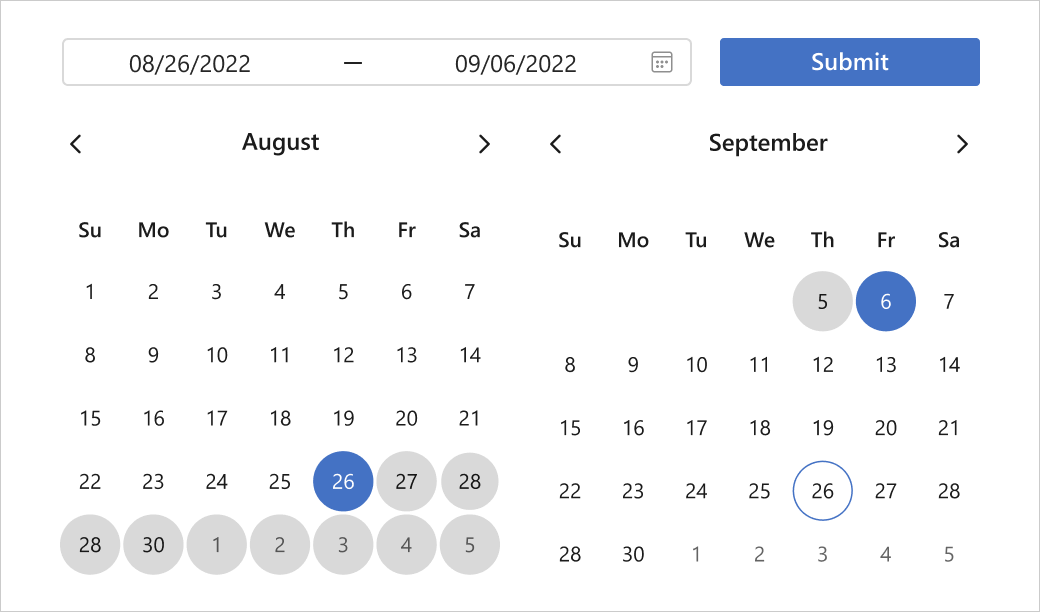
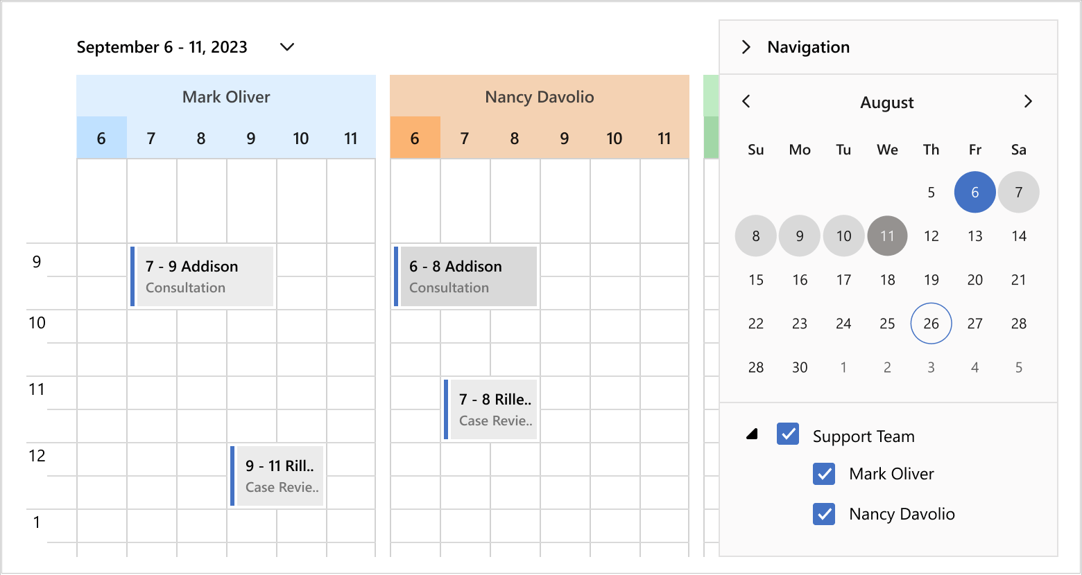
Date Navigator Range Selection
Like the WPF Date Range Editor above, you will be able to select date ranges within our WPF Date Navigator. This feature will help simplify date range selection when you link the control to our WPF Scheduler:
Themed Window Win11 Snapping
Our WPF Themed Window will support snapping (available in Windows 11). This will allow users to position and resize windows as requirements dictate:
GroupBy and Aggregate Support in OData Sources
As you may know, our ODataInstantFeedbackSource allows you to bind the DevExpress WPF Data Grid to OData services and to leverage Instant Feedback/Server Mode (to load data on demand and execute data operations on the server side). In our v23.1 release cycle, we expect to support GroupBy and Aggregate functions recently introduced to the OData .NET library. This enhancement will allow you to calculate summaries, group rows and apply filters when binding to OData services.
WPF PropertyGrid XAML - Instance Initializer
As you may know, our WPF Property Grid control allows you to dynamically add items to collection properties:

Currently, you need to implement the IInstanceInitializer interface to define how new collection items are created. We expect to ship an intuitive API to specify basic initialization settings in XAML and implement advanced behavior using an event:
<PropertyGridControl>
    <CollectionDefinition>
        <CollectionDefinition.NewItemInitializer>
            <XamlInitializer>
                <TypeDefinition Type = "{x:Type SomeType}" Name = "New SomeType">
                <TypeDefinition Type = "{x:Type SomeType1}" Name = "New SomeType1">
                <TypeDefinition Type = "{x:Type SomeType2}" Name = "New SomeType2">
            </XamlInitializer>
        </CollectionDefinition.NewItemInitializer>
    </CollectionDefinition>
    <PropertyDefinition>
        <PropertyDefinition.InstanceInitializer>
            <XamlInitializer Initialize="OnInitializeInstance">
                <TypeDefinition Type = "{x:Type SomePropertyType}" Name = "New SomeType">
                <TypeDefinition Type = "{x:Type SomePropertyType1}" Name = "New SomeType1" Description="Very useful type">
                <TypeDefinition Type = "{x:Type SomePropertyType2}" Name = "New SomeType2">
            </XamlInitializer>
        </PropertyDefinition.InstanceInitializer>
    </PropertyDefinition>
<PropertyGridControl/>
 private void OnInitializeInstance(XamlInitializer sender, InstanceInitializeEventArgs e) {
     //custom logic
 }
Reporting
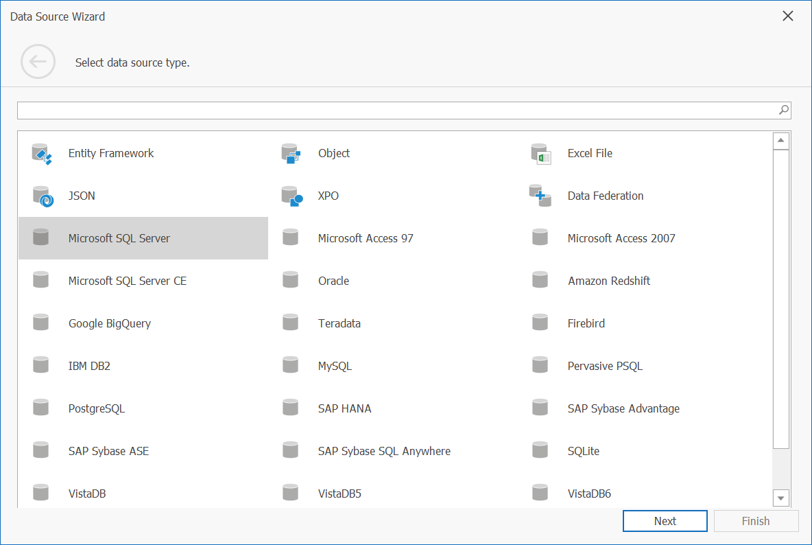
WPF Data Source Wizard Update
We will merge the first two pages of our Report Designer’s Data Source Wizard. Pages once used to select data source type and database provider will be replaced with a single page that displays a flat list of all supported data sources (with integrated search). The following screenshot illustrates the changes you can expect in our v23.1 release cycle (please note - this is an early mockup of the interface):
Barcodes — FNC symbols support
FNC (Functional Control) symbols are characters used in barcodes to perform specific functions. While they are not part of the data encoded into a barcode, they do provide additional information to the scanner (how the scanner must interpret and process data). These symbols are often used to specify data type or data structures. For example, some barcode formats use FNC symbols to indicate the start and end of a barcode or to separate different data elements within the barcode.
In our next major update (v23.1), we're going to support several FNC symbol types within our XRBarCode report control:
- FNC2: Specifies data type encoded in the barcode.
- FNC3: Provides additional information about data, such as its length or format.
- FNC4: Indicates that the data must be treated as a special data type (such as a reference number or a serial number).
Reporting Chart Enhancements — Localization and Bindable Properties
Our next major update will improve localization and binding support.
One of the enhancements planned for the next update is the introduction of bindable chart properties. With this new feature, users will be able to use expression bindings to set up Constant Line values, Strip Axis values, Chart Titles, and other elements with ease. This will streamline the report creation process and decrease the amount of code you need to write.
We will also give you the ability to localize chart elements within a report. You will be able to localize Chart and Axis titles, Text Patterns, etc.
Your Feedback Matters
Free DevExpress Products - Get Your Copy Today
 Alexander Russkov (DevExpress)