.NET Multi-platform App UI (.NET MAUI) is gaining market traction with each passing day. As you may know, Microsoft’s newest dev platform allows you to create cross-platform applications with a single codebase. Though many WPF developers have yet to jump on the .NET MAUI bandwagon, we wanted to demonstrate its potential in this blog post. Specifically, we want to describe commonalities between WPF and .NET MAUI.
Project Structure
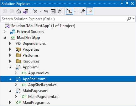
Unlike Xamarin, .NET MAUI solutions contain a single project for all target platforms. Like WPF, .NET MAUI projects include an App.xaml file and the main view. Additionally, you can find the AppShell class used as the root visual element:
The Resources folder contains application resources used across every platform. You can place platform-specific resources in the Platforms directory’s sub-folders to execute associated code on application startup.
XAML and Code-Behind
.NET MAUI pages have a similar structure as WPF windows or user controls. The root element contains namespace declarations and an x:Class attribute that defines the code-behind class name:
<?xml version="1.0" encoding="utf-8" ?>
<ContentPage xmlns="http://schemas.microsoft.com/dotnet/2021/maui"
             xmlns:x="http://schemas.microsoft.com/winfx/2009/xaml"
             x:Class="MauiFirstApp.MainPage">
    <ScrollView>
        <!--...-->
    </ScrollView>
</ContentPage>
The InitializeComponent method is generated automatically based on your XAML:
namespace MauiFirstApp;
public partial class MainPage : ContentPage {
    public MainPage() {
        InitializeComponent();
    }
}
Binding
.NET MAUI Binding uses a similar context as WPF Binding. It has similar modes, relative sources, a converter, etc. .NET MAUI uses a similar concept to WPF’s DataContext. The only difference is that the property is called BindingContext:
<ContentPage xmlns="http://schemas.microsoft.com/dotnet/2021/maui"
             xmlns:x="http://schemas.microsoft.com/winfx/2009/xaml"
             xmlns:local="clr-namespace:MauiFirstApp"
             x:Class="MauiFirstApp.MainPage">
    <ContentPage.BindingContext>
        <local:ViewModel/>
    </ContentPage.BindingContext>
    <Label Text="{Binding FirstName}"/>
</ContentPage>
Layout
.NET MAUI contains Grid and StackPanel analogs that help you arrange visual elements based on business requirements:
<Grid>
    <Grid.ColumnDefinitions>
        <ColumnDefinition Width="Auto"/>
        <ColumnDefinition Width="*"/>
    </Grid.ColumnDefinitions>
    <ListView Grid.Column="0"/>
    <StackLayout Grid.Column="1" WidthRequest="50">
        <Button Text="Print"/>
        <Button Text="Export"/>
    </StackLayout>
</Grid>
Resources
Resource Dictionaries store application resources (styles, templates, converters, etc). You can use the StaticResource or DynamicResource markup extension to apply these resources to an element:
<ContentPage xmlns="http://schemas.microsoft.com/dotnet/2021/maui"
             xmlns:x="http://schemas.microsoft.com/winfx/2009/xaml"
             xmlns:local="clr-namespace:MauiFirstApp"
             x:Class="MauiFirstApp.MainPage">
    <ContentPage.Resources>
        <Color x:Key="ButtonBackgroundColor">DarkOrange</Color>
        <Color x:Key="ButtonForegroundColor">Black</Color>
    </ContentPage.Resources>

    <Button Text="Export"
            BackgroundColor="{StaticResource ButtonBackgroundColor}"
            TextColor="{StaticResource ButtonForegroundColor}"/>
</ContentPage>
Templates
In .NET MAUI, you can use ControlTemplates and DataTemplates to retain the same UI flexibility as WPF:
<ListView>
    <ListView.ItemTemplate>
        <DataTemplate>
            <Label Text="{Binding FirstName}"/>
        </DataTemplate>
    </ListView.ItemTemplate>
</ListView>
Styles
You can create both explicit and implicit styles to apply similar settings to multiple elements:
<ContentPage.Resources>
    <Style TargetType="Button">
        <Setter Property="Background" Value="Orange"/>
        <Setter Property="TextColor" Value="White"/>
        <Setter Property="CornerRadius" Value="4"/>
    </Style>
</ContentPage.Resources>
<StackLayout Orientation="Horizontal">
    <Button Text="Next"/>
    <Button Text="Prev"/>
</StackLayout>
Triggers
Declarative XAML triggers allow you to apply styles conditionally:
<ContentPage.Resources>
    <Style TargetType="Editor" x:Key="redOnFocusStyle">
        <Style.Triggers>
            <Trigger TargetType="Editor" Property="IsFocused" Value="True">
                <Setter Property="Background" Value="Red"/>
            </Trigger>
        </Style.Triggers>
    </Style>
</ContentPage.Resources>
<StackLayout VerticalOptions="Start">
    <Editor Text="Red on Focus" Style="{StaticResource redOnFocusStyle}"/>
</StackLayout>
Visual Tree
Much like WPF, a hierarchy of visual elements allows you to easily identify control ancestors and child elements. As intuition would suggest, the Parent property contains the direct visual parent and the Children property - direct children. The main difference is that .NET MAUI doesn’t have a logical tree.
MVVM
.NET MAUI uses the same MVVM paradigm as WPF. Many MVVM frameworks, such as Prism, are cross-platform, so you are not likely to notice many differences. Here is a basic example, that demonstrates how to bind an editor to a property and a button to a command in your View Model:
<?xml version="1.0" encoding="utf-8" ?>
<ContentPage xmlns="http://schemas.microsoft.com/dotnet/2021/maui"
             xmlns:x="http://schemas.microsoft.com/winfx/2009/xaml"
             xmlns:local="clr-namespace:MauiFirstApp"
             x:Class="MauiFirstApp.MainPage">
    <ContentPage.BindingContext>
        <local:ViewModel/>
    </ContentPage.BindingContext>
    <StackLayout VerticalOptions="Start">
        <Editor Text="{Binding FirstName}"/>
        <Button Text="Process" Command="{Binding ProcessUserCommand}"/>
    </StackLayout>
</ContentPage>
public class ViewModel : INotifyPropertyChanged {
    private string name;
    public string FirstName {
        get { return name; }
        set {
            name = value;
            OnPropertyChanged();
        }
    }

    public ICommand ProcessUserCommand { get; }

    public ViewModel() {
        ProcessUserCommand = new Command(ProcessUser);
    }

    void ProcessUser() {
        Console.WriteLine(FirstName);
    }

    public event PropertyChangedEventHandler PropertyChanged;

    public void OnPropertyChanged([CallerMemberName] string name = "") =>
    PropertyChanged?.Invoke(this, new PropertyChangedEventArgs(name));
}
Dependency Properties
.NET MAUI Dependency Properties are called Bindable Properties. They use a similar construction for declaration: a static field and a public property. The BindableProperty.Create method accepts all similar arguments as DependencyProperty.Register in WPF:
public int MaxValue {
    get => (int)GetValue(MaxValueProperty);
    set => SetValue(MaxValueProperty, value);
}

public static readonly BindableProperty MaxValueProperty =
    BindableProperty.Create("MaxValue", typeof(int), typeof(MainPage), 0, propertyChanged: OnMaxValueChanged);

private static void OnMaxValueChanged(BindableObject bindable, object oldValue, object newValue) {
    // ...
}
Conclusion
WPF and .NET MAUI development have a lot in common. If you are familiar with WPF, you can create a capable .NET MAUI application without much difficulty. If you are interested in .NET MAUI, refer to the following help topic for more information: Get Started with .NET Multi-platform App UI (.NET MAUI).
If you decide to pursue .NET MAUI development, be sure to download our .NET MAUI components today – they are available free of charge for a limited time: .NET MAUI Controls.
Free DevExpress Products - Get Your Copy Today
The following free DevExpress product offers remain available. Should you have any questions about the free offers below, please submit a ticket via the
DevExpress Support Center at your convenience. We'll be happy to follow-up.