Blazor Components - New Blazor Scheduler Control, Data Grid Enhancements and more (available in Beta #1)

As you may know, DevExpress released the first preview of its Blazor UI components in April. Thanks to your outstanding feedback, we are inching closer to our official release and, as the next major step to that goal, we're publishing our first beta.
This first beta includes a new Blazor Scheduler component along with a myriad of enhancements designed to improve the overall capabilities of our Blazor product line.
Blazor Preview 7 Support
Microsoft recently announced availability of Blazor Preview 7. The components in our first beta fully support Preview 7.
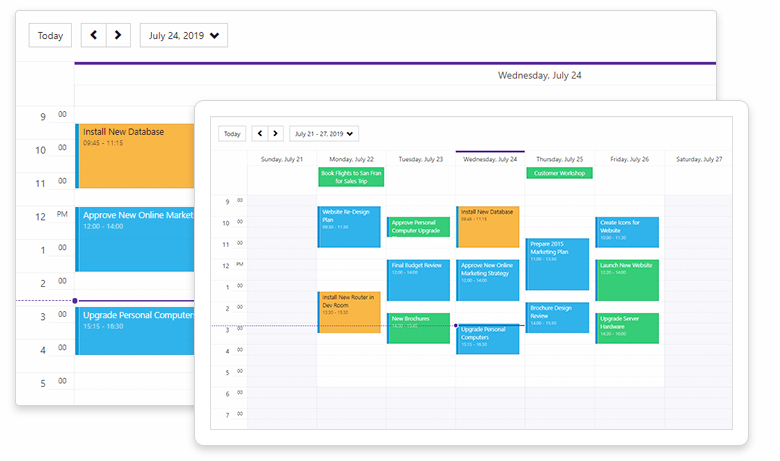
New Blazor Scheduler Component
A picture is worth a thousand words…Here is a screenshot of our new Blazor Scheduler component (available in Beta #1).
Mobile Friendly
The component is ready for both desktop and tablets alike. We plan to add a mobile-optimized Agenda view in a future release.
Scheduler Views
The Scheduler control supports 3 calendar views: 'Day View', 'Work Week View', and 'Week View'. As its name implies, the 'Day View' displays appointments for a single or for multiple days. Use the DayCount setting to control the number of days to display. The 'Work Week View' displays 5-day working week intervals. The 'Week View' displays appointments/events across a 7 day period. FirstDayOfWeek allows you to specify the first day of the week (which is Sunday by default).
Data Binding
To bind the control to appointment data, use the DxSchedulerDataStorage object, and populate the AppointmentsSource and AppointmentMappings collections. The DxSchedulerDataStorage object also supports additional fields for custom data:
- Use
AppointmentLabelsSourceandAppointmentLabelMappingsto display custom labels within the Scheduler - Use
AppointmentStatusSourceandAppointmentStatusMappingsto display any custom event statuses
Once the DxSchedulerDataStorage object is created, you can assign it to the DxScheduler.DataStorage property for use with a Scheduler control. Alternately, you can use it as a stand-alone data source to retrieve appointment data without needing to add the component to a web page. See our online demo for more information.
Recurring Appointments
Our Blazor Scheduler control supports recurring appointments. To create a recurring appointment, add a RecurrenceInfo field in the following format:
<RecurrenceInfo Start="07/23/2019 9:30:00" End="07/23/2019 11:00:00" WeekDays="36" Id="04dcc127-df56-49d7-baff-ce4b6264addd" OccurrenceCount="10" Range="1" Type="1" />
An recurring appointment supports the following recurrence types:
public enum RecurrenceType {
  Daily = 0,
  Weekly = 1,
  Monthly = 2,
  Yearly = 3
}
and recurrence ranges:
public enum RecurrenceRange {
  NoEndDate = 0,
  OccurrenceCount = 1,
  EndByDate = 2
}Data Grid
Vertical and Horizontal Scrolling
Our Blazor Data Grid control now supports both vertical and horizontal scrolling. To activate scrolling, assign one of the following values to the VerticalScrollBarMode and HorizontalScrollBarMode properties:
Auto– A scrollbar is automatically displayed when content size exceeds the component size, otherwise it is hidden.Visible- The scrollbar is always visible.Hidden- The scrollbar is always hidden.
Use the VerticalScrollableHeight property to set the height of the visible scroll region.
Horizontal scrolling is fully compatible with the Virtual Scrolling mode. You can enable Virtual mode for both vertical scrolling and horizontal scrolling at the same time.
See the online demo for additional info.
Column Visibility
The Data Grid now provides support for hidden columns. Use the Visible property to manage column visibility. Once you hide a column, its editor is no longer available. Should you want to display the editor, assign one of the following values to the DxDataGridColumn.EditorVisible property:
Default– Column editor visibility is linked to column visibility. If the column is hidden, the editor is hidden as well. If the column is visible, the editor is also visible.True– The Column editor is visible regardless of the column’s Visible property value.False– The Column’s editor is always hidden.
TreeView
Data Binding
Our Blazor TreeView allows you to bind hierarchical data via any object that implements the IEnumerable interface (one that has a child item collection for use as a data source for the TreeView). Assign your data source to the TreeView.Data property and ChildrenExpression to obtain the child item collection used to bind the TreeView to data.
Additionally, our TreeView provides the following properties for custom data display:
TextExpression- A lambda expression that returns the node text from a corresponding data itemNameExpression- A lambda expression that returns a node’s unique identifier (that is, a name)NavigateUrlExpression- A lambda expression that returns a node’s target URLIconCssClassExpression- A lambda expression that returns the name of a CSS class applied to a node’s icon
To learn more, please review our TreeView - Binding to Hierarchical Data demo.
Form Layout
Items Visibility
We’ve added a Visible property to the following FormLayout items:
DxFormLayoutItemDxFormLayoutGroupDxFormLayoutTabPagesDxFormLayoutTabPage
You can now display or hide specific items, item groups, or tabs by setting the Visible property to true or false.
Your Feedback
Your feedback matters. Please share your thoughts about this update below and tell us what you’d like to see us develop next for the Blazor platform.
Free DevExpress Products - Get Your Copy Today
 The DevExpress Team