Blazor Components - New Charts, Data Grid Enhancements and more (available in Beta #2)

The second beta of the DevExpress UI for Blazor is now available and it includes new Chart and Data Visualization components, DataGrid enhancements, and support for Blazor Preview 8.
Blazor Preview 8 Support
As you may know, Microsoft recently announced the release of .NET Core 3.0 Preview 8. This release includes numerous updates to ASP.NET Core and Blazor. Components in this, our second beta fully support Preview 8.
Blazor Charts and Data Visualization Controls
Our second beta ships with an entirely new control set - DevExpress Charts for Blazor.
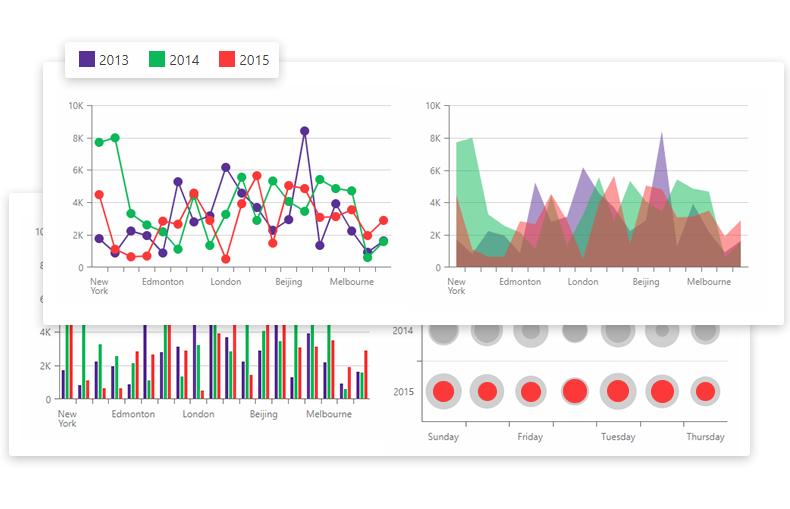
DevExpress Charts for Blazor allows you to create different chart types for your next Blazor project. Major features include:
Multiple Chart Series
The following Chart series are available:
- Area: Stacked Area, Full Stacked Area, Spline Area, Stacked Spline Area, Full Stacked Spline Area, and Step Area.
- Bar: Stacked Bar and Full Stacked Bar.
- Line: Step Line, Stacked Line, and Full Stacked Line.
- Bubble
We will introduce Financial and Range chart series support in an upcoming release.
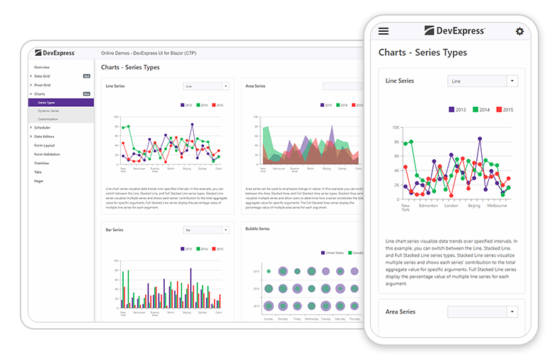
Please explore our online demo to learn more about available chart types.
Table Data Binding
You can bind our Blazor Charts component to a data source that contains table-based data. The following chart series settings are available through the DxChartCommonSeries object:
NameField– Specifies the data field that provides series names.AggregationMethod– A data aggregation method. You can use any predefined or custom function withFunc<IEnumerable<TValue>,<TValue>signature. In our demo, we use a static Enumerable.Sum method available in .Net and Blazor.ArgumentField– Specifies the data field that provides series arguments.- Value`Field – Specifies the data field that provides series values.
The SeriesTemplate can contain DxChartBarSeries, DxChartLineSeries, and other series objects to customize specific series types.
Please test drive our online demo to learn more.
Use our Blazor Pivot Grid as Data Source
Our Blazor Charts component can load and visualize data directly from our Blazor Pivot Grid component. The chart will also update itself instantly to reflect changes made to the pivot table.
You can synchronize DevExpress Blazor Charts with our Pivot Grid using DxPivotGridDataProvider<T>. The code below demonstrates use of the Create method (creates a data provider and asynchronously provides the IEnumerable<T> collection to this provider):
DxPivotGridDataProvider PivotGridDataProvider = DxPivotGridDataProvider.Create(Sales.Load());
The DxPivotGridDataProvider includes two data sources (PivotGridDataSource and ChartDataSource) for the Blazor Pivot Grid and Charts components. Use the NameField, ArgumentField, and ValueField properties to specify the fields of a data source object used for a chart’s series names, arguments, and values.
To group data by panes and create a separate pane for each group, set the PaneField property. When used, charts automatically display the most detail data level. When a user expands a row in the pivot grid, the chart displays expanded field values
Series Customization
You can display multiple axes and combine different chart types (e.g., bars and lines) in the same chart.
Use the DxChartTooltip object to specify a custom template for the tooltip displayed when users hover over a chart series.
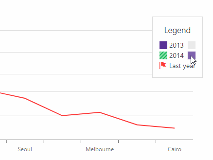
The DxChartSeriesLegendItem component in a chart series markup allows you to customize legend item appearance, change legend position, and its visibility.
Additionally, DxChart provides built-in functionality to display and hide series when an end-user clicks a corresponding legend item:
Mobile Friendly
The DevExpress Blazor Charts component is ready for use on tablets and mobile devices alike:
Data Grid - Your Feedback Matters
Thanks to your great feedback, we’ve added the following new features to our Data Grid:
1. New Sorting API
The DevExpress Blazor Data Grid provides a new API to control data sorting. Use the DxDataGrid.AllowSort property to control sort order availability for the grid control.
Additionally, each data column provides settings to manage sort order.
- The
AllowSortproperty allows sorting for a specific column. - The
SortOrderproperty specifies sort direction. - The
SortIndexsetting sets column sort priority.
2. Multiple Column Sort
End users can also sort our Blazor Data Grid using multiple columns. Hold down the SHIFT key and click an unsorted column header and this field will be added to the list of sorted fields.
3. Cell Text Alignment
Our customers asked us to incorporate a cell text alignment option. The DevExpress DataGrid for Blazor now includes this option. By default, the grid aligns DxDataGridSpinEditColumn text to the right. Other cells can be aligned to the left. If you want to change this behavior, set the DxDataGrid.TextAlignment property to one of the following: Left, Center, Right, or Justify.
4. Command Buttons Enhancements
A command column (DxDataGridCommandColumn) provides three new Boolean properties to manage command buttons: NewButtonVisible, EditButtonVisible, and DeleteButtonVisible.
5. Command Buttons Customization
A new StartRowEdit method allows you to add edit functionality to a custom button located within or outside the data grid.
public void StartRowEdit(object dataItem);
The method accepts a dataItem object to identify the processed row. If the inner key value parameter is null, the grid creates a new row and switches the grid to edit mode.
We've created an example to show you how to use the StartRowEdit method and implement custom command buttons inside a DevExpress Blazor Data Grid component.
Getting Started and Ongoing Feedback
To get started with DevExpress UI for Blazor, simply create a new Blazor project and incorporate our controls as needed.
As always, your feedback matters. Please share your thoughts with us - we want to do everything possible to earn your business now and into the future.
Free DevExpress Products - Get Your Copy Today
 The DevExpress Team